Sun and Ice

The warm March sun is melting the snow and ice in our neighborhood, so it seems like a good time to talk about the sun and Arctic climate change.
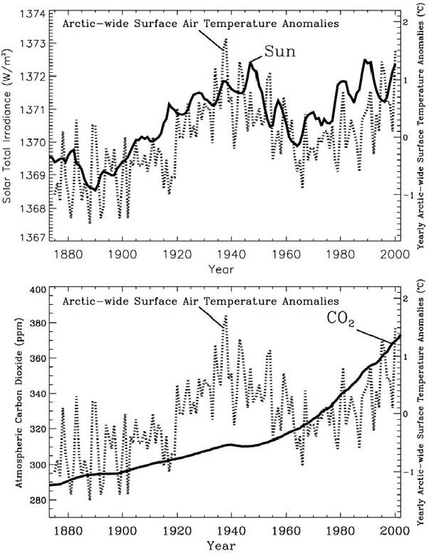
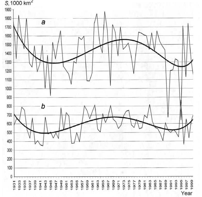
Figure 6.5. Annual-mean Arctic-wide air temperature anomaly time series (dotted line) correlated with estimated total solar irradiance (solid line in the top panel) from the model by Hoyt and Schatten, and with the mixing ratio of atmospheric carbon dioxide (solid line in the bottom panel) From Frovlov et al. 2009
Again, I am relying on a book by Frolov et al. Climate Change in Eurasian Arctic Shelf Seas, Centennial Ice Cover Observations (with some additional more recent material below).
Of course, the most direct effect of the sun on ice is in the summer:
Short-wave solar radiation is the most significant summer-season forcing, or, more precisely, the part of it that depends on albedo and absorption by the ice cover and the sea. Due to changes in albedo not related to greenhouse gases of anthropogenic origin, this heat balance constituent can vary by several dozen W/m2 in polar regions, or one order of magnitude greater than the most optimistic assessments of the influence of greenhouse gases. P 121
And the internal oscillations of the ocean-ice-atmosphere system were discussed extensively in a previous post here:
It was noted in Sections 4.1 and 4.2 that air temperature at mid and high latitudes primarily depends on dynamic processes in the atmosphere (Alekseev, 2000; Alekseev et al., 2003; Vorobiev and Smirnov, 2003). They influence air temperature due to both advective processes and the impact of cloudiness, which depend on the type of baric system in play. In winter, this influence is particularly high in areas where anticyclones are common. Weakening of anticyclones results in increasing temperature and cloudiness. Variation in cloudiness is one of the main causes of climate change is indicated by Sherstyukov (2008). p 119
Frolov et al. explore the connection between solar activity and these atmospheric processes. They are not jumping to conclusions and recognize that uncertainty surrounds the mechanisms between Solar Activity (SA) and Arctic ice variability.
The variation of temperature matches the TSI curve far better than it matches the CO2 curve. However, the Hoyt and Schatten model for TSI is just one of many, and other models lead to very different patterns for TSI vs. year. Furthermore, climate modelers would argue that the temperature curve in the second warming epoch represents the continuation of the first warming epoch, interrupted by a period from about 1940 to about 1980 when increasing aerosol concentrations outweighed the effect of increasing greenhouse gases. Therefore, Figure 6.5 is just one representation of many that could be derived. Nevertheless, if Figure 6.5 were taken at face value, the temperature and TSI variation charts would suggest the presence of both a positive “100-year” trend and quasi 60-year cyclic oscillations.
While Figure 6.5 is suggestive, the fact remains that we really do not know how TSI varied prior to the advent of satellite measurements around 1980. Figure 6.5 demonstrates that the form of the variability of Arctic surface temperatures during the 20th century resembles the variability of the Hoyt and Schatten model for TSI. This is suggestive that variations in TSI may have been an important factor in 20th century climate change. Though the total variance of TSI from 1880 to 2000 according to Hoyt and Schatten was 384 W/m2, the simple spreading of this flow over the spherical area of the Earth is incorrect. As we show in this work, a significant part of TSI variance influences the high-latitude regions. Furthermore, as was noted in Section 5.4, Budyko (1969) concluded by calculations that solar constant variations of several tenths of % are sufficient to induce essential climate changes.
In seeking a relationship between solar variability and climate change, we may consider TSI and SA (Solar Activity). The connection between TSI and climate is direct; TSI represents the fundamental heat input from the Sun that drives our climate. However, although SA represents fundamental aspects of the dynamics of the Sun, its connection to the total power emitted by the Sun is not quite clear. SA includes energetic particle emission, electromagnetic emission in the UV and higher frequency ranges and magnetic fields. It is manifested in the Earth’s phenomena in the form of polar lights, magnetic storms, radio-communication blackouts, etc. A number of different indices are used to measure the level of SA, particularly sunspot indices (Wolf number, etc.), the intensity of solar wind, and various magnetic indices. Even though variations in TSI associated with changes in SA may be small, the impact on higher latitudes is significantly amplified by the interaction of charged solar wind particles with the Earth’s magnetic field. As shown in our work, evidence exists that variability of SA is connected to Arctic climate variations. Frolov et al. 2009 pp. 124
Conclusion
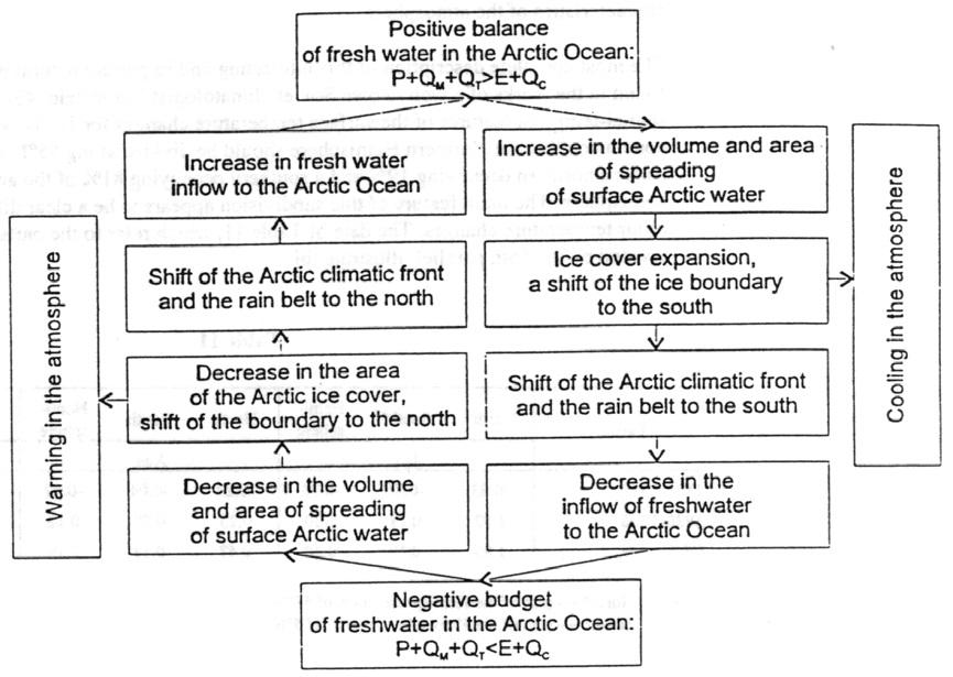
The Earth’s climate is affected by internal and external factors. The internal factors include natural hydro-meteorological, geological, and biological processes, as well as self-oscillation phenomena related to interactions in the ocean-sea ice-atmosphere-glaciers system. In addition, anthropogenic impacts are also considered to be internal factors; they are caused by the increase in concentration of greenhouse gases in the atmosphere because of human activity. External factors include solar activity, tidal and nutation phenomena, variability of the Earth’s rotation speed, fluctuations in the solar constant, fluxes of energy and charged particles from space, and other astronomical factors. p.133
Addendum
Some may claim the Hoyt and Schatten model is outdated, so I provide recent comparable results from Jan Erik Solheim October 2014 here.
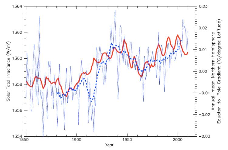
Figure 4: Annual-mean EPTG over the entire Northern Hemisphere (°C/latitude; dotted blue line) and smoothed 10-yr running mean (dashed blue line) versus the estimated TSI of Hoyt and Schatten (Soon and Legates, 2013)
The reconstruction by D. Hoyt and K. Schatten (1993) updated with the ACRIM data (Scafetta, 2013) gives a remarkable good correlation with the Central England temperature back to 1700. It also shows close correlation with the variation of the surface temperature at three drastically different geographic regions with the respect to climate: USA, Arctic and China.
The excellent relationship between the TSI and the Equator-to-Pole (Arctic) temperature gradient (EPTG) is displayed in figure 4. Increase in TSI is related to decrease in temperature gradient between the Equator and the Arctic. This may be explained as an increase in TSI results in an increase in both oceanic and atmospheric heat transport to the Arctic in the warm period since 1970.

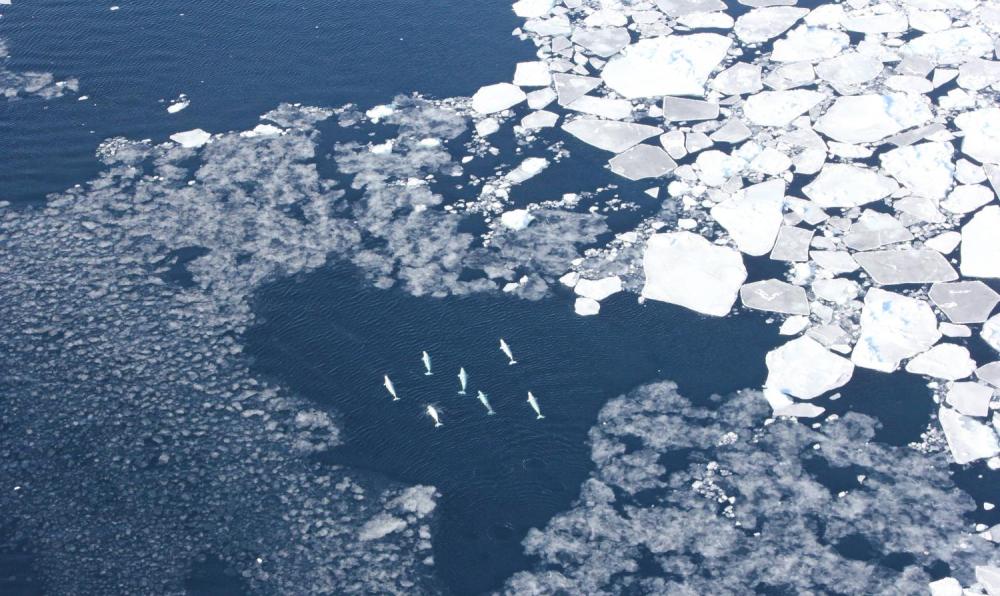
White sea ice in the Arctic melting from the sun, and also reflecting back solar energy.

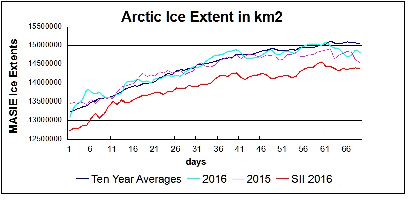


Your dataset is invaluable since it represents multiple sources, including satellite passive microwave sensors, and is more precise in defining ice edges. I have been following MASIE for years, and was pleased to see the dataset for the last ten years released in November 2015. This ice extent record based on navigational observations is a vital resource for comparisons, not only with the satellite measurements, but also with the longer-term history of ice charts from Russia, Denmark, Norway and Canada.
Thank you, and please keep up the excellent work.
Ron Clutz
Blogsite: Science Matters
https://rclutz.wordpress.com/category/arctic-sea-ice/
I received a nice reply and word that my message was forwarded to the team leader.
Any others wanting to see this dataset maintained might also want to communicate their interest.
“If you see something, Say something.”