Amidst all the concerns for social diversity, let’s raise a cry for scientific diversity. No, I am not referring to the gender or racial identities of people doing science, but rather acknowledging the diversity of climates and their divergent patterns over time. The actual climate realities affecting people’s lives are hidden within global averages and abstractions. A previous post Concurrent Warming and Cooling presented research findings that on long time scales maritime climates can shift toward inland patterns including both colder winters and warmer summers.
It occurred to me that Frank Lansner had done studies on weather stations showing differences depending on exposure to ocean breezes or not. That led me to his recent publication Temperature trends with reduced impact of ocean air temperature Lansner and Pederson March 21, 2018. Excerpts in italics with my bolds.
Abstract
Temperature data 1900–2010 from meteorological stations across the world have been analyzed and it has been found that all land areas generally have two different valid temperature trends. Coastal stations and hill stations facing ocean winds are normally more warm-trended than the valley stations that are sheltered from dominant oceans winds.
Thus, we found that in any area with variation in the topography, we can divide the stations into the more warm trended ocean air-affected stations, and the more cold-trended ocean air-sheltered stations. We find that the distinction between ocean air-affected and ocean air-sheltered stations can be used to identify the influence of the oceans on land surface. We can then use this knowledge as a tool to better study climate variability on the land surface without the moderating effects of the ocean.
We find a lack of warming in the ocean air sheltered temperature data – with less impact of ocean temperature trends – after 1950. The lack of warming in the ocean air sheltered temperature trends after 1950 should be considered when evaluating the climatic effects of changes in the Earth’s atmospheric trace amounts of greenhouse gasses as well as variations in solar conditions.
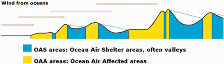
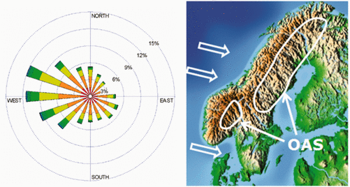
As a contrast to the OAS stations, we compare with what we designate as ocean air affected (OAA) stations, which are more exposed to the influence of the ocean, see Figure 1. The optimal OAA locations are defined as positions with potential first contact with ocean air. In general, stations where the location offers no shelter in the directions of predominant winds are best categorized as OAA stations.
Conversely, the optimal OAS area is a lower point surrounded by mountains in all directions. In this case, the existence of predominant wind directions is not needed. Only in locations with a predominant wind direction, the leeward side of the mountains can also form an OAS region.

Figure 2. The optimal OAA and OAS locations with respect to dominating wind direction.
A total of 10 areas were chosen for this work to present the temperature trends of OAS areas (typically valley areas) and OAA areas from Scandinavia, Central Siberia, Central Balkan, Midwest USA, Central China, Pakistan/North India, the Sahel Area, Southern Africa, Central South America, and Southeast Australia. In this work, we have only considered an area as “OAS” or “OAA” if it comprises at least eight independent temperature sets. In the following, temperature data 1900–2010 from individual areas are discussed.
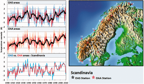
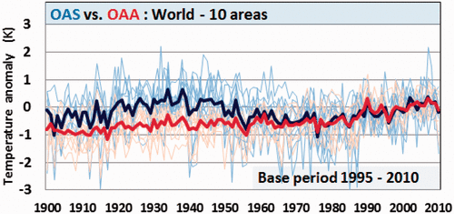
As an example, we show in Figure 3 the results for the Scandinavian area where we have used a total of 49 OAS stations and 18 OAA stations. The large number of stations available is due to the use of meteorological yearbooks as supplement to data sources such as ECA&D climate data and Nordklim database.

Figure 3. OAS and OAA temperature stations, Scandinavia.
The upper set of curves is from the OAS areas: Here the blue lines show one-year mean temperature averages for each temperature station, the red lines show the average of all stations of the area, and the thick black line is a five-year running mean of the station average. The reference period is 1951–1980. The middle set of curves is from the OAA areas. Here the orange lines show one-year mean temperature averages for each temperature station, the red lines show average of the stations of the area, and the thick black line is a five-year running mean of the station average. The reference period is 1951–1980.
On the lower set of curves labeled “OAS vs. OAA areas,” a comparison of the two data sets of stations is shown. The blue lines are the one-year average of OAS stations of the area and the red lines are the one-year average of OAA stations of the area. The reference period is 1995–2010. We note that these Scandinavian OAS stations are not well shielded from easterly winds.
Although easterly winds are not frequent (see Figure 2), the OAS area used cannot be characterized as an optimal OAS area. Despite this, we find a difference between the OAS and OAA area temperature data. While the general five-year running mean temperature curves (left panel in Figure 3) show resemblance in warming/cooling cycles, the OAA stations show less variation than the OAS stations.
We also find the absolute temperature anomalies for the Scandinavian OAS areas deviate from the OAA area with the OAS stations showing less warming than the OAA stations during the 20th century. For the years 1920–1950, we thus find temperatures in the OAS area to be up to 1 K warmer than temperature in the OAA area. In recent years, there is a closer agreement between OAS and OAA trends and even though the Scandinavian OAS data generally are warmer than OAA data for 1920–1950, we also note that in some very cold years, OAS temperatures are slightly colder than the OAA temperatures.
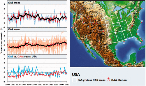
The paper presents all ten regions analyzed, but I will include here the USA example to see how it compares with other depictions of US regions. For example, see the map at the top shows the dramatic difference between temperature records in Eastern versus Western US stations. Here is the assessment from Lansner and Pederson. Note the topographical realities.

For the USA (Figure 6), we defined the OAS area as consisting of eight boxes, each of size 5° X 5°. The boxes were defined as 40–45N X 100–95 W, 40–45N X 95–90W, 35– 40N X 100–95W, 35–40N X 95–90 W, 35–40N X 90–85W, 35–30N X 100– 95W, 35–30N X 95–90W, and 35–30N X 90–85W. A total of 236 temperature stations were used from this area. Full 5 X 5 grids were not found to be suited as OAA areas, but 27 stations indicated on the map were used for the OAA data set. All data were taken from GHCN v2 raw data. The OAS area in the US Midwest is well protected against westerly oceanic (Pacific) winds due to the Rocky Mountains. The US Midwest is also to some degree sheltered against easterly winds due to the Appalachian mountain range. Again the temperature trends from the OAS area as defined above show the 1920–1955 period in most years to be around 1 K warmer than temperature trends from the OAA areas.
Summation

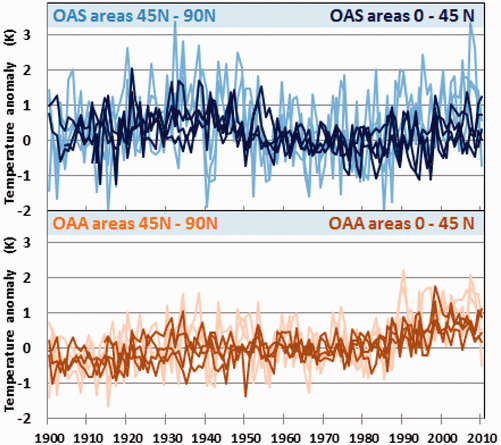
Figure 13. OAS and OAA temperature averages, Northern Hemisphere.
In Figure 13 we have combined average temperature trends for all seven NH OAS areas (blue curves) and OAA areas (brown curves) were areas are divided into low (0–45N) and high (45–90N) latitudes (dark colors are used for low and light colors for high latitudes). Both for the OAS areas and the OAA areas we see that the seven NH areas have similar development of temperature trends for 1900–2010. The larger variation in data from high latitudes (45–90N) is likely to reflect the Arctic amplification of temperature variations. OAS temperature stations further away from the Arctic (0–45N) seem to show less temperature increase during 1980–2010 than the OAS areas most affected by the Arctic (45– 90N). The NH OAS data all reveal a period of heating of the Earth surface 1920–1950 that the OAA data do not reflect well.

Figure 19. OAS and OAA temperatures, all regions.
Conclusion
Bromley et al. raise shifts in seasonality as a factor in climate change. Now Lansner and Pederson show differences in temperature trends due to ocean exposure, and also greater fluctuations with higher latitudes. Note that the cooling in the USA is replicated in the pattern shown worldwide in OAS regions. The key factor is the hotter temperatures prior to 1950s appearing in OAS records but not in OAA records.
Despite all the clamor about global warming (or recently global cooling since the hiatus), it all depends on where you are. Recognizing the diversity of local and regional climates is the sort of climate justice I can support.
Footnote:
I do not subscribe to Arctic “Amplification” to explain latitudinal differences. Since earth’s climate system is always working to transport energy from the equator to poles, any additional heat shows up in higher latitudes by meridional transport. Previous posts have noted how anomalies give a distorted picture since temperatures are more volatile at higher (colder) NH latitudes.
See: Temperature Misunderstandings

Clive Best provides this animation of recent monthly temperature anomalies which demonstrates how most variability in anomalies occur over northern continents.

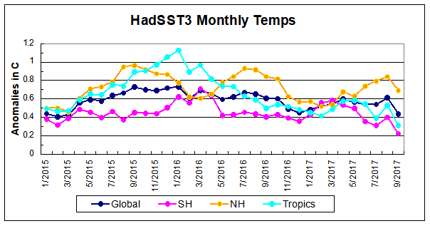
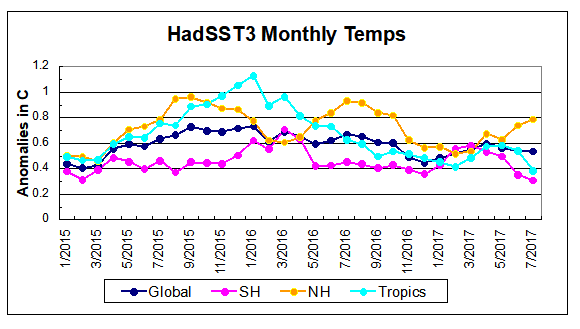
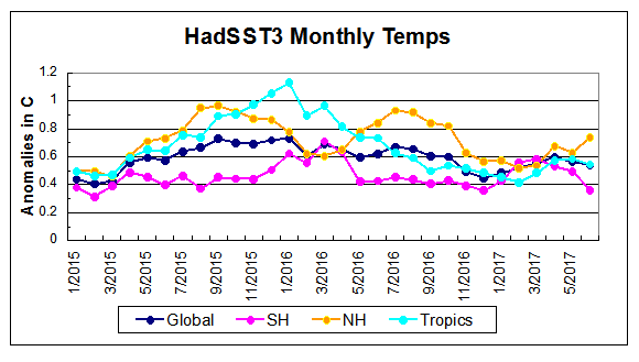
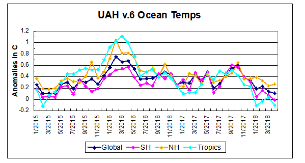 The anomalies have reached the same levels as 2015. Taking a longer view, we can look at the record since 1995, that year being an ENSO neutral year and thus a reasonable starting point for considering the past two decades. On that basis we can see the plateau in ocean temps is persisting. Since last October all oceans have cooled, with upward bumps in Feb. 2018, now erased.