NOAA Is Losing Arctic Ice

MASIE: “high-resolution, accurate charts of ice conditions”
Walt Meier, NSIDC, October 2015 article in Annals of Glaciology.
Something strange is happening in the reporting of sea ice extents in the Arctic. I am not suggesting that “Something is rotten in the state of Denmark.” That issue about a Danish graph seems to be subsiding, though there are unresolved questions. What if the 30% DMI graph is overestimating and the 15% DMI graph is underestimating?
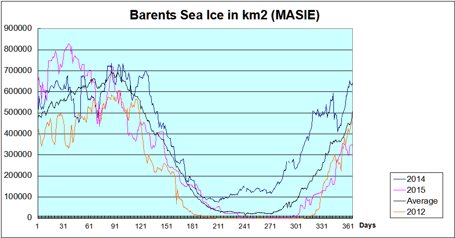
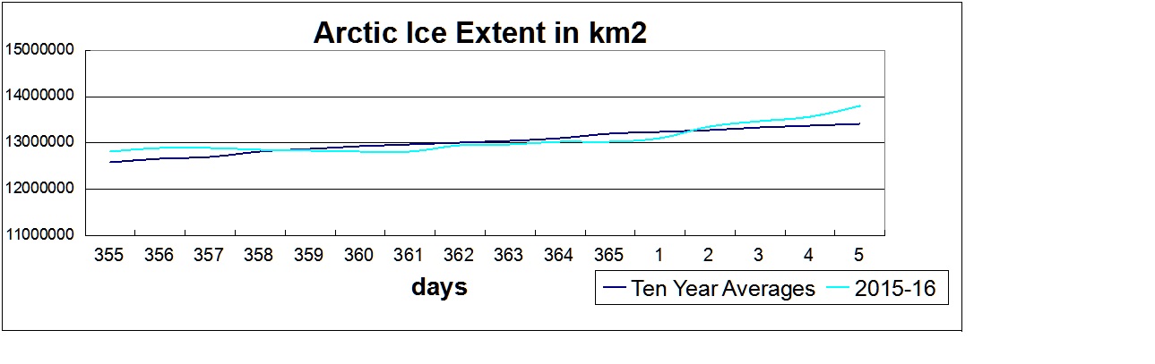
The MASIE record from NIC shows an average year in progress, with new highs occurring well above the 2015 maximum:

Meanwhile from NOAA’s Sea Ice Index (SII) dataset we get this:
The monthly average January 2016 sea ice extent was the lowest in the satellite record, 90,000 square kilometers (35,000 square miles) below the previous record low in 2011.

Why the Discrepancy between SII and MASIE?
The issue also concerns Walter Meier who is in charge of SII, and as a true scientist, he is looking to get the best measurements possible. He and several colleagues compared SII and MASIE and published their findings last October. The purpose of the analysis was stated thus:
Our comparison is not meant to be an extensive validation of either product, but to illustrate as guidance for future use how the two products behave in different regimes.
The Abstract says:
Passive microwave sensors have produced a 35 year record of sea-ice concentration variability and change. Operational analyses combine a variety of remote-sensing inputs and other sources via manual integration to create high-resolution, accurate charts of ice conditions in support of navigation and operational forecast models. One such product is the daily Multisensor Analyzed Sea Ice Extent (MASIE). The higher spatial resolution along with multiple input data and manual analysis potentially provide more precise mapping of the ice edge than passive microwave estimates. However, since MASIE is based on an operational product, estimates may be inconsistent over time due to variations in input data quality and availability. Comparisons indicate that MASIE shows higher Arctic-wide extent values throughout most of the year, largely because of the limitations of passive microwave sensors in some conditions (e.g. surface melt). However, during some parts of the year, MASIE tends to indicate less ice than estimated by passive microwave sensors. These comparisons yield a better understanding of operational and research sea-ice data products; this in turn has important implications for their use in climate and weather models.
http://www.igsoc.org/annals/56/69/a69a694.pdf
The whole document is informative and worth the read.
For instance MASIE is described thus:
Human analysis of all available input imagery, including visible/infrared, SAR, scatterometer and passive microwave, yields a daily map of sea-ice extent at a 4 km gridded resolution, with a 40% concentration threshold for the presence of sea ice. In other words, if a gridcell is judged by an analyst to have >40% of its area covered with ice, it is classified as ice; if a cell has <40% ice, it is classified as open water.
The fact that MASIE employs human judgment is discomforting to climatologists as a potential source of error, so Meier and others prefer that the analysis be done by computer algorithms. Yet, as we shall see, the computer programs are themselves human inventions and when applied uncritically by machines produce errors of their own.
The passive microwave sea-ice algorithms are capable of distinguishing three surface types (one water and two ice), and the standard algorithms are calibrated for thick first-year and multi-year ice (Cavalieri, 1994). When thin ice is present, the algorithms underestimate the concentration of new and thin ice, and when such ice is present in lower concentrations they may detect only open water. The underestimation of concentration and extent of thin-ice regions has been noted in several evaluation studies. . .Melt is another well-known cause of underestimation of sea ice by passive microwave sensors.
The paper by Meier et al. is a good analysis, as far as it goes. In this post I will show the gory details and bring the comparison up to date.
Detailed Comparison between SII and MASIE
Here is a graph comparing SII and MASIE over the last decade and in the last year:
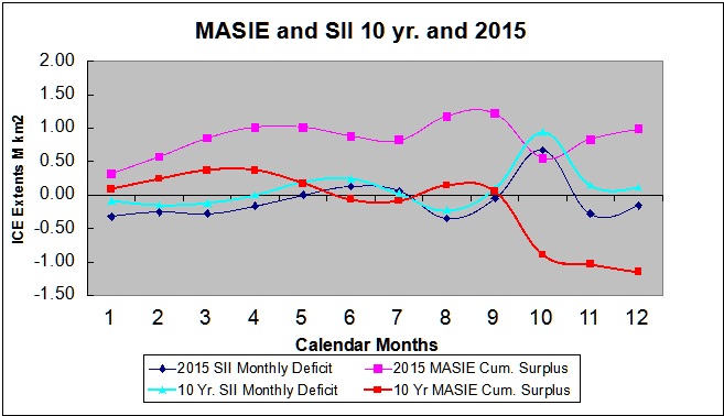
The green line shows the SII deficit to MASIE each month averaged over the last 10 years. The red line shows a cumulative surplus of ice reported by MASIE running through the 12 months, averaged over the last 10 years. Clearly, the graph shows SII underestimates ice extent most of the year, but by September the discrepancy is minimal. Then a huge surplus of ice is reported by SII each October, which results in SII reporting a higher annual extent than MASIE.
But look at what is happening recently.
The blue line shows the SII monthly deficit to MASIE in 2015, while the purple line shows the MASIE surplus during 2015. SII last year underestimated extents more than previously, and with a smaller correction in October, MASIE shows an annual surplus, the cumulative divergence for 2015 is about 2M km2 above the 10 year average.
And in 2016, SII results are increasingly untrustworthy. January 2016 is 450k km2 down, and February (so far) is 600k km2 less than MASIE.
Conclusions
It is unwise to rely on NOAA’s Sea Ice Index as a sole measurement of Arctic ice extent.
The October SII readings are unbelievable, and resemble an adjustment applied to bring the annual results into line.
The MASIE record is good enough for Walter Meier to analyze it with the objective of making SII closer to MASIE’s accuracy.

Addendum:
Here are the tables so you can see the numbers:
| 2006-2015 | 2006-2015 | 2006-2015 | 2006-2015 | MASIE Surplus |
| Averages | MASIE | SII | SII Deficit | |
| January | 13.87 | 13.78 | -0.09 | 0.09 |
| February | 14.79 | 14.63 | -0.15 | 0.25 |
| March | 15.01 | 14.89 | -0.12 | 0.37 |
| April | 14.31 | 14.31 | 0.00 | 0.37 |
| May | 12.77 | 12.96 | 0.19 | 0.17 |
| June | 10.95 | 11.19 | 0.24 | -0.07 |
| July | 8.40 | 8.42 | 0.02 | -0.08 |
| August | 6.07 | 5.84 | -0.23 | 0.14 |
| September | 4.79 | 4.88 | 0.09 | 0.05 |
| October | 6.74 | 7.69 | 0.94 | -0.89 |
| November | 9.98 | 10.12 | 0.15 | -1.04 |
| December | 12.24 | 12.35 | 0.11 | -1.15 |
| 12 month Ave. | 10.83 | 10.92 | -0.10 |
| 2015 | 2015 | 2015 | MASIE Surplus | |
| Averages | MASIE | SII | SIIDeficit | |
| January | 13.94 | 13.62 | -0.32 | 0.32 |
| February | 14.68 | 14.43 | -0.25 | 0.57 |
| March | 14.67 | 14.39 | -0.28 | 0.85 |
| April | 14.12 | 13.96 | -0.16 | 1.01 |
| May | 12.65 | 12.65 | 0.00 | 1.01 |
| June | 10.84 | 10.97 | 0.13 | 0.88 |
| July | 8.71 | 8.77 | 0.06 | 0.82 |
| August | 5.96 | 5.61 | -0.35 | 1.17 |
| September | 4.68 | 4.63 | -0.05 | 1.22 |
| October | 7.05 | 7.72 | 0.67 | 0.55 |
| November | 10.34 | 10.06 | -0.28 | 0.83 |
| December | 12.43 | 12.27 | -0.16 | 0.99 |
| 12 month Ave. | 10.84 | 10.757 | 0.08 |
| 2016 | 2016 | 2016 | |
| MASIE | SII | MASIE-SII | |
| January | 13.92 | 13.47 | 0.45 |
| February | 14.77 | 14.17 | 0.60 |


Your dataset is invaluable since it represents multiple sources, including satellite passive microwave sensors, and is more precise in defining ice edges. I have been following MASIE for years, and was pleased to see the dataset for the last ten years released in November 2015. This ice extent record based on navigational observations is a vital resource for comparisons, not only with the satellite measurements, but also with the longer-term history of ice charts from Russia, Denmark, Norway and Canada.
Thank you, and please keep up the excellent work.
Ron Clutz
Blogsite: Science Matters
https://rclutz.wordpress.com/category/arctic-sea-ice/
I received a nice reply and word that my message was forwarded to the team leader.
Any others wanting to see this dataset maintained might also want to communicate their interest.
“If you see something, Say something.”