Arctic Ice Marching 2019

A previous post discussed 15M km2 as the average maximum threshold for March arctic ice extents.The graph shows 2019 exceeded the previous two years, but now it appears to fall just short.  On day 61, March 2, 2016 peaked well above 15M, and did not reach that level again. The graph shows 2017 peaked early and then descended into the Spring melt.  2018 started much lower, gained steadily before peaking on day 74, 250k km2 below average. 2019 has been exceptional, surging early to surpass average on day 54, then declined for a week, before re-surging to virtually tie the average extent on day 70.  Day 71 extent matched the earlier peak, then retreated and is now unlikely to go higher after day 75.

Presently, on day 75 2019 is 1% below the 12 year average (2007 to 2018 inclusive) and slightly higher than the preceding three years.

As reported previously, the action is mostly in the Pacific basins.  The last 10 days show Bering on the right recovering from its minimum to add back 230k km2.  Meanwhile Okhotsk on the left lost 120k km2, so the combined gain was not enough for NH to reach the threshold.  On the Atlantic side, ice extents held firm, with Barents higher than in recent years.

Note on the left the ice has pushed well south of Newfoundland.  On the right Barents ice is holding onto Svalbard, and Kara remains at its maximum.

The table below shows the distribution of ice over the various Arctic basins compared to average and to last year.

Region 2019075 Day 075
Average
2019-Ave. 2018075 2019-2018
 (0) Northern_Hemisphere 14823898 14996207 -172310 14704038 119860
 (1) Beaufort_Sea 1070498 1070200 297 1070445 53
 (2) Chukchi_Sea 965766 966002 -236 966006 -240
 (3) East_Siberian_Sea 1087137 1087134 3 1087137 0
 (4) Laptev_Sea 897845 897842 3 897845 0
 (5) Kara_Sea 934746 917400 17346 934970 -224
 (6) Barents_Sea 777137 618675 158462 718542 58595
 (7) Greenland_Sea 549834 616633 -66799 533408 16426
 (8) Baffin_Bay_Gulf_of_St._Lawrence 1561378 1593403 -32025 1480294 81084
 (9) Canadian_Archipelago 853337 852783 555 853109 229
 (10) Hudson_Bay 1260903 1257469 3434 1260838 66
 (11) Central_Arctic 3235099 3218575 16524 3167361 67738
 (12) Bering_Sea 371625 802103 -430478 432417 -60791
 (13) Baltic_Sea 54792 82770 -27978 125618 -70826
 (14) Sea_of_Okhotsk 1194159 995230 198928 1159963 34196

The table shows that except for Bering, Arctic ice extents are firm almost everywhere.  Barents, Kara and Okhotsk are well above average, but not enough to offset the deficit of Bering ice, even with the recent recovery.

Typically, Arctic ice extent loses 67 to 70% of the March maximum by mid September, before recovering the ice in building toward the next March.

Drift ice in Okhotsk Sea at sunrise.


Overheating About Global Warming

Mar 13, 2019 Bjørn Lomborg writes about the overheated discourse that has children taking to the streets on the advice of adults who should know better.  Overheating About Global Warming was published today at Project Syndicate.  Excerpts in italics with my bolds and images.

Decades of climate-change exaggeration in the West have produced frightened children, febrile headlines, and unrealistic political promises. The world needs a cooler approach that addresses climate change smartly without scaring us needlessly and that pays heed to the many other challenges facing the planet.

Across the rich world, school students have walked out of classrooms and taken to the streets to call for action against climate change. They are inspired by 16-year-old Swedish activist Greta Thunberg, who blasts the media and political leaders for ignoring global warming and wants us to “panic.” A global day of action is planned for March 15.

Although the students’ passion is admirable, their focus is misguided. This is largely the fault of adults, who must take responsibility for frightening children unnecessarily about climate change. It is little wonder that kids are scared when grown-ups paint such a horrific picture of global warming.

For starters, leading politicians and much of the media have prioritized climate change over other issues facing the planet. Last September, United Nations Secretary-General António Guterres described climate change as a “direct existential threat” that may become a “runaway” problem. Just last month, The New York Times ran a front-page commentary on the issue with the headline “Time to Panic.” And some prominent politicians, as well as many activists, have taken the latest report from the United Nations Intergovernmental Panel on Climate Change (IPCC) to suggest the world will come to an end in just 12 years.

This normalization of extreme language reflects decades of climate-change alarmism. The most famous clip from Al Gore’s 2006 film An Inconvenient Truth showed how a 20-foot rise in sea level would flood Florida, New York, the Netherlands, Bangladesh, and Shanghai – omitting the fact that this was seven times worse than the worst-case scenario.

A separate report that year described how such alarmism “might even become secretly thrilling – effectively a form of ‘climate porn.’” And in 2007, The Washington Post reported that “for many children and young adults, global warming is the atomic bomb of today.”

When the language stops being scary, it gets ramped up again. British environmental campaigner George Monbiot, for example, has suggested that the term “climate change” is no longer adequate and should be replaced by “catastrophic climate breakdown.”

Educational materials often don’t help, either. One officially endorsed geography textbook in the United Kingdom suggests that global warming will be worse than famine, plague, or nuclear war, while Education Scotland has recommended The Day After Tomorrow as suitable for climate-change education. This is the film, remember, in which climate change leads to a global freeze and a 50-foot wall of water flooding New York, man-eating wolves escape from the zoo, and – spoiler alert – Queen Elizabeth II’s frozen helicopter falls from the sky.

Reality would sell far fewer newspapers. Yes, global warming is a problem, but it is nowhere near a catastrophe. The IPCC estimates that the total impact of global warming by the 2070s will be equivalent to an average loss of income of 0.2-2% – similar to one recession over the next half-century. The panel also says that climate change will have a “small” economic impact compared to changes in population, age, income, technology, relative prices, lifestyle, regulation, and governance.

And while media showcase the terrifying impacts of every hurricane, the IPCC finds that “globally, there is low confidence in attribution of changes in [hurricanes] to human influence.” What’s more, the number of hurricanes that make landfall in the United States has decreased, as has the number of strong hurricanes. Adjusted for population and wealth, hurricane costs show “no trend,” according to a new study published in Nature.

Another Nature study shows that although climate change will increase hurricane damage, greater wealth will make us even more resilient. Today, hurricanes cost the world 0.04% of GDP, but in 2100, even with global warming, they will cost half as much, or 0.02% of GDP. And, contrary to breathless media reports, the relative global cost of all extreme weather since 1990 has been declining, not increasing.

Perhaps even more astoundingly, the number of people dying each year from weather-related catastrophes has plummeted 95% over the past century, from almost a half-million to under 20,000 today – while the world’s population has quadrupled.

My Mind is Made Up, Don’t Confuse Me with the Facts. H/T Bjorn Lomborg, WUWT

Meanwhile, decades of fearmongering have gotten us almost nowhere. What they have done is prompt grand political gestures, such as the unrealistic cuts in carbon dioxide emissions that almost every country has promised under the 2015 Paris climate agreement. In total, these cuts will cost $1-2 trillion per year. But the sum total of all these promises is less than 1% of what is needed, and recent analysis shows that very few countries are actually meeting their commitments.

In this regard, the young protesters have a point: the world is failing to solve climate change. But the policy being pushed – even bigger promises of faster carbon cuts – will also fail, because green energy still isn’t ready. Solar and wind currently provide less than 1% of the world’s energy, and already require subsidies of $129 billion per year. The world must invest more in green-energy research and development eventually to bring the prices of renewables below those of fossil fuels, so that everyone will switch.

And although media reports describe the youth climate protests as “global,” they have taken place almost exclusively in wealthy countries that have overcome more pressing issues of survival. A truly global poll shows that climate change is people’s lowest priority, far behind health, education, and jobs.

In the Western world, decades of climate-change exaggeration have produced frightened children, febrile headlines, and grand political promises that aren’t being delivered. We need a calmer approach that addresses climate change without scaring us needlessly and that pays heed to the many other challenges facing the planet.

Bjørn Lomborg, a visiting professor at the Copenhagen Business School, is Director of the Copenhagen Consensus Center. His books include The Skeptical Environmentalist, Cool It, How to Spend $75 Billion to Make the World a Better Place, The Nobel Laureates’ Guide to the Smartest Targets for the World, and, most recently, Prioritizing Development. In 2004, he was named one of Time magazine’s 100 most influential people for his research on the smartest ways to help the world.

Arctic Ice High Jump March 2019

For ice extent in the Arctic, the bar is set at 15M km2. The average in the last 12 years occurs on day 62 at 15.07M before descending. Most years are able to clear 15M, but in the five previous years only 2014 and 2016 ice extents cleared the bar at 15M km2; the others came up short.

On day 61, March 2, 2016 peaked well above 15M, and did not reach that level again. The graph shows 2017 peaked early and then descended into the Spring melt.  2018 started much lower, gained steadily before peaking on day 74, 250k km2 below average. 2019 has been exceptional, surging early to surpass average on day 54, then declined for a week, before re-surging to virtually tie the average extent on day 70.  One final push in the next few days could go over the top.

As reported previously, Bering Sea is a big part of the story this year.  The graph above shows NH ice extents from mid-February to mid-March with and without Bering ice.  The gap between black and green lines shows that Bering contributed about 700k km2 to the NH average, increasing to 800k km2 by the end of this period.  However, 2019 started with about 500k km2 from Bering.  The gap between the cyan and purple lines shows Bering ice declined down to 140k km2, before adding back 100k km2 in the last 3 days. Meanwhile, Okhotsk Sea next door gained steadily and is now holding above average ice extents.  Except for Bering, 2019 ice extents are well above the 12 year average (2007 to 2018 inclusive).

Typically, Arctic ice extent loses 67 to 70% of the March maximum by mid September, before recovering the ice in building toward the next March.

What will the ice do this year?  Where will 2019 rank in the annual Arctic Ice High Jump competition?

Drift ice in Okhotsk Sea at sunrise.


February Land and Sea Mixed Cooling

banner-blog

With apologies to Paul Revere, this post is on the lookout for cooler weather with an eye on both the Land and the Sea.  UAH has updated their tlt (temperatures in lower troposphere) dataset for January.   Previously I have done posts on their reading of ocean air temps as a prelude to updated records from HADSST3. This month I will add a separate graph of land air temps because the comparisons and contrasts are interesting as we contemplate possible cooling in coming months and years.

Presently sea surface temperatures (SST) are the best available indicator of heat content gained or lost from earth’s climate system.  Enthalpy is the thermodynamic term for total heat content in a system, and humidity differences in air parcels affect enthalpy.  Measuring water temperature directly avoids distorted impressions from air measurements.  In addition, ocean covers 71% of the planet surface and thus dominates surface temperature estimates.  Eventually we will likely have reliable means of recording water temperatures at depth.

Recently, Dr. Ole Humlum reported from his research that air temperatures lag 2-3 months behind changes in SST.  He also observed that changes in CO2 atmospheric concentrations lag behind SST by 11-12 months.  This latter point is addressed in a previous post Who to Blame for Rising CO2?

The February update to HadSST3 will appear later this month, but in the meantime we can look at lower troposphere temperatures (TLT) from UAHv6 which are already posted for February. The temperature record is derived from microwave sounding units (MSU) on board satellites like the one pictured above.

The UAH dataset includes temperature results for air above the oceans, and thus should be most comparable to the SSTs. There is the additional feature that ocean air temps avoid Urban Heat Islands (UHI).  The graph below shows monthly anomalies for ocean temps since January 2015.

The anomalies over the entire ocean dropped to the same value, 0.12C  in August (Tropics were 0.13C).  Warming in previous months was erased, and September added very little warming back. In October and November NH and the Tropics rose, joined by SH.  In December 2018 all regions cooled resulting in a global drop of nearly 0.1C. The upward bump in January in SH was reversed in February.  Despite some warming in both NH and the Tropics, the Global anomaly cooled. The trajectory is not yet set, but soon we will see if the long-expected El Nino appears in NH and Tropics SSTs.

Land Air Temperatures Tracking Downward in Seesaw Pattern

We sometimes overlook that in climate temperature records, while the oceans are measured directly with SSTs, land temps are measured only indirectly.  The land temperature records at surface stations record air temps at 2 meters above ground.  UAH gives tlt anomalies for air over land separately from ocean air temps.  The graph updated for February is below.

The greater volatility of the Land temperatures was evident earlier, but has calmed down recently. Also the  NH dominates, having twice as much land area as SH.  Note how global peaks mirror NH peaks.  In December air over Tropics fell sharply, SH slightly, while the NH land surfaces rose, pulling up the Global anomaly for the month.  In January  both NH and SH cooled slightly, pulling the Global anomaly down despite some Tropical warming. Then in February, air temps over both NH and SH land rose, pulling the Global anomaly slightly upward to match 12/2018.

TLTs include mixing above the oceans and probably some influence from nearby more volatile land temps.  Clearly NH and Global land temps have been dropping in a seesaw pattern, now more than 1C lower than the peak in 2016.  TLT measures started the recent cooling later than SSTs from HadSST3, but are now showing the same pattern.  It seems obvious that despite the three El Ninos, their warming has not persisted, and without them it would probably have cooled since 1995.  Of course, the future has not yet been written.


Bering Ice Lost and Found

2019/03/06 GCOM-W/AMSR2 [Okhotsk] Sea Ice Concentration Source: JAXA. Note Hokkaido Island, Japan, under the white triangle tip.

This week has news reports frightened about the early melting of ice in Bering Sea.  This post is to reassure everyone that the lost ice has been found, most of it just next door in Okhotsk sea.

The Pacific basins of Bering and Okhotsk display opposing ice patterns this year.

The last two weeks saw open water growing on the right in Bering Sea, now down to 140k km2, one-fourth of its maximum extent.  Meanwhile, Okhotsk on the left grew steadily, now pressing down on Hokkaido Island, producing the southernmost Arctic Ice to be found. The graph below shows how 2019 compares to the 12 year average, after taking the Bering anomaly out of the picture.

The chart runs from mid-February to mid-March, showing how 2019 NH ice extent peaked above average on day 54, declined for a week, then rose again recently.  The effect of Bering ice loss appears in the gaps between NH extents with and without Bering ice.  Note that the black and green lines show Bering has contributed about 700k km2 to the overall total, and that increases to 800k km2 by day 76.

2019 NH included about 500k km2 from Bering on day 32, but the Bering extent has steadily decreased, now only 140k km2.  Thus 2019 w/o Bering is 270k km2 greater than NH average w/o Bering at this time, with another 10 days or so for additional ice to form.

The table below shows ice extents in the various basins on day 64.

Region 2019064 Day 064 
Average
2019-Ave. 2018064 2019-2018
 (0) Northern_Hemisphere 14706623 15022070 -315447 14461393 245231
 (1) Beaufort_Sea 1070498 1070200 297 1070445 53
 (2) Chukchi_Sea 943452 965931 -22479 965161 -21709
 (3) East_Siberian_Sea 1087137 1087133 4 1087120 18
 (4) Laptev_Sea 897845 897842 3 897845 0
 (5) Kara_Sea 934558 927864 6694 934055 503
 (6) Barents_Sea 781551 642119 139431 598121 183430
 (7) Greenland_Sea 553335 639443 -86108 548263 5072
 (8) Baffin_Bay_Gulf_of_St._Lawrence 1575867 1538064 37803 1610374 -34507
 (9) Canadian_Archipelago 853337 853037 300 853109 229
 (10) Hudson_Bay 1260903 1259978 925 1260838 66
 (11) Central_Arctic 3246782 3218361 28421 3150790 95993
 (12) Bering_Sea 140439 716013 -575574 286010 -145571
 (13) Baltic_Sea 64749 106825 -42077 166155 -101407
 (14) Sea_of_Okhotsk 1285797 1063174 222622 1008051 277746

The Bering deficit is 575k km2 or just 20% of the 12 year average.  Surpluses in Okhotsk, Baffin, Central Arctic and Barents do not completely offset, so the NH total is 315k km2 or 2% below average.

Taking a boat trip from Hokkaido Island to see Okhotsk drift ice is a big tourist attraction, as seen in the short video below.  Al Gore had them worried back then, but not now.

Drift ice in Okhotsk Sea at sunrise.

Weather is Not Climate (again): Marine Heat Waves

Currently, the fashion is to prove global warming/climate change by pointing to “extreme” weather events. This week we have a new candidate for alarms: Marine Heat Waves. For example:

Suffering in the heat—the rise in marine heatwaves is harming ocean species Phys.org08:40

Marine heat waves threaten fish, corals SBS00:28

Ocean heat waves remake Pacific and Caribbean habitats Ars Technica06:56

Study: More Marine Heat Waves Threaten Fish, Corals Voice of America20:55 Mon, 04 Mar

More marine heatwaves threaten fish and corals — study Gulf Times16:55 Mon, 04 Mar

Ocean Heat Waves Are Threatening Marine Life The New York Times13:55 Mon, 04 Mar

Background

Variation in sea surface temperatures is not new. Cliff Mass of U. Washington, Seattle, educated us some years ago regarding a persistent patch of N. Pacific warm water he named: “The BLOB.” A series of posts at his blog covered this event starting in Autumn 2013, waxing and waning until finally disappearing in 2018. Most informative is The Blob Strengthens Excerpts in italics with my bolds.

The original BLOB, named by Washington State Climatologist Nick Bond, formed the previous winter (2013-2014). The BLOB was defined as a persistent region of anomalously warm water in the northeast Pacific. With the air reaching the Northwest generally passing over the BLOB, the result was warmer than normal temperatures.

And by the first week of this month, the BLOB seems to have returned, and with it, its evil twin, El Nino, indicated by the warm waters in the eastern tropical Pacific. Now we have a problem. Note that the temperatures in the BLOB are 2-3 C (roughly 4-5F) above normal.

The effects of the BLOB have become more than a little evident to everyone living in our region. Temperatures are way above normal because of the warming effects of the ocean…it is hard for our minimum temperatures to fall much below the ocean temperatures this time of the year. Want to see evidence of this? Here are the surface air temperatures at Seattle Tacoma Airport for the last 4 weeks, with the average highs and lows shown. We have been warmer than normal, with minimum temperatures consistently 3-4F above normal.

The BLOB itself is not an independent player. It has been forced by an anomalous atmospheric circulation, including anomalous high pressure (ridging) centered north of our region (see map showing the height (pressure) anomalies (difference from normal) at 500 hPa (about 18,000ft) for the last 30 days. Yellow indicates higher heights than normal.

An article from that time (2016) at Climate Central took mainly the alarmist view, but also quoted a reasonable statement from Cliff Mass. California Drought, Marine Heat More Likely With Warming

“The atmospheric variability that forced the warm blob is the same that forced the drought,” said Emanuele Di Lorenzo, an ocean and climate dynamics professor at Georgia Tech who coauthored the analysis, published in Nature Climate Change. “This atmospheric variability is increasing under greenhouse gases.”

The new findings could help scientists predict when similar marine heatwaves and droughts will strike in the future. They also suggest such heatwaves will become more common and intense, which could mean greater drought risks in the West. (By increasing evaporation and reducing snowfall, warmer temperatures are already making Western droughts worse.)

“This could potentially provide predictability,” said Cliff Mass, a University of Washington atmospheric sciences professor who wasn’t involved with the research. “This is natural variability that we’re dealing with.”

What Are “Marine Heat Waves?” (From Marine Heat Waves.org)

We use a recently developed definition of marine heatwaves (Hobday et al. 2016). A marine heatwave is defined a when seawater temperatures exceed a seasonally-varying threshold (usually the 90th percentile) for at least 5 consecutive days. Successive heatwaves with gaps of 2 days or less are considered part of the same event.

Marine heatwaves can be caused by a whole range of factors, and not all factors are important for each event. The most common drivers of marine heatwaves include ocean currents which can build up areas of warm water and air-sea heat flux, or warming through the ocean surface from the atmosphere. Winds can enhance or suppress the warming in a marine heatwave, and climate modes like El Niño can change the likelihood of events occurring in certain regions.

[Note: the phrase about the atmosphere warming the ocean is misleading. The ocean has 1000 times the heat capacity of the air, and the heat transfer is upward. From Columbia U. on the Ocean/Atmosphere Heat Flux:

Solar heating of the ocean on a global average is 168 watts per square meter

Net infrared radiation cools the ocean, on a global average by 66 watts per square meter.

On global average the oceanic heat loss by conduction is only 24 watts per square meter. (If the ocean were colder than the atmosphere (which of course happens) the air in contact with the ocean cools, becoming denser and hence more stable, more stratified. As such the conduction process does a poor job of carrying the atmosphere heat into the cool ocean.)

On global average the heat loss by evaporation is 78 watts per square meter. (The largest heat loss for the ocean is due to evaporation, which links heat exchange with hydrological cycle.) ]

The trigger for the current concern is Marine heatwaves threaten global biodiversity and the provision of ecosystem services published March 4, 2019 at Nature Climate Change. Dan A. Smale is lead author with 17 co-authors. The media were quick to misinterpret the study and claim a link to burning of fossil fuels.  Excerpts in italics with my bolds.

Abstract: The global ocean has warmed substantially over the past century, with far-reaching implications for marine ecosystems. Concurrent with long-term persistent warming, discrete periods of extreme regional ocean warming (marine heatwaves, MHWs) have increased in frequency. Here we quantify trends and attributes of MHWs across all ocean basins and examine their biological impacts from species to ecosystems. Multiple regions in the Pacific, Atlantic and Indian Oceans are particularly vulnerable to MHW intensification, due to the co-existence of high levels of biodiversity, a prevalence of species found at their warm range edges or concurrent non-climatic human impacts. The physical attributes of prominent MHWs varied considerably, but all had deleterious impacts across a range of biological processes and taxa, including critical foundation species (corals, seagrasses and kelps). MHWs, which will probably intensify with anthropogenic climate change, are rapidly emerging as forceful agents of disturbance with the capacity to restructure entire ecosystems and disrupt the provision of ecological goods and services in coming decades.

My Comments

The authors managed to produce an hockey stick graph by means of attaching an high-resolution instrumental record to low-resolution proxy estimates of the past. The method is described in the paper:

Global time series and regional trends in total MHW days were derived using a combination of satellite-based, remotely sensed SSTs and in situ-based seawater temperatures. First, total MHW days were calculated globally over 1982–2015 at 1/4° resolution from the National Oceanic and Atmospheric Administration (NOAA) Optimum Interpolation SST V2 high-resolution data. Then, proxies for total MHW days globally over 1900–2016 were developed on the basis of five monthly gridded SST datasets (HadISST v.1.1, ERSST v.5, COBE 2, CERA-20C and SODA si.3). A final proxy time series was calculated by averaging across the five datasets. The five monthly datasets were used since no global daily SST observations are available before 1982.

The three peaks in the modern record are clearly the result of the major El Ninos 1997, 2009 and 2015. And it is likely that mining the daily satellite records since 1982 identified marine heat waves that would not show up in the proxy monthly datasets.

Conclusion

This is another example of a natural process that threatens our livelihoods but which we struggle to predict and to adapt. As with other short-term weather events, humankind has a great stake in better understanding in order to forecast, prepare and manage adapations as required. There have always been major variations in warming and cooling sea surface temperatures. And yet the Global average anomalies vary by a few tenths of a degree celsius, with significant difference in the two hemispheres. This implies both that marine heat waves are offset by cold waves elsewhere, and that the well-mixed CO2 molecules are not to blame.

See Also: On Climate “Signal” and Weather “Noise”

Empirical Evidence: Oceans Make Climate

Pacific Ice Seesaw Feb. 2019


10 Days in Pacific Arctic:
The above image shows the pacific ice seesaw returning at the end of February.  Bering Sea on the right was at 95% of 2018 maximum and then lost  180k km2 in ten days, now at 65 % of max.  Meanwhile on the left Okhotsk Sea gained 70k km2, and is now 106% of 2018 maximum.

The graph below shows February progress in ice extent recovery.As noted before, the month started with a slight decline, then ice grew rapidly for 18 days peaking on day 54 above the 12 yr. average, and above the previous two years.  Then ice retreated the last five days with the February monthly average ending  240k km2 or 2% below average. SII lags MASIE by ~100k km2 for the month.

The next two weeks will show whether 2019 is maxed out, or whether the ice extent catches up to the average which flatlines over that period.

The table below shows the distribution of ice in the various Arctic basins.

Region 2019059 Day 059 
Average
2019-Ave. 2018059 2019-2018
 (0) Northern_Hemisphere 14625288 15006867 -381579 14485052 140236
 (1) Beaufort_Sea 1070498 1070200 297 1070445 53
 (2) Chukchi_Sea 960221 965872 -5651 965971 -5750
 (3) East_Siberian_Sea 1087137 1087133 4 1087120 18
 (4) Laptev_Sea 897845 897842 3 897845 0
 (5) Kara_Sea 931672 929289 2383 922905 8767
 (6) Barents_Sea 684894 625620 59274 544938 139956
 (7) Greenland_Sea 513404 628938 -115534 473064 40340
 (8) Baffin_Bay_Gulf_of_St._Lawrence 1570308 1539346 30962 1786606 -216298
 (9) Canadian_Archipelago 853337 853036 302 853109 229
 (10) Hudson_Bay 1260903 1260611 293 1260838 66
 (11) Central_Arctic 3231172 3213214 17958 3065181 165991
 (12) Bering_Sea 250169 710647 -460479 336065 -85896
 (13) Baltic_Sea 39687 110466 -70780 123280 -83594
 (14) Sea_of_Okhotsk 1260392 1067746 192646 1069898 190494

The table shows how 2019 is matching the 12-year average almost everywhere.  Barents Sea has caught up and edged ahead of average, and much higher than last year.  Greenland Sea is below average but higher than 2018.  The overall deficit is due to Bering ice down 460k km2 to average, only partially offset by a surplus of 193k km2 in Okhotsk.

cg524a47d218458

Footnote:  At his AER blog  Arctic Oscillation and Polar Vortex Analysis and Forecasts Dr. Judah Cohen writes on Feb. 25 regarding this cold winter in the Arctic. Excerpts in italics with my bolds.

As I have written many times in the blog this fall and winter season the influence of a significant stratospheric PV disruption typically lasts on the order of four to eight weeks. It certainly looks like the PV split from early January has gone the distance and has persisted for a full eight weeks or possibly even a little longer. Based on the latest polar cap geopotential heights (PCHs) forecast the whole event is winding down over the next week or so. Therefore, I think that we can start to draft the obituary for this event.

The stratosphere-troposphere coupling differed from last year’s PV split and other previous similar events but certainly not all. Though the “dripping” of warm PCHs occurred periodically, there were long gaps between “drips” where the tropospheric PCHs even turned cold for an appreciable period. Also, the AO and NAO never turned strongly negative nor was there any persistent period where both indices remained in negative territory. This is in strong contrast to last winter. As I wrote in last week’s blog, I think at least part of the reason might be the relatively cold central Arctic this winter compared with the last several winters where the Arctic was near or at record warm.

Though despite what could be considered atypical or less traditional stratosphere-troposphere coupling following the stratospheric PV split, I would argue there were still some impressive impacts on the weather. Maybe those impacts were more discernable and more impressive across North America than Eurasia, but both continents had record cold and snow.

So, what to expect as the stratosphere-troposphere coupling event wraps up. For Europe, temperatures are already mild and with the AO predicted to remain positive and could potentially turn even more strongly positive if the cold PCHs couple all the way to the surface, it is hard for me to see a return to any kind of prolonged cold this month. Across North America it is more complicated. Cold temperatures are predicted to be expansive across the continent and even record cold is possible over the next week or so. In addition, snow cover is relatively extensive and, in many locations, unusually deep especially on either side of the US-Canadian border. I don’t expect the cold air across in North America to simply disappear anytime soon, but if the if the cold PCHs couple all the way to the surface, this would favor the cold temperatures being mostly confined to western North America. I also feel that circulation and temperature anomalies in the stratosphere suggest a relatively cold western North America and relatively mild eastern North America especially Eastern US. And despite the cold start to March in the Eastern US the models are predicting a return to mild conditions by the middle of March.


On Sea Ice Thickness

ice Charts from AARI showing ice extents by duration. Appearing in brown is Multi-year ice (surviving at least one melt season).

At the recent post Arctic Ice Surpasses 2018 Maximum, I was asked about measures of sea ice thickness and estimates of volume, combining extents (or concentrations) with thickness.  My response:

Agencies like DMI produce model-driven estimates of Arctic sea ice thickness. I limit my analysis to extents because they are observation-driven.

DMI says this:  “The figures are based on calculations using the DMI operational coupled ocean- and sea-ice model HYCOM-CICE. The total sea-ice volume is a product of the sea-ice concentration and its thickness.”

“Today, the sea-ice concentration is in general well estimated using satellite products, while the sea-ice thickness is poorly known. The model gives a realistic estimate of the total amount of sea-ice within the Arctic.” (concentration means extent). FWIW, DMI estimates of Arctic thickness have increased over the last decade.

It’s a complicated business to get remote signals of thickness, which varies with drifting and compaction from storms and currents.  Another way to get at the issue appears in the animation above with AARI ice charts.  They are derived from satellite imagery, configured so that the brown color represents multi-year ice that survived at least one melt season.   The animation shows the last 11 years had some low years, especially 2008, 2009 and 2013, with higher years since.  And obviously the locations of older ice are variable.

Of course there are other sea ice volume modelled products such PIOMAS.  For an insight into how complicated is estimating sea ice thickness from remote sensors see this article Estimating Arctic sea ice thickness and volume using CryoSat-2 radar altimeter data

Arctic Ice Surpasses 2018 Maximum

Atlan2019036to051
Sea Ice Extends on the Atlantic Side: 
The animation above shows the last two weeks on the Atlantic side, with Kara achieving its annual maximum and Barents growing ice up to 86% of its max last March. In the upper right the ice solidifies down to Svalbard and fast ice forms along the mainland.  On the left, Baffin ice thickens along the Labrador coast and  a large mass forms along Newfoundland. The Gulf of St. Lawrence is nearly iced over.  Below is the ice recovery on the Pacific side.

BerOk2019036to051

Bering on the right retreats and then recovers to stay at 95% of its 2018 maximum.  Meanwhile Okhotsk on the left shows a surge of sea ice, gaining almost 400k km2 over these two weeks.  Bering is well below the 12 year average, while Okhotsk has already passed its 2018 maximum and is 22% above the 12 year average.

The graph below shows February progress in ice extent recovery.
ArcticIce2019051

2019 ice extents declined slightly to start the month, then grew rapidly in the last two weeks to nearly match the 12-year average (2007 to 2018 inclusive).  SII lags MASIE by 100k km2 at this date. 2019 is presently matching 2017, and has nearly 500k km2 more ice than 2018.

Interestingly, 2019 extent has already surpassed 14.75 M km2, the 2018 maximum reached on day 74.  Note in the graph that 2017 peaks on day 53, the maximum extent that year.  The average maximum is 15.07 M km2 on day 62, so 2019 has 11 days more to reach that level.

The table below shows the distribution of ice in the various Arctic basins.

Region 2019051 Day 051 
Average
2019-Ave. 2018051 2019-2018
 (0) Northern_Hemisphere 14785938 14847524 -61587 14303929 482009
 (1) Beaufort_Sea 1070498 1070200 297 1070445 53
 (2) Chukchi_Sea 965972 964755 1217 955104 10868
 (3) East_Siberian_Sea 1087137 1087133 4 1087120 18
 (4) Laptev_Sea 897845 897842 3 897845 0
 (5) Kara_Sea 934970 920340 14629 917650 17319
 (6) Barents_Sea 685511 606250 79261 537870 147642
 (7) Greenland_Sea 564543 619655 -55112 440813 123730
 (8) Baffin_Bay_Gulf_of_St._Lawrence 1527391 1487134 40257 1731868 -204477
 (9) Canadian_Archipelago 853337 853036 302 853109 229
 (10) Hudson_Bay 1260903 1260717 186 1260838 66
 (11) Central_Arctic 3239858 3210652 29205 3154998 84860
 (12) Bering_Sea 428805 724586 -295781 211528 217277
 (13) Baltic_Sea 54788 107524 -52735 85965 -31177
 (14) Sea_of_Okhotsk 1194028 977205 216823 1059514 134514

The table shows how 2019 is matching the 12-year average almost everywhere.  Barents has edged 13% ahead of average, and is much higher than last year.  The slight overall deficit is mainly due to Bering ice down nearly 300k km2 to average, only partly offset by the surplus in Okhotsk and Central Arctic.

cg524a47d218458

Footnote:  At his AER blog  Arctic Oscillation and Polar Vortex Analysis and Forecasts Dr. Judah Cohen writes on February 18 regarding this cold winter in the Arctic and NH.  Excerpts in italics with my bolds.

screen-shot-2019-02-18-at-1.21.38-pm

Figure ii. Analysis of surface temperature anomalies ffrom 18 November 2018 until 15 February 2019. Taken from https://www.esrl.noaa.gov/psd/map/clim/glbcir_rnl.shtml.

This winter once again we had what I would refer to as a highly anomalous stratospheric PV split but not as extreme as 2009 and the temperature anomalies for the winter, or certainly post the PV split are probably not going to look that terribly different from 2009. The largest negative departures are likely to be in western North America and Siberia. I will show the winter temperature anomalies with the AER forecast posted in November and from the dynamical models but for today’s blog a quick and dirty surface temperature plot from NOAA will do (Figure ii). The most striking temperature anomalies are what I would consider as a couplet – strong positive temperature anomalies in the Barents-Kara Seas and strong negative temperature anomalies in Siberia. This temperature couplet has been the most consistent feature of Northern Hemisphere winters of probably the past 15-20 years. This gets to the heart of the debate does Arctic change influence mid-latitude weather. I think I have been as emphatic as anybody on the planet that the answer is yes, and this winter will only strengthen my conviction. The other continental region that is likely to have negative departures is Canada and since the PV spit the largest negative departures are centered in Western Canada.

figureiii_02182019

Since November, I have consistently stated that the largest sea ice anomalies and consequently the largest positive atmospheric temperature anomalies will be in the Barents-Kara Seas. I have also discussed how surprising I find it how cold the remainder of the Arctic has been this winter. As an example, I show in Figure iii the global temperature anomalies from yesterday February 17th the https://climatereanalyzer.org/. The Arctic positive temperature departure is 0.9°C equal to the NH and global temperature departure. This is a far cry from recent winters when the Arctic has warmed at a rate six times the rate of the remainder of the globe. Ironically the globe is currently experiencing Antarctic amplification and not Arctic amplification contrary to expectations.

My thoughts about March haven’t changed much since last week. The stratosphere has worked well as a predictor of North American temperature anomalies and for the most part they seem to support a continuation of cold temperatures focused in western North America. Despite this it is my own experience that cold air focused in western North America tends to shift east with time especially in the late winter. Therefore, based on this empirical observation I was expecting possibly a return to more sustained cold in the eastern US as winter winds down. This is now being predicted by both the GFS and ECMWF models. It is my experience that models may be too quick to predict a pattern change but they are often correct in anticipating the pattern change. But even assuming the eastern US turns colder, will it persist for more than just a few days? My confidence in such an outcome would increase if the Arctic finally warms something that has not really happened so far this winter.


Cold Waves and CO2

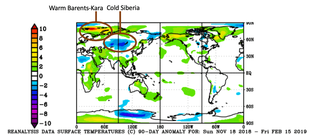
To put this year’s winter cold into perspective, there is an informative article by Jon Erdman at weather.com America’s Coldest Outbreaks January 17 2018 Excerpts with my bolds and showing CO2 concentrations at the referenced dates. Note  that temperatures are in degrees Fahrenheit.

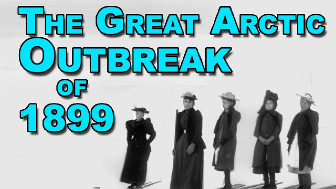
The Clear Number 1  February 1899: Atmospheric CO2 295 ppm.
The cold wave during the first two weeks of February 1899 is by far and away the gold standard for cold outbreaks in U.S. history.

What made this outbreak worthy of its lofty status was the magnitude, areal coverage and longevity of the cold.

For the first and only time on record, every state in the Union (recall, there were only 45 states at the time) dipped below zero. Subzero cold invaded parts of south-central Texas, the Gulf Coast beaches and northwest Florida.

Tallahassee, Florida, dipped to -2 degrees on Feb. 13, 1899, the only subzero low in the city’s history. This remains the all-time record low for the Sunshine State.

All-time record lows were set in a dozen states, from the Plains to the Ohio Valley, Southeast and District of Columbia. In addition to Florida, state record lows in Louisiana (-16 in Minden), Nebraska (-47 in Camp Clarke) and Ohio (-39 in Milligan) still stand today.

Dozens of cities still hold onto their all-time record low from this cold wave, including Atlanta (-9), Grand Rapids, Michigan (-24), and Wichita, Kansas (-22). Temperatures as frigid as -61 degrees (Montana), -59 degrees (Minnesota) and -50 degrees (Wisconsin) were recorded.

The Mississippi River froze solid north of Cairo, Illinois, and ice not only clogged the river in New Orleans, but also flowed into the Gulf of Mexico a few days after the heart of the cold outbreak.

Ice jams triggered floods along parts of the Ohio, Tennessee, Cumberland and James Rivers. Ice skating was the activity of choice as the San Antonio River froze.

Lacking snow cover, the ground froze to a depth of 5 feet in Chicago, damaging water, gas and other pipes.

New York City engineers found trusses on the Brooklyn Bridge had contracted 14 feet due to the cold, according to Extreme American Weather, by Tim Vasquez. Due to frozen aqueducts from Catskills reservoirs, the city of Newark was forced to draw water from other rivers and bays.

Adding insult to injury, a massive snowstorm punctuated the cold outbreak from the Gulf Coast to New England Feb. 11-14.

Cape May, New Jersey, picked up 34 inches of snow, the nation’s capital was buried by 21 inches and 15.5 inches fell in New York City, overwhelming city crews and isolating suburbs.

In Florida, snow fell in Fort Myers, Tampa saw measurable snow for one of only two times in its history, and Jacksonville picked up 1.9 inches of snow. New Orleans was blanketed by 3 inches of snow.

Here are some other notable cold outbreaks since the massive 1899 outbreak.

Winter 2013-2014 Atmospheric CO2 399 ppm

Ice builds up along Lake Michigan as temperatures dipped well below zero on January 6, 2014 in Chicago, Illinois. Chicago hit a record low of -16 degree Fahrenheit as an arctic air mass brought the coldest temperatures in about two decades into the city.
(Scott Olson/Getty Images)

– December 2013 – February 2014 was among the top 10 coldest such periods on record in seven Midwest states.

– An early January 2014 outbreak brought the coldest temperatures of the 21st century, to date, for some cities.

– The winter was among the top five snowiest on record in at least 10 major cities.

Late January-Early February 1996 Atmospheric CO2 363 ppm

– Minnesota state record: -60 degrees near Tower on Feb. 2, 1996. WCCO radio’s Mike Lynch broadcasted live from Tower that morning, during which he blew soap bubbles which then froze on the ground as a crowd watched.

– All Minnesota public schools shut down.

– Fears of natural gas shortage in northern Illinois prompted requests to reduce consumption.

Mid-Late January 1994 Atmospheric CO2 359 ppm
– 14 cities set all-time record lows, including Indianapolis (-27), Cleveland (-20) and Harrisburg, Pennsylvania (-22). Pittsburgh (-22) beat its previous all-time record set during the February 1899 outbreak.

– Both Pittsburgh (52 hours) and Cleveland (56 hours) set their record stretch of subzero cold.

– Indiana state record low set: -36 degrees at New Whiteland on Jan. 19

– 35 counties in Ohio plunged to -30 degrees or colder on Jan. 19.

– Worcester, Massachusetts, had seven straight days with subzero lows, a record stretch.

– Crown Point, New York, dipped to -48 degrees on Jan. 27.

– Coldest month on record in Caribou, Maine, with an average temperature of -0.7 degrees.

December 1990 Atmospheric CO2 356 ppm
– Most destructive freeze in California since 1949. Fifty percent of California’s citrus crop damaged.

– Record 18-day freeze streak in Salt Lake City

– 2,000 children stranded in Seattle schools due to heavy snow on Dec. 18

– Randolph, Utah, bottomed out at -45 degrees on Dec. 22.

December 1989 Atmospheric CO2 354 ppm
– All-time record lows in Kansas City (-23), Topeka, Kansas (-26), Lake Charles, Louisiana (-4), and Wilmington, North Carolina (0).

– First Christmas Day snow (trace) on record in Tallahassee. Miami had a rare freeze while Key West dipped to 44 degrees.

– 14 inches of snow fall at Myrtle Beach, South Carolina, on Christmas Eve.

– At the time, it was the fourth coldest December on record for the entire U.S.

President Reagan Inauguration – Jan. 1985 Atmospheric CO2 346 ppm
Due to the cold, President Ronald Reagan takes the oath of office for his second term as President in the Capitol Rotunda on Jan. 21, 1985.

– 13.2 inches of snow in San Antonio, Texas (Jan. 12), crushed the previous 24-hour snow record, there. Austin and Houston (3 inches each) also were blanketed by this snowstorm.

– All-time record lows were set in Chicago (-27), Jacksonville, Florida (7), and Macon, Georgia (-6)

– State record lows were set in Virginia (-30 at Mountain Lake) and North Carolina (-34 atop Mt. Mitchell).

– $1.2 billion in damage to Florida’s citrus crop

– Ronald Reagan’s second inauguration was the coldest Inauguration Day on record (7 degrees). The ceremony was moved indoors and parade cancelled.

Late December 1983 Atmospheric CO2 343 ppm
– $2 billion damage to agriculture, mainly due to freezing temperatures in central and northern Florida.

– As measured using the old formula, wind chills reached 100 degrees below zero over much of North Dakota on Dec. 22.

– Williston, North Dakota tied its all-time record low (-50) on Dec. 23. (Check out the hourly observations from that day.)

– Sioux Falls, South Dakota, remained below zero from the morning of Dec. 16 until Christmas Day afternoon.

– Over 125 daily low-temperature records were broken on Christmas Day. Tampa’s Christmas Day high was only 38 degrees.

Remembering the “Freezer Bowl AFC Championship game in Cincinnati, Ohio on Jan. 10, 1982.

January 1982 Atmospheric CO2 341 ppm
– 85 deaths were attributed to the cold wave, according to the National Climatic Data Center.

– Chicago’s O’Hare and Midway Airports set all-time record lows (-26).

– Milwaukee, Wisconsin, plunged to -26 degrees on Jan. 17, their coldest temperature in 111 years.

– Montgomery, Alabama (-2), Jackson, Mississippi (-5), and Atlanta (-5) each plunged below zero.

– Snow at rush hour on Jan. 11 slickened streets, stranding motorists in Atlanta.

– Natural gas lines froze, and up to 7 million experienced brownouts, according to Tim Vasquez.

– The second coldest game in National Football League history, the “Freezer Bowl”, was played in Cincinnati, where a kickoff temperature of -9 degrees greeted the warm-weather San Diego Chargers.

– Hundreds of cases of frostbite were treated at the stadium, including Bengals quarterback Kenny Anderson’s frosbitten ear.

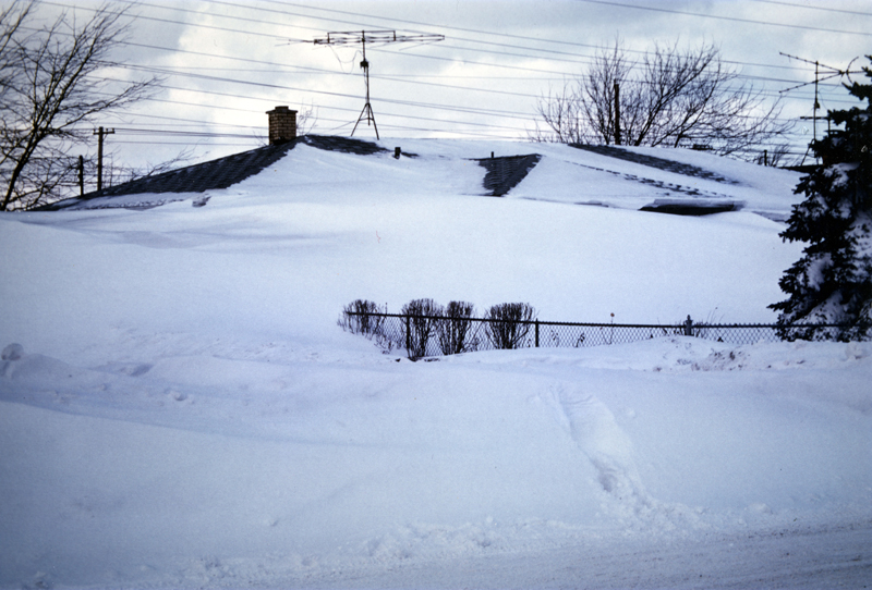
Tonawanda, New York – Post Blizzard of 1977
Photo of a house almost completely buried in snow in the aftermath of the “Blizzard of ’77” in Tonawanda, New York.  (Jeff Wurstner/Wikipedia)

January 1977 Atmospheric CO2 334 ppm
– 69 first-order weather stations shivered through their record coldest month, according to Weather Underground’s Christopher Burt.

– South Carolina state record set: -20 degrees near Long Creek

– Temperatures did not rise above freezing the entire month in a swath from eastern Iowa to western Pennsylvania northward, according to Burt.

– Snow fell as far south as Miami and Homestead, Florida, the farthest south occurrence of snow in the U.S. Two inches of snow fell in Winter Haven, Florida.

– 35 percent of Florida’s citrus crop was damaged; rolling blackouts were needed in Florida due to heavy power demand.

– President Jimmy Carter walked 1.5 miles in the Inauguration Parade with temperatures just below freezing on Jan. 20.

– The “Buffalo Blizzard of ’77” added a foot of snow to the 33 inches of snow on the ground, accompanied by wind gusts to 75 mph, producing snow drifts up to 30 feet high, paralyzing the city.

January 1949 Atmospheric CO2 311 ppm
Coldest month on record in Boise, Idaho, and Spokane, Washington.

– Coldest winter at virtually every weather station in California, Nevada, Idaho and Oregon, according to Burt.

– A series of blizzards in the Great Basin and Plains claimed 150,000 sheep and cattle, isolating ranches from Wyoming to South Dakota.

– The Army airlifted supplies to snowbound ranchers.

– Snow fell in San Diego. One of only three measurable snowfalls on record in Downtown Los Angeles, as well.

– All-time record low set in San Antonio, Texas (0 degrees).

Winter of 1935-1936 Atmospheric CO2 310 ppm
– Coldest Plains winter of record.

– Low temperatures dropped below -50 degrees on four separate days in Malta, Montana.

– Parshall, North Dakota, plunged to -60 degrees on Feb. 15, still the state record low today.

– Langdon, North Dakota, remained below zero for an incredible 41 straight days, the longest stretch on record in the Lower 48 states, according to Burt.

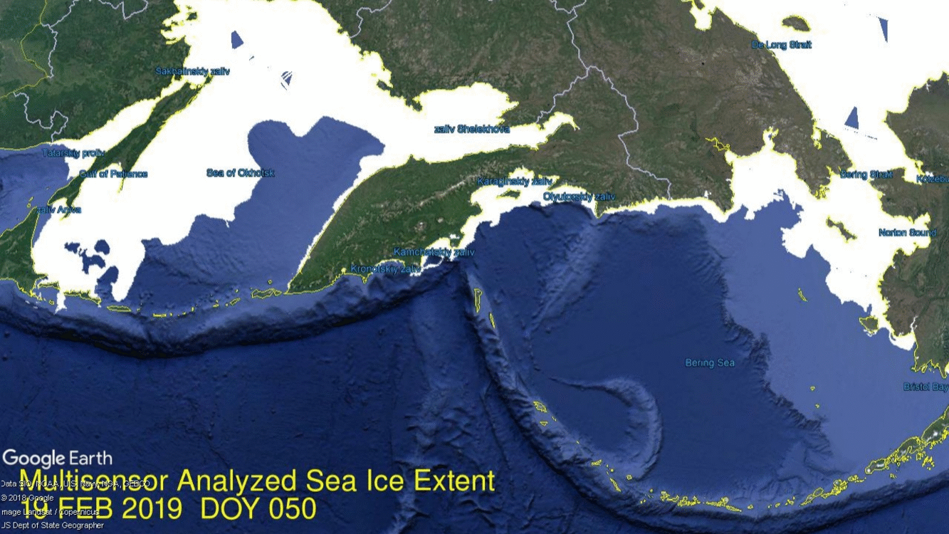
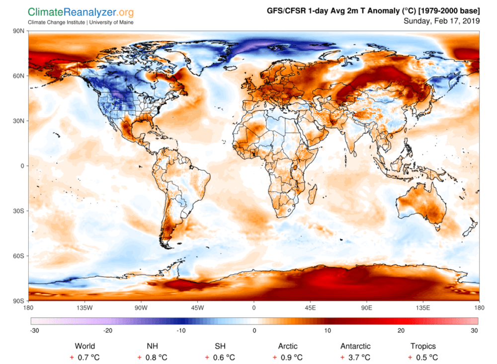
Winter of 2019 Atmospheric CO2 409 ppm


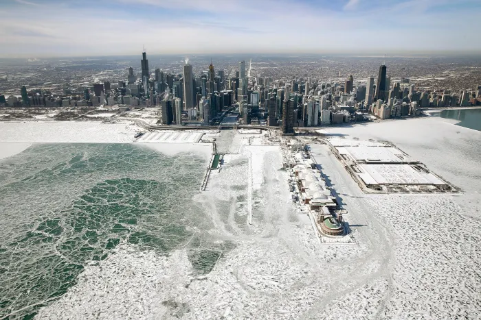
Ice builds up along the shore of Lake Michigan as temperatures dipped to lows around -20 degrees on January 31st, 2019, in Chicago, Illinois. Businesses and schools closed, Amtrak suspended service into the city, more than a thousand flights were canceled, and mail delivery was suspended as the city coped with record-setting low temperatures.  (Photo: Scott Olson/Getty Images)


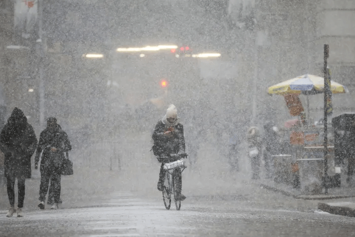
A cyclist rides through the falling snow in the Financial District, January 30th, 2019, in New York City
(Photo: Drew Angerer/Getty Images)


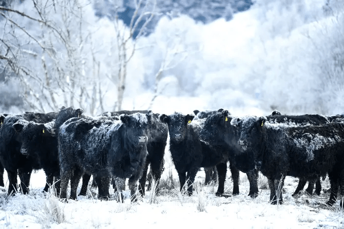
Frost forms on the back of Galloway cows on February 1st, 2019, in Crainlarich in Scotland. Temperatures plummeted to -15 degrees Celsius on the coldest night of the year. (Photo: Jeff J. Mitchell/Getty Images)

Summary

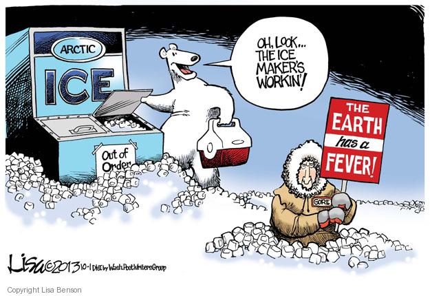
Clearly CO2 neither causes nor prevents outbreaks of arctic cold invading North America. Concerning ourselves with GHGs is no substitute for ensuring reliable, affordable energy and robust infrastructure.

Jonathan Erdman is a senior meteorologist at weather.com and has been an incurable weather geek since a tornado narrowly missed his childhood home in Wisconsin at age 7.
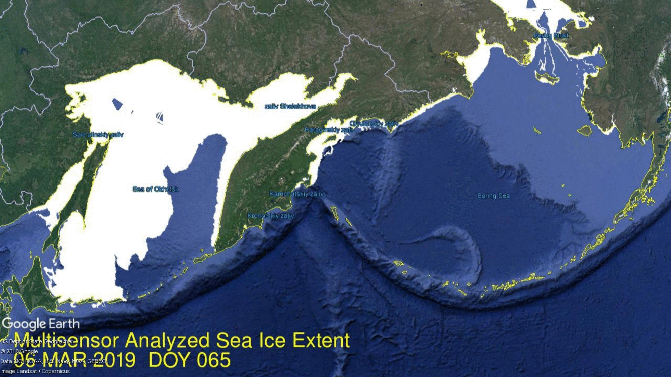
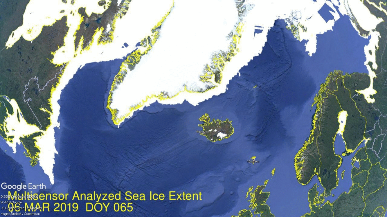
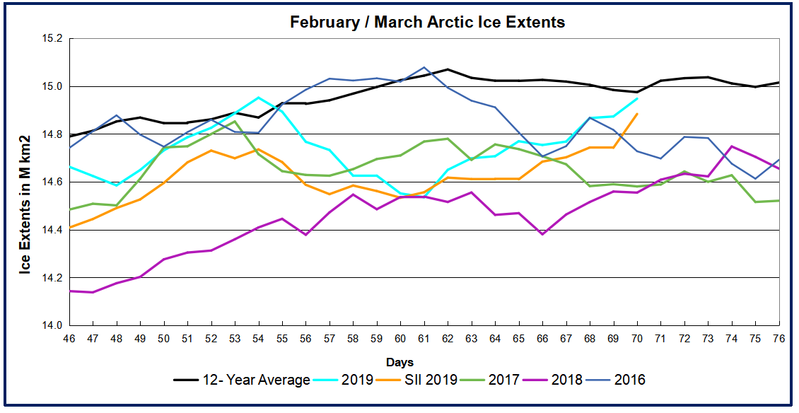
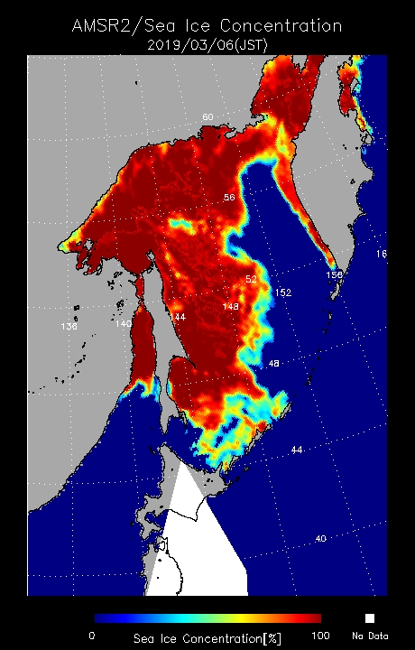
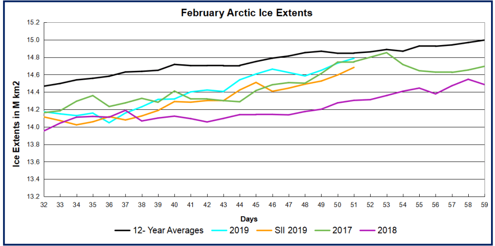
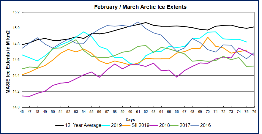
edc2b929c8ec9c162f76f86c1df59ec3