Rise of the Dominion Effect

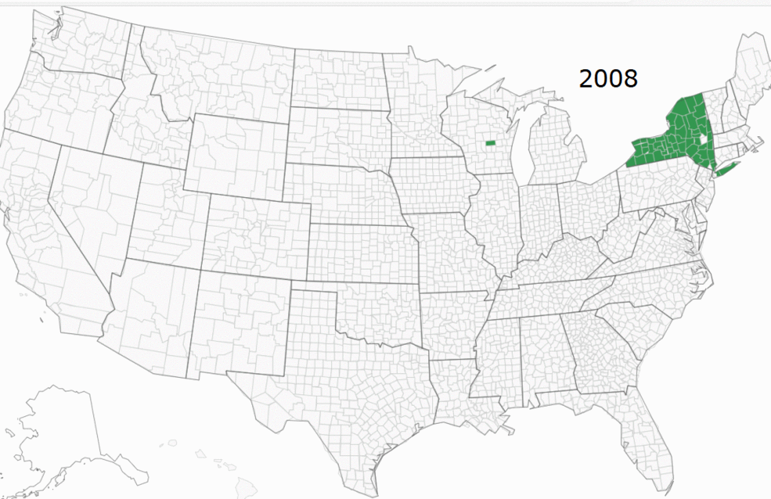
In 2008, although Dominion was in many counties in New York and had an insignificant presence in Wisconsin, it had no presence in the rest of the USA. Dominion built up its presence in 2012, increased it in 2016, and increased it further in 2020.

Background from Shocking History of Dominion Voting  Excerpts in italics with my bolds.

Dominion Voting Systems Corp. is the Canadian company behind the ballot switching software.

Dominion was founded in 2003, with a mission to provide electronic voting systems friendly for progressives. Because of such partisanship, it languished with almost no customers for the next 5-6 years, until the Obama administration came to power. In 2010, the Obama administration confiscated electronic voting systems assets (software, intellectual property, manufacturing tools, customer base, etc.) from two established American companies, and gave them to Dominion. At the same time, Dominion got some employees and assets from a foreign EVS company, tied to Hugo Chavez.

Its software has been used by some 40% of the voters in this election, mostly by Democrat-controlled states and election commissions. Apparently, no protections were put in place against ballot switching, deletion, or creation. According to Dominion’s own website, it software was used in “battleground” states and the largest Democrat states, including MI, GA, AZ, NV, NM, CO, AK, UT, NJ, CA, NY.

The Dominion Effect on Vote Counting

From Fraudspotters Statistical Evidence of Dominion Election Fraud? Time to Audit the Machines. Excerpts in italics with my bolds.

Overview

Statistical analysis of past presidential races supports the view that in 2020, in counties where Dominion Machines were deployed, the voting outcomes were on average (nationwide) approximately 1.5% higher for Joe Biden and 1.5% lower for Donald Trump after adjusting for other demographic and past voting preferences. Upon running hundreds of models, I would say the national average effect appears to be somewhere between 1.0% and 1.6%.

For Dominion to have switched the election from Trump to Biden, it would have had to have increased Biden outcomes (with a corresponding reduction in Trump outcomes) by 0.3% in Georgia, 0.6% in Arizona, 2.1% in Wisconsin, and 2.5% in Nevada. The apparent average “Dominion Effect” is greater than the margin in Arizona and Georgia, and close to the margin for Wisconsin and Nevada. It is not hard to picture a scenario where the actual effect in Wisconsin and Nevada was greater than the national average and would have changed the current reported outcome in those two states.

Assuming the “Dominion Effect” is real, it is possible that an audit of these machines would overturn the election.

These results are scientifically valid and typically have a p-value of less than 1%, meaning the chances of this math occurring randomly are less than 1 in 100. This article, and its FAQ, shows many ways to model the “Dominion Effect.”

The best way to restore faith in the system is to audit the Dominion voting machines in Arizona, Georgia, Nevada, and Wisconsin.

Discussion

To do this study, we will link results from 2008 to 2020 by each county, parish, or in some cases city. Since this is usually based on county, we will refer to it as county in this article.

By comparing the county to itself, we are constructing the test similar to how a drug company would test the effects of its proposed therapy. In this case, we have 3,050 counties that do not have Dominion in 2008. In 2020, 657 of the counties have Dominion while 2,388 do not. If we assume that the same societal forces are acting upon all of these counties equally, then in comparing the average change from 2008 to 2020 for Dominion counties versus non Dominion counties, we should have a similar change in voter share. In this regard, it is as if Dominion is the proposed treatment, and non-Dominion is the placebo.

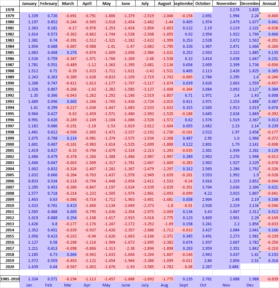
When doing this analysis, we do NOT see a change that is constant across counties. In fact, below are the results comparing 2008 to 2020. A verbal description is “the average US county’s percentage of vote for the Democrat presidential candidate was 8.4 percentage points less Democrat in 2020 (Biden vs. Trump) than in 2008. (Obama vs. McCain). However, despite this 8.4%-point decrease, Dominion counties only decreased 6.4% points, while the non-Dominion counties decreased 9.0% points.”

Unlike a drug company’s test of a new treatment, our counties were not randomly selected to be “treated” by Dominion. These counties chose to install Dominion. Was there selection bias? We should control for other factors to see if the presence of Dominion still significantly affects results.

We can obtain demographic data on a county level basis from the U.S. department of agriculture. By attaching this data on a county basis to our already existing dataset, and running multiple linear regression, we obtain the following results. You’ll notice that Dominion’s p-value became more significant as we controlled for other variables. In some cases Dominion is more significant than the control variables.

To provide a basic interpretation, look at the sign of the coefficient. It is telling you whether the demographic factor increased or decreased Democratic presidential voter percentage. So, from 2008 to 2020:

  • The more rural, the less the Democratic share
  • The more manufacturing dependent, the less the Democratic share
  • The more a county is considered a “high natural amenity,” the more the Democratic share if we consider counties equally weighted but not if we give larger counties more weight. Note this variable has a less significant p-value than some of the others.
  • The more a county is considered “high creative class,” the more the Democratic share
  • The more a county is considered “low education,” the more the Democratic share
  • The more the population increased, the more the Democratic share
  • The more international immigration, the more the Democratic share, although one measure had this value with a questionable p-value.
  • And most importantly, if Dominion was installed, there was approximately a 1.5%-point increase in Democratic share which also corresponds to a 1.5%-point Republican decrease, so a total swing of 3% points.

If the “Dominion Effect” is real, would it have affected the election?

This article showed a range of estimates for the “Dominion Effect,” the more persuasive being from the multiple linear regression analysis:

Multiple Linear Regress: Ordinary Least Squares: 1.65%
Multiple Linear Regress: Weighted Least Squares: 1.55%

I find the weighted least square model the most persuasive and refer to it often in the FAQ.

If there is a Dominion Effect, it adds that percentage to Democrat presidential vote and subtracts from Republican. If the Dominion Effect is real, it may have affected this close election. For Dominion to have switched the election from Trump to Biden, it would have had to increase Democratic presidential outcomes by 0.3% and reduced Republican outcomes by 0.3% in Georgia. The factors for the other states are 0.6% in Arizona, 2.1% in Wisconsin, and 2.5% in Nevada. Click here to see the math.

If you believe the Dominion Effect is real, it is not hard to believe that this effect would be greater in swing states and could have swung these four states into Biden’s column, putting the electoral college in his favor.

Are there really enough machines in Wisconsin to have changed the outcome there?

If you go to verifiedvoting.org, and selection Dominion, 2020, Wisconsin, and download the data, you’ll see that they are saying 527 precincts, 640,215 registered voters are on Dominion machines. The state only has a 20k vote difference among Biden and Trump. And, in my paper, the Dominion effect was calculated on a county basis, not precinct basis. To the extent counties are split on which machine they used, then my paper is underestimating the Dominion effect: the effect is likely bigger on a precinct by precinct basis; I don’t have the data to go to that detail.

But to answer the question: yes, based on published, public information, there are enough machines to change the election in Wisconsin.

Have you really accounted for very large and very small counties?

In our model, we are already using these adjustments:

  • weighting by county size
  • a field called “RuralUrbanContinuumCode2013”

These should adjust for county size, but in effort to address concerns of readers, I ran the model with two new flags:

  • 657 counties with highest number of voters in 2008
  • 657 counties with lowest number of voters in 2008

The Dominion Effect is still 1.55% and the p-values are 0.00% (traditional) 0.09% (robust). These p-values are suggesting less than 1 in 1000 chance of randomly occurring.

To further address this, I ran an additional model which also includes a field for the population per square mile. This model produces identical results of Dominion Effect of 1.55% and a p-value of 0.00% and 0.09%.

Disputing Ignorant Virtue Signaling

Adam Anderson, CEO of Innovex Downhole Solutions, wrote the letter below to Steve Rendle, CEO of North Face’s parent, VF Corporation, in response to the latter’s refusal to fulfill a shirt order for the oil and gas company. Mr. Rendle has not responded to date. H/T Master Resource  Excerpts in italics with my bolds and images.

I am proud to be the CEO of Innovex Downhole Solutions. We are an industry leader providing tools and technologies to service oil and natural gas producers worldwide.

Our work enables our customers, employees and communities to thrive. Low-cost, reliable energy is critical to enable humans to flourish. Oil and natural gas are the two primary resources humanity can use to create low-cost and reliable energy. The work of my company and our industry more broadly enables humans to have a quality of life and life expectancy that were unfathomable only a century ago.

The merits of low-cost and reliable energy are too numerous to cite in totality but here are a few key highlights:

  • Lifespans and quality of life have expanded dramatically over the last 150 years, enabled by access to abundant energy.
  • Low-cost and reliable energy enables life-saving technologies. For example, the new Pfizer vaccine must be stored at -70 0C. This would be impossible without low cost and reliable energy.
  • American industry is dependent on low-cost and reliable energy to thrive and compete internationally.
  • More than a billion people worldwide live today without access to electricity. As a result, these people live shorter, more difficult and dangerous lives than necessary. The solution to this problem is more low-cost and reliable energy, not less.

Hydrocarbons are the only source of supply for the vast majority of our low-cost and reliable energy needs.  The Oil and Gas industry is essential to enable human flourishing and no low-cost and reliable alternative exists:

Oil and natural gas are the only viable sources for low-cost, reliable energy today.

Wind, solar and many other alternatives suffer from an intermittency problem that has not yet been solved.

Any attempts to move our energy consumption to these unreliable, higher-cost sources of energy will have many negative impacts for humanity as it will dramatically decrease our access to low-cost and reliable energy.

For example, Germany has endeavored to transition their energy grid to alternatives such as wind and solar with disastrous consequences. Electricity costs in Germany have tripled over the last 20 years and are roughly 2x the US costs (which are themselves elevated due to the partial shift to unreliable, intermittent sources of energy in the US).

Oil and natural gas are used in many other important ways to create materials that go into thousands of critical products including, clothes, smart phones, vehicles and life-saving medical devices.

Lastly, the Oil and Gas industry is a bastion of high-quality, high-paying, industrial jobs for our people. Last year, Innovex employed ~650 people and paid our employees an average salary of >$85,000 per year. More than 230 of our employees earned over $100,000 last year. The majority of these individuals do not have a college degree and achieve these high levels of income due to their intelligence, dedication and work ethic. We need more high-quality jobs staffed with individuals like my team members in this country, not fewer.

Frequently people are concerned about the impacts of CO2 released from the burning of hydrocarbons. I acknowledge that CO2 is a greenhouse gas and modest increases in CO2 level will have modest impacts on global temperatures. However, I think the climate catastrophists who claim we will endure dramatic negative impacts from these changes are terribly wrong and misunderstand how low cost energy can help us adapt to our ever changing climate:

  • The US Oil and Gas Industry has enabled an ~14% reduction in US CO2 emissions over the last decade, largely as a result of significant growth in Natural Gas production
  • Climate related deaths have declined ~90% since the beginning of the 20th century as a direct result our society is more robust against floods, draughts, storms, wildfires and extreme temps
  • As there has been a modest increase in CO2, there has been an increase in carbon dioxide fertilization in plants across the Globe. According to NASA there has been significant greening of the Earth over the last 35 years
  • This greening combined with incredible technological progress enabled by low cost and reliable energy has led to a dramatic decrease in death by famine. The death rate due to famines has declined by more than 95% over the last century.

At this point, you may wonder why I am directing this letter to you, the CEO of one of the world’s largest apparel companies. We recently contacted North Face to inquire about buying jackets with the Innovex logo for all of our employees as Christmas presents. We viewed North Face as a high-quality brand that our employees would value and cherish for years to come. Unfortunately, we were informed that North Face would not sell us jackets because we were an oil and gas services company.

The irony in this statement is your jackets are made from the oil and gas products the hardworking men and women of our industry produce. I think this stance by your company is counterproductive virtue signaling, and I would appreciate you re-considering this stance. We should be celebrating the benefits of what oil and gas do to enable the outdoors lifestyle your brands embrace. Without Oil and Gas there would be no market for nor ability to create the products your company sells.

I appreciate your consideration and look forward to hearing from you.

Adam Anderson, CEO, Innovex Downhole Solutions, 4310 N Sam Houston Parkway E Houston, TX 77032

How to Pierce the Silicon Curtain

Today’s veil of secrecy and control is made of silicon, not iron.

Bret Swanson explains at Real Clear Politics in his article The Technology Solution to Hysterical Mythmaking. Excerpts in italics with my bolds.

In an MSNBC interview last Monday, Steve Coll, dean of the Columbia University Graduate School of Journalism, was contemplating a staggering dilemma. He noted that Facebook had performed a bit better in 2020 than in 2016 at suppressing inconvenient election content, but it still is not adequately policing the ideas of its 3 billion users. CEO Mark Zuckerberg “profoundly believes in free speech,” Coll lamented. “And,” Coll continued,

“those of us in journalism have to come to terms with the fact that free speech, a principle that we hold sacred, is being weaponized against the principles of journalism. And what do we do about that? As reporters, we march into this war with our facts nobly shouldered, as if they were going to win the day. And what we’re seeing is that because of the scale of this alternate reality … our facts, our principles, our scientific method, it isn’t enough. So what do we do?

Coll is puzzled that citizens aren’t more impressed by the mainstream media’s noble marshaling of facts and science (science!). Could it be that Americans are tired of actors playing roles in elaborately scripted illusions? That they instead prefer actual news and insight? An exploding new array of amateurs, subject matter experts, local reporters, and independent journalists, all leveraging the internet, are often delivering facts far more reliably than the old outlets. When the prestige media pumps and dumps fake conspiracy theories, moralizes over a complex pandemic, blacks out real scandals, collaborates with those it is supposed to cover, and forgets to report on an entire presidential campaign, people will look elsewhere for their information. Today, it’s often former portfolio managers, suburban mothers, lawyers, engineers, curious teenagers, and doctors who are telling us what’s actually happening.

The powerful but cheap tools of the new citizen journalists are tweets, video streams, and podcasts.

So, naturally, Coll and his colleagues of the Fourth Estate have been harassing technology and social media companies to erect a Silicon Curtain (as James Freeman of The Wall Street Journal dubbed it) between the American people and any content not slickly produced in Washington or New York. They’d prefer a social media that is just as incurious, herd-oriented, and partisan as they are. Differentiation is the enemy.

Silicon Valley has been far too willing to oblige. Thus, disfavored people and content get shadow-banned, suspended, demonetized, and, most recently, scolded about the ironclad reliability of signature-less, address-less, mass-marketed, late-arriving mail-in ballots. “Learn how voting by mail is safe and secure,” Twitter insisted a million times over. Twitter even suspended Richard Baris, the pollster who most successfully predicted the 2020 state-by-state election results. And last week, YouTube announced that going forward it will disallow all content questioning the validity of the 2020 election results. Will it let users discuss the multitude of lawsuits, forensic audits, and law enforcement investigations still taking place? Perhaps Rudy Giuliani is crazy, or merely wrong.

Censorship, however, is the refuge not of the confident but the deeply insecure.

In 2005, former President Jimmy Carter and James Baker III issued an authoritative report on election integrity. They found that mail-in ballots are a chief source of fraud. International election monitors have long insisted that top indicators of fraud are stopping counts in mid-stream and prohibiting observation of ballot handling and counting. Yet suddenly the Silicon Valley tech firms became experts in election law, insisting greater information about elections is more dangerous than well-known risky behavior. The soothing new admonition might as well be: “Lamborghinis and whiskey are in fact a safe combination.”

The Silicon Curtain is frustrating, but it has backfired more than Big Media and Silicon Valley know.

Not only have they lost hundreds of millions of readers, viewers, and users, they’ve also locked themselves in a Faraday cage of ignorance. One of the things they are most uninformed about is the hundreds of new tech channels and media outlets already challenging them, and maybe soon looking at them in the rearview mirror.

As technologist and investor Balaji Srinivasan says, “exit > voice.” Meaning, the hope to be treated fairly by CNN, The New York Times, or Twitter is futile. Don’t fight on their battlefield, at least not exclusively. The far more fruitful solution is to exit and create new channels — with crypto communities, Substack newsletters, online magazines, the Brave browser, and video streaming alternatives such as Rumble and NewTube. (The outlet that regularly publishes my articles without question refused to run this one. Which is funny because it proves the point – exactly.)

This path is also more promising than a Washington solution. A clarification and upgrade of Section 230 of the Communications Decency Act to reflect unforeseen dynamics, for example, is warranted. Social media has perverted and exploited it. But throwing it out wholesale and reinstituting a “fairness doctrine” would be unwise. As I wrote last year,

Just as social media offers a Fifth Estate to correct and replace the corrupt and crumbling Fourth Estate, an open society can create a Sixth Estate to hold Big Tech’s feet to the fire. 

No companies, news outlets, political parties, scientific organizations, or government agencies will ever be perfect. That’s why we need continual openness to an Nth Estate, which can help correct our inevitable commercial and cultural mistakes. A new Washington-based regime that seeks to regulate social media in particular and speech in general would do more harm than good. By cementing today’s regime, it would block the pathways to the Nth Estate.

One of our great remaining newsmen, Holman Jenkins of The Wall Street Journal, correctly laments that “the increasing substitution of hysterical mythmaking for news is a malignancy of our time.”

An Nth Estate of American openness, innovation, exit, and free speech is the solution. It is the regenerative vaccine.

Wacky “War on Nature”

The usual suspects reported U.N. Secretary General Antonio Guterres announcing that humans are at war upon nature.  For example, NY Daily News (in italics with my bolds):

The United Nations is calling on people worldwide to stop “waging war on nature” as the planet achieves disturbing milestones in the battle against climate change.

In a speech at Columbia University, UN Secretary-General Antonio Guterres said, “The state of the planet is broken. … This is suicidal,” The Associated Press reported Wednesday.

Guterres pointed to “apocalyptic fires and floods, cyclones and hurricanes” that have only become more frequent in recent years, and in particular, during 2020, one of the three hottest years on record.

“Human activities are at the root of our descent towards chaos,” he explained, noting this also means humans are the ones who “can solve it.”

John Osbourne explains at Real Markets how crazy is this latest meme in his article The Utterly Nonsensical View That Humanity Is Waging War on Nature. Excerpts in italics with my bolds.

The narrative that humanity is waging a ‘war on nature’ is nonsense.

At Columbia University on December 2, 2020, U.N. Secretary General Antonio Guterres claimed that humanity’s “war” on the environment was coming to a head. Guterres said, “We are facing a devastating pandemic, new heights of global heating, new lows of ecological degradation and new setbacks in our work towards global goals for more equitable, inclusive and sustainable development… To put it simply, the state of the planet is broken.”

Is humanity facing the crisis that Guterres claims? Is the planet ‘broken’? Most importantly, is there any scientific basis for these claims of doom and gloom?

To answer these questions: No. Global living standards continue to rise, despite alarmists constant failed predictions of a dreary future. Greater prosperity has allowed developed countries to devote time and money to remediating existing damage and improving the environment; developing countries have no such luxury. Contrary to alarmists’ claims, climate and temperature changes are extensively documented and perfectly natural. Guterres’ belief that man is at war with nature is unsubstantiated.

Facts, rather than beliefs, should be the foundation of public policy.

In his speech, Guterres highlights nearly every woe in the world. He implies that any problem in the natural world, be it fires, flooding, cyclones, hurricanes, pollution, disease, changes in sea ice and ocean temperatures, can be blamed on climate change. And in Guterres’ view, humanity is the sole driver of climate change. This couldn’t be further from the truth.

Nor is Guterres the sole proponent of such ideas. Media outlets such as CNN, the Huffington Post, and NPR repeat these tropes while rarely citing facts for their claims of impending calamity.

An examination of the science and history of natural disasters will show that deaths from natural disasters are at one of the lowest rates in history. While natural disasters are more expensive than they once were, the reasons are mundane and expected.

Climate has changed throughout history, well before humanity had any significant impact. Even with CO2’s warming effect, UN IPCC and U.S. Government data show no increase in rates most natural disasters from the period of natural warming (1900 to 1950) to the period the IPCC claims is one of largely human-caused warming (1950 to 2018).

This calls into question not just claims of current CO2-driven “climate crisis” but projections of future damage by those who promote the ‘war on nature’ narrative.

Guterres continues, “Air and water pollution are killing 9 million people annually.” Not only is his number wrong, but his reasoning is flawed. In developed countries (which have access to cheap reliable energy), air and water are cleaner than ever because of the economic growth driven by fossil fuels. Furthermore, his solutions condemn the populations of less developed countries to continue to suffer public health problems arising from lack of affordable energy. Nearly half of the deaths cited in the WHO’s number are caused by cooking indoors with dirty fuels. In the CO2 Coalition’s latest white paper, New-Tech American Coal Fired Electricity for Africa: Clean Air, Indoors and Out we offer a solution to the polluted indoor air: cheap, reliable energy using local resources. President Trump could reverse by executive order the Obama-era ban on U.S. exports of clean-coal technology to coal-rich Africa, saving thousands of lives.

As to ocean health, Guterres says, “The carbon dioxide they absorb is acidifying the seas…” Again, he misses the mark. The CO2 Coalition has analyzed decades of research and found that CO2, which is plankton food that enriches sea life, does not cause “ocean acidification” and that the term itself is misleading.

Guterres concludes by advocating humanity “flick the green switch” and transform the world’s economy by using ‘renewable energy’ to drive sustainability. While this sounds wonderful, the reality is that so-called ‘renewables’ are anything but renewable. Flipping the green switch requires us to depend on energy that is unreliable, expensive, and requires the use of dangerous pollutants. His proposed solution would be harmful to both health and global prosperity.

One thing is certain: the General Secretary is wrong on the science and wrong on the economics. His ‘war on nature’ narrative is bunk.


.


In Denial of Election Fraud

Meaning of In Denial:  Refusing to look at information to avoid considering an undesirable reality.  Antonym: Facing Facts

The judiciary has now signaled from the very top Supreme Justices along with state and district judges that they will avert their eyes from any cases questioning the 2020 election.  The media as well attaches the adjective “baseless” to all claims of election irregularities.  The results are “valid” they say, without any effort to confront all the evidence of “invalid” activity before, during, and after November 3.  The undesirable reality is that a pre-meditated, nationally organized criminal enterprise stole the US election, meaning that one of the US major political parties should now be called the Undemocrats.  The infographic below presents the extensive legal case against this election process and results, summarized from numerous hearings attended by officials who actually want to know the truth.

Previous Post;  The Phishy Election

The age of distributed computers and internet connectivity results in everyone from time to time receiving phishing emails.  Just opening the link can get malware installed on your notebook, and can even generate a ransom demand from those who kidnapped your device.  The same kind of criminals working 24/7 to steal from you are suspected of using their methods to steal the Office of the President of the US.

As we know from TV shows and reading crime novels, any criminal investigation seeks to prove the perpetrators possessed three factors:  Motive, Opportunity, and Means.  No one doubts the Democrats had plenty of Motive, as evidenced by a four-year slow-moving coup against Trump from the moment the 2016 results were confirmed.  As we now see, the Opportunity came in Democratic control over big city strongholds in the large battleground states.  And as the legal affidavits confirm, the Means consisted of both Old School ballot stuffing fraud (ballot harvesting and overwriting) and New School counting fraud (using computer algorithms to warp the results). The allegations summarized in the exhibit above show how perpetrators added votes in big cities and suppressed votes in the countryside.

There is a short timetable for exposing these illegal tactics, and the media is looking to play out the clock, after having already declared Biden the winner.  An example is the recent Washington Post article Swing-state counties that used Dominion voting machines mostly voted for Trump.  At least they are finally admitting that the election results are questionable.  But like all the MSM, they are resolutely averting their eyes from anything that could sour the Biden victory they so covet. Excerpts in italics with my bolds.

A review of 10 key states (Arizona, Colorado, Florida, Georgia, Michigan, Minnesota, Nevada, North Carolina, Pennsylvania and Wisconsin) finds that Dominion systems were used in 351 of 731 counties. Trump won 283 of those counties, 81 percent of the total. He won 79 percent of the counties that didn’t use Dominion systems.

The idea that Trump only lost, say, Pennsylvania, because of Dominion voting systems has to reconcile with the fact that Trump actually won more votes in counties that used Dominion systems (beating Biden by about 74,000 votes in those counties) but lost the state because he was beaten by 154,000 votes in non-Dominion counties. That same pattern holds in Wisconsin as well.

In other words, there’s nothing to suggest that counties using Dominion systems looked significantly different from counties that didn’t. The idea that Biden is president-elect because of some nefarious calculations simply doesn’t match the reality of the county-level vote results.

The WP conclusion ignores the analyses showing how the algorithms distort the results.  In order to shift votes from Trump to Biden, the perpetrators needed to identify large pools of Trump-only votes (ballots cast only for the President race) that could be switched to Biden-only votes.  By skimming in this way, Trump wins those counties as expected, but by enough fewer votes to lose the state. As well, it appears that forensic testing of seized ballot machines confirms that vote tabulations are converted from whole numbers to decimals so that weighting can be applied.  In one example, Biden votes were weighted 1.2 while Trump votes weighted at 0.8.  Thus the race results effectively shift votes from Trump to Biden.  Meanwhile in the big city precincts, large Biden margins were already organized through production of mail-in ballots stuffed into the machines.

See: Inside the Election Black Box

The forensics report for Antrim County makes for an interesting read.

A forensic audit of Dominion Voting Systems machines and software in Michigan showed that they were designed to create fraud and influence election results, a data firm said Monday (Dec. 14)

“We conclude that the Dominion Voting System is intentionally and purposefully designed with inherent errors to create systemic fraud and influence election results,” Russell Ramsland Jr., co-founder of Allied Security Operations Group, said in a preliminary report.

“The system intentionally generates an enormously high number of ballot errors. The electronic ballots are then transferred for adjudication. The intentional errors lead to bulk adjudication of ballots with no oversight, no transparency, and no audit trail. This leads to voter or election fraud. Based on our study, we conclude that The Dominion Voting System should not be used in Michigan. We further conclude that the results of Antrim County should not have been certified,” he added.

Footnote:

Today, in the midst of an uproar over election violations, Covid restrictions,  and also illicit relations with Chinese Communists, this song came up on my playlist.

Lyrics:

Everybody knows that the dice are loaded
Everybody rolls with their fingers crossed
Everybody knows that the war is over
Everybody knows the good guys lost
Everybody knows the fight was fixed
The poor stay poor, the rich get rich
Thats how it goes
Everybody knows

Everybody knows that the boat is leaking
Everybody knows that the captain lied
Everybody got this broken feeling
Like their father or their dog just died
Everybody talking to their pockets
Everybody wants a box of chocolates
And a long stem rose
Everybody knows

Everybody knows that you love me baby
Everybody knows that you really do
Everybody knows that you’ve been faithful
Ah give or take a night or two
Everybody knows you’ve been discreet
But there were so many people you just had to meet
Without your clothes
And everybody knows

Everybody knows, everybody knows
Thats how it goes
Everybody knows

And everybody knows that its now or never
Everybody knows that its me or you
And everybody knows that you live forever
Ah when you’ve done a line or two
Everybody knows the deal is rotten
Old black joe’s still pickin’ cotton
For your ribbons and bows
And everybody knows

And everybody knows that the plague is coming
Everybody knows that its moving fast
Everybody knows that the naked man and woman
Are just a shining artifact of the past
Everybody knows the scene is dead
But there’s gonna be a meter on your bed
That will disclose
What everybody knows

And everybody knows that you’re in trouble
Everybody knows what you’ve been through
From the bloody cross on top of calvary
To the beach of Malibu
Everybody knows its coming apart
Take one last look at this sacred heart
Before it blows
And everybody knows

Everybody knows, everybody knows
Thats how it goes
Everybody knows

Footnote:

I doubt Leonard Cohen had politics or climate change in mind when he wrote this masterpiece.  But he did have a pertinent poetic insight; namely, that social proof is an unreliable guide to the truth.


Fear Not Rising Temperatures or Ocean Levels


Dominick T. Armentano writes at the Independent Institute Are Temperatures and Ocean Levels Rising Dangerously? Not Really. Excerpts in italics with my bolds.  H/T John Ray

There are two widely held climate-change beliefs that are simply not accurate. The first is that there has been a statistically significant warming trend in the U.S. over the last 20 years. The second is that average ocean levels are rising alarmingly due to man-made global warming. Neither of these perspectives is true; yet both remain important, nonetheless, since both are loaded with very expensive public policy implications.

To refute the first view, we turn to data generated by the National Oceanic and Atmospheric Administration (NOAA) for the relevant years under discussion. The table below reports the average mean temperature in the continental U.S. for the years 1998 through 2019*:

1998 54.6 degrees
1999 54.5 degrees
2000 54.0 degrees
2001 54.3 degrees
2002 53.9 degrees
2003 53.7 degrees
2004 53.5 degrees
2005 54 degrees
2006 54.9 degrees
2007 54.2 degrees
2008 53.0 degrees
2009 53.1 degrees
2010 53.8 degrees
2011 53.8 degrees
2012 55.3 degrees
2013 52.4 degrees
2014 52.6 degrees
2015 54.4 degrees
2016 54.9 degrees
2017 54.6 degrees
2018 53.5 degrees
2019 52.7 degrees

*National Climate Report – Annual 2019

It is apparent from the data that there has been no consistent warming trend in the U.S. over the last 2 decades; average mean temperatures (daytime and nighttime) have been slightly higher in some years and slightly lower in other years. On balance–and contrary to mountains of uninformed social and political commentary—annual temperatures on average in the U.S. were no higher in 2019 than they were in 1998.

The second widely accepted climate view—based on wild speculations from some op/ed writers and partisan politicians–is that average sea levels are increasing dangerously and rationalize an immediate governmental response. But as we shall demonstrate below, this perspective is simply not accurate.

There is a wide scientific consensus (based on satellite laser altimeter readings since 1993) that the rate of increase in overall sea levels has been approximately .12 inches per year.

To put that increase in perspective, the average sea level nine years from now (in 2029) is likely to be approximately one inch higher than it is now (2020). One inch is roughly the distance from the tip of your finger to the first knuckle. Even by the turn of the next century (in 2100), average ocean levels (at that rate of increase) should be only a foot or so higher than they are at present.

NYC past & projected 2020

None of this sounds particularly alarming for the general society and little of it can justify any draconian regulations or costly infrastructure investments. The exception might be for very low- lying ocean communities or for properties (nuclear power plants) that, if flooded, would present a wide-ranging risk to the general population. But even here there is no reason for immediate panic. Since ocean levels are rising in small, discrete marginal increments, private and public decision makers would have reasonable amounts of time to prepare, adjust and invest (in flood abatement measures, etc.) if required.

But are sea levels actually rising at all? Empirical evidence of any substantial increases taken from land-based measurements has been ambiguous. This suggests to some scientists that laser and tidal-based measurements of ocean levels over time have not been particularly accurate.

For example, Professor Niles-Axel Morner (Stockholm University) is infamous in climate circles for arguing–based on his actual study of sea levels in the Fiji Islands–that “there are no traces of any present rise in sea levels; on the contrary, full stability.” And while Morner’s views are controversial, he has at least supplied peer reviewed empirical evidence to substantiate his nihilist position on the sea-level increase hypothesis.

The world has many important societal problems and only a limited amount of resources to address them. What we don’t need are overly dramatic climate-change claims that are unsubstantiated and arrive attached to expensive public policies that, if enacted, would fundamentally alter the foundations of the U.S. economic system.

DOMINICK T. ARMENTANO is a Research Fellow at the Independent Institute and professor emeritus in economics at the University of Hartford (CT).

Update Dec.11: USCRN Comparable Temperature Results

In response to Graeme Weber’s Question, this information is presented:

Anthony Watts:

NOAA’s U.S. Climate Reference Network (USCRN) has the best quality climate data on the planet, yet it never gets mentioned in the NOAA/NASA press releases. Commissioned in 2005, it has the most accurate, unbiased, and un-adjusted data of any climate dataset.

The USCRN has no biases, and no need for adjustments, and in my opinion represents a ground truth for climate change.

In this graph of the contiguous United States updated for 2019 comes out about 0.75°F cooler than the start of the dataset in 2005.

See Also Fear Not For Fiji

Setting the Global Temperature Record Straight

Setting the Global Temperature Record Straight

Figure 4. As in Fig. 3 except for seasonal station and global anomalies. As noted in the text, the inhabitants of the Earth experience the anomalies as noted by the black circles, not the yellow squares.

The CO2 Coalition does the world a service by publishing a brief public information about the temperature claims trumpeted in the media to stir up climate alarms.  The pdf pamphlet is The Global Mean Temperature Anomaly Record  How it works and why it is misleading by Richard S. Lindzen and John R. Christy.  H/T John Ray.  Excerpts in italics with my bolds.

Overview

At the center of most discussions of global warming is the record of the global mean surface temperature anomaly—often somewhat misleadingly referred to as the global mean temperature record. This paper addresses two aspects of this record. First, we note that this record is only one link in a fairly long chain of inference leading to the claimed need for worldwide reduction in CO2 emissions. Second, we explore the implications of the way the record is constructed and presented, and show why the record is misleading.

This is because the record is often treated as a kind of single, direct instrumental measurement. However, as the late Stan Grotch of the Laurence Livermore Laboratory pointed out 30 years ago, it is really the average of widely scattered station data, where the actual data points are almost evenly spread between large positive and negative values.

The average is simply the small difference of these positive and negative excursions, with the usual problem associated with small differences of large numbers: at least thus far, the approximately one degree Celsius increase in the global mean since 1900 is swamped by the normal variations at individual stations, and so bears little relation to what is actually going on at a particular one.

The changes at the stations are distributed around the one-degree global average increase. Even if a single station had recorded this increase itself, this would take a typical annual range of temperature there, for example, from -10 to 40 degrees in 1900, and replace it with a range today from -9 to 41. People, crops, and weather at that station would find it hard to tell this difference. However, the increase looks significant on the charts used in almost all presentations, because they omit the range of the original data points and expand the scale in order to make the mean change look large.

The record does display certain consistent trends, but it is also quite noisy, and fluctuations of a tenth or two of a degree are unlikely to be significant. In the public discourse, little attention is paid to magnitudes; the focus is rather on whether this anomaly is increasing or decreasing. Given the noise and sampling errors, it is rather easy to “adjust” such averaging, and even change the sign of a trend from positive to negative.

The Global Temperature Record and its Role

The earth’s climate system is notoriously complex. We know, for example, that this system undergoes multiyear variations without any external forcing at all other than the steady component of the sun’s radiation (for example, the El Niño Southern Oscillation and the Quasibiennial Oscillation of the tropical stratosphere). We know, moreover, that these changes are hardly describable simply by some global measure of temperature. Indeed, what is presented is actually something else. You may have noticed that it is referred to as the global mean temperature anomaly.

What is being averaged is the deviation of the surface temperature from some 30-year mean at stations non-randomly scattered around the globe. As we will soon see, this average bears rather little relation to the changes at the individual stations. Moreover, as noted by Christy and McNider (2017), the temperature anomaly of the lower troposphere (measured by satellites) relative to the surface temperature is much better sampled and represents the “more climate-relevant quantity of heat content, a change in which is a [theorized] consequence of enhanced GHG forcing.”

However imprecise and lightly-relevant the surface temperature is to the physics of the issue, the narrative of a global warming disaster uses the record as the first in a sequence of often comparably questionable assumptions. The narrative first claims that changes in this dubious metric are almost entirely due to variations in CO2, even though there are quite a few other factors whose common variations are as large as or larger than the impact of changes in CO2 (for example, modest changes in the area of upper and lower level clouds or changes in the height of upper level clouds).

Then the narrative asserts that changes in CO2 were primarily due to man’s activities. There is indeed evidence that this link is likely true for changes over the past two hundred years. However, over Earth’s history, there were radical changes in CO2 levels, and these changes were largely uncorrelated with changes in temperature.

Presentations of the Global Mean Temperature Anomaly Record

In order to obscure the fact that the global means are small residues of large numbers whose precision is questionable, the common presentations plot the global mean anomalies without the scattered points and expand the scale so as to make the changes look large. These expanded graphs of global means are shown in Figures 5 and 6.

Figure 6. Global seasonal anomalies of temperature from Fig. 4 without station anomalies. Note
the range here is -0.8 to +1.2 °C, or 9 times less than Figs. 2 and 4.

The frequently cited trends are evident in these graphs–most notably, the pre-CO2 warming from 1920-1940 and the warming that has been attributed to man from 1978-1998. We also see a reduced rate from 1998 (best seen in Fig. 6) until the major El Niño of 2016 occurred. Even if one could attribute all the 1978-1998 warming to the increases in CO2 , the slowdown clearly shows that there is something going on that is at least as large as the response to CO2 . This contradicts the IPCC attribution studies that assume, based on model results, that other sources of variability since 1950 are negligible.

Note that the results in Figures 5 and 6 are quite noisy, with large interseasonal and interannual fluctuations. This noise contributes to the uncertainty of the values, in addition to the usual sampling errors. The graphs one usually sees are a lot smoother looking than what we see in Figures 5 and 6; these have resulted from taking running means over 5 or more years. The results of such smoothing are shown in Figure 7 (smoothed over 11 years) and 8 (smoothed over 21 seasons, or about 5 years). They look much cleaner and presumably more authoritative than the unsmoothed results or the scatter diagrams, but this tends to disguise the uncertainty, which is likely on the order of 0.1-0.2 degrees. (For example, Figure 7 substantially disguises the pause following 1998; Figure 8 does this less because it is averaged over only about 5 years.)

Obviously, warmings or coolings of a tenth or two of a degree are without significance since possible adjustments can easily lead to changes of sign from positive to negative, yet in the popular literature much is made of such small changes. Like with sausage, you might not want to know what went into these graphs, but, in this case, it is important that you do.

Some Concluding Remarks

An examination of the data that goes into calculating the global mean temperature anomaly clearly shows that any place on earth is almost as likely, at any given time, to be warmer or cooler than average. The anomaly is the small residue of the generally larger excursions we saw in Figures 1 and 2. This residue (which is popularly held to represent “climate”) is also much smaller than the temperature variations that all life on Earth regularly experiences. Figure 9 illustrates this for 14 major cities in the United States.

Indeed, the 1.2 degree Celsius global temperature change in the past 120 years, depicted as alarming in Figure 7, is only equivalent to the thickness of the “Average” line in Figure 9. As the figure shows, the difference in average temperature from January to July in these major cities ranges from just under ten degrees in Los Angeles to nearly 30 degrees in Chicago. And the average difference between the coldest and warmest moments each year ranges from about 25 degrees in Miami (a 45 degree Fahrenheit change) to 55 degrees in Denver (a 99 degree Fahrenheit change)

Figure 9. Temperature Changes People Know How to Handle

At the very least, we should keep the large natural changes in Figure 9 in mind, and not attribute them to the small residue, the global mean temperature anomaly, or obsess over its small changes.

See Also  Temperature Misunderstandings

Clive Best provides this animation of recent monthly temperature anomalies which demonstrates how most variability in anomalies occur over northern continents.


Yes, HCQ Works Against Covid19

Updated December 2020 is this report from hcqmeta.com HCQ is effective for COVID-19 when used early: meta analysis of 156 studies  (Version 28, December 4, 2020).  Excerpts in italics with my bolds.

HCQ is effective for COVID-19. The probability that an ineffective treatment generated results as positive as the 156 studies to date is estimated to be 1 in 36 trillion (p = 0.000000000000028).

Early treatment is most successful, with 100% of studies reporting a positive effect and an estimated reduction of 65% in the effect measured (death, hospitalization, etc.) using a random effects meta-analysis, RR 0.35 [0.27-0.46].

100% of Randomized Controlled Trials (RCTs) for early, PrEP, or PEP treatment report positive effects, the probability of this happening for an ineffective treatment is 0.00098.

There is evidence of bias towards publishing negative results. 89% of prospective studies report positive effects, and only 76% of retrospective studies do.

Significantly more studies in North America report negative results compared to the rest of the world, p = 0.0005.

Study results ordered by date, with the line showing the probability that the observed frequency of positive results occurred due to random chance from an ineffective treatment.

We analyze all significant studies concerning the use of HCQ (or CQ) for COVID-19, showing the effect size and associated p value for results comparing to a control group. Methods and study results are detailed in Appendix 1. Typical meta analyses involve subjective selection criteria, effect extraction rules, and bias evaluation, requiring an understanding of the criteria and the accuracy of the evaluations. However, the volume of studies presents an opportunity for a simple and transparent analysis aimed at detecting efficacy.

If treatment was not effective, the observed effects would be randomly distributed (or more likely to be negative if treatment is harmful). We can compute the probability that the observed percentage of positive results (or higher) could occur due to chance with an ineffective treatment (the probability of >= k heads in n coin tosses, or the one-sided sign test / binomial test). Analysis of publication bias is important and adjustments may be needed if there is a bias toward publishing positive results. For HCQ, we find evidence of a bias toward publishing negative results.

Figure 2 shows stages of possible treatment for COVID-19. Pre-Exposure Prophylaxis (PrEP) refers to regularly taking medication before being infected, in order to prevent or minimize infection. In Post-Exposure Prophylaxis (PEP), medication is taken after exposure but before symptoms appear. Early Treatment refers to treatment immediately or soon after symptoms appear, while Late Treatment refers to more delayed treatment.

Table 1. Results by treatment stage. 2 studies report results for a subset with early treatment, these are not included in the overall results.

We also note a bias towards publishing negative results by certain journals and press organizations, with scientists reporting difficulty publishing positive results [Boulware, Meneguesso]. Although 124 studies show positive results, The New York Times, for example, has only written articles for studies that claim HCQ is not effective [The New York Times, The New York Times (B), The New York Times (C)]. As of September 10, 2020, The New York Times still claims that there is clear evidence that HCQ is not effective for COVID-19 [The New York Times (D)]. As of October 9, 2020, the United States National Institutes of Health recommends against HCQ for both hospitalized and non-hospitalized patients [United States National Institutes of Health].

Treatment details. We focus here on the question of whether HCQ is effective or not for COVID-19. Significant differences exist based on treatment stage, with early treatment showing the greatest effectiveness. 100% of early treatment studies report a positive effect, with an estimated reduction of 65% in the effect measured (death, hospitalization, etc.) in the random effects meta-analysis, RR 0.35 [0.27-0.46]. Many factors are likely to influence the degree of effectiveness, including the dosing regimen, concomitant medications such as zinc or azithromycin, precise treatment delay, the initial viral load of patients, and current patient conditions.

The Phishy Election

The age of distributed computers and internet connectivity results in everyone from time to time receiving phishing emails.  Just opening the link can get malware installed on your notebook, and can even generate a ransom demand from those who kidnapped your device.  The same kind of criminals working 24/7 to steal from you are suspected of using their methods to steal the Office of the President of the US.

As we know from TV shows and reading crime novels, any criminal investigation seeks to prove the perpetrators possessed three factors:  Motive, Opportunity, and Means.  No one doubts the Democrats had plenty of Motive, as evidenced by a four-year slow-moving coup against Trump from the moment the 2016 results were confirmed.  As we now see, the Opportunity came in Democratic control over big city strongholds in the large battleground states.  And as the legal affidavits confirm, the Means consisted of both Old School ballot stuffing fraud (ballot harvesting and overwriting) and New School counting fraud (using computer algorithms to warp the results). The allegations summarized in the exhibit below show how perpetrators added votes in big cities and suppressed votes in the countryside.

There is a short timetable for exposing these illegal tactics, and the media is looking to play out the clock, after having already declared Biden the winner.  An example is the recent Washington Post article Swing-state counties that used Dominion voting machines mostly voted for Trump.  At least they are finally admitting that the election results are questionable.  But like all the MSM, they are resolutely averting their eyes from anything that could sour the Biden victory they so covet. Excerpts in italics with my bolds.

A review of 10 key states (Arizona, Colorado, Florida, Georgia, Michigan, Minnesota, Nevada, North Carolina, Pennsylvania and Wisconsin) finds that Dominion systems were used in 351 of 731 counties. Trump won 283 of those counties, 81 percent of the total. He won 79 percent of the counties that didn’t use Dominion systems.

The idea that Trump only lost, say, Pennsylvania, because of Dominion voting systems has to reconcile with the fact that Trump actually won more votes in counties that used Dominion systems (beating Biden by about 74,000 votes in those counties) but lost the state because he was beaten by 154,000 votes in non-Dominion counties. That same pattern holds in Wisconsin as well.

In other words, there’s nothing to suggest that counties using Dominion systems looked significantly different from counties that didn’t. The idea that Biden is president-elect because of some nefarious calculations simply doesn’t match the reality of the county-level vote results.

The WP conclusion ignores the analyses that show how the algorithms effects show up in the results.  In order to shift votes from Trump to Biden, the perpetrators needed to identify large pools of Trump-only votes (ballots cast only for the President race) that could be switched to Biden-only votes.  By skimming in this way, Trump wins those counties as expected, but by enough fewer votes to lose the state. As well, it appears that forensic testing of seized ballot machines will confirm that vote tabulations are converted from whole numbers to decimals so that weighting can be applied.  In one example, Biden votes were weighted 1.3 while Trump votes weighted at 0.7.  Thus the race results effectively shift votes from Trump to Biden.

See: Inside the Election Black Box

Meanwhile in the big city precincts, large Biden margins are already organized through production of mail-in ballots stuffed into the machines.

From Previous Post:  Election Fraud Too Big to Fail?

Arctic Ice Fears Erased in November

As noted in a previous post, alarms were raised over slower than average Arctic refreezing in October.  Those fears are now laid to rest by ice extents roaring back in November.  The image above shows the ice gains completed from October 31 to November 30, 2020. In fact 3.5 Wadhams of sea ice were added during the month.  (The metric 1 Wadham = 1 M km2 comes from the professor’s predictions of an ice-free Arctic, meaning less than 1 M km2 extent)

Some years ago reading a thread on global warming at WUWT, I was struck by one person’s comment: “I’m an actuary with limited knowledge of climate metrics, but it seems to me if you want to understand temperature changes, you should analyze the changes, not the temperatures.” That rang bells for me, and I applied that insight in a series of Temperature Trend Analysis studies of surface station temperature records. Those posts are available under this heading. Climate Compilation Part I Temperatures

This post seeks to understand Arctic Sea Ice fluctuations using a similar approach: Focusing on the rates of extent changes rather than the usual study of the ice extents themselves. Fortunately, Sea Ice Index (SII) from NOAA provides a suitable dataset for this project. As many know, SII relies on satellite passive microwave sensors to produce charts of Arctic Ice extents going back to 1979.  The current Version 3 has become more closely aligned with MASIE, the modern form of Naval ice charting in support of Arctic navigation. The SII User Guide is here.

There are statistical analyses available, and the one of interest (table below) is called Sea Ice Index Rates of Change (here). As indicated by the title, this spreadsheet consists not of monthly extents, but changes of extents from the previous month. Specifically, a monthly value is calculated by subtracting the average of the last five days of the previous month from this month’s average of final five days. So the value presents the amount of ice gained or lost during the present month.

These monthly rates of change have been compiled into a baseline for the period 1980 to 2010, which shows the fluctuations of Arctic ice extents over the course of a calendar year. Below is a graph of those averages of monthly changes during the baseline period. Those familiar with Arctic Ice studies will not be surprised at the sine wave form. December end is a relatively neutral point in the cycle, midway between the September Minimum and March Maximum.

The graph makes evident the six spring/summer months of melting and the six autumn/winter months of freezing.  Note that June-August produce the bulk of losses, while October-December show the bulk of gains. Also the peak and valley months of March and September show very little change in extent from beginning to end.

The table of monthly data reveals the variability of ice extents over the last 4 decades.

The values in January show changes from the end of the previous December, and by summing twelve consecutive months we can calculate an annual rate of change for the years 1979 to 2019.

As many know, there has been a decline of Arctic ice extent over these 40 years, averaging 40k km2 per year. But year over year, the changes shift constantly between gains and losses.

Moreover, it seems random as to which months are determinative for a given year. For example, much ado has been printed about October 2020 being slower than expected to refreeze and add ice extents. As it happens in this dataset, October has the highest rate of adding ice. The table below shows the variety of monthly rates in the record as anomalies from the 1980-2010 baseline. In this exhibit a red cell is a negative anomaly (less than baseline for that month) and blue is positive (higher than baseline).

Note that the  +/ –  rate anomalies are distributed all across the grid, sequences of different months in different years, with gains and losses offsetting one another.  Yes, October 2020 recorded a lower than average gain, but higher than 2016. The loss in July 2020 was the largest of the year, during the hot Siberian summer.  Note November 2020 ice gain anomaly exceeded the October deficit anomaly by more than twice as much.  The bottom line presents the average anomalies for each month over the period 1979-2020.  Note the rates of gains and losses mostly offset, and the average of all months in the bottom right cell is virtually zero.

Combining the months of October and November shows 2020 828k km2 more ice than baseline for the two months and matching 2019 ice recovery.

A final observation: The graph below shows the Yearend Arctic Ice Extents for the last 30 years.

Note: SII daily extents file does not provide complete values prior to 1988.

Year-end Arctic ice extents (last 5 days of December) show three distinct regimes: 1989-1998, 1998-2010, 2010-2019. The average year-end extent 1989-2010 is 13.4M km2. In the last decade, 2009 was 13.0M km2, and ten years later, 2019 was 12.8M km2. So for all the the fluctuations, the net loss was 200k km2, or 1.5%. Talk of an Arctic ice death spiral is fanciful.

These data show a noisy, highly variable natural phenomenon. Clearly, unpredictable factors are in play, principally water structure and circulation, atmospheric circulation regimes, and also incursions and storms. And in the longer view, today’s extents are not unusual.


Illustration by Eleanor Lutz shows Earth’s seasonal climate changes. If played in full screen, the four corners present views from top, bottom and sides. It is a visual representation of scientific datasets measuring Arctic ice extents.