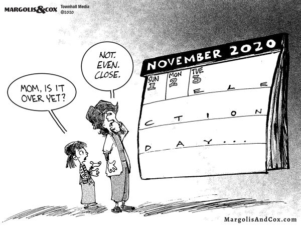
The Odds Against Biden

Steve Cortes writes at the National Pulse The Statistical Case Against Biden’s Win.  Excerpts in italics with my bolds.

Statistics continue to cast real doubt on the probability of a President Trump loss in the election.

The statistical case is, admittedly, circumstantial rather than conclusive.

But the numbers also firmly point to the intense improbability of the accuracy of the present Biden lead. The statistical case provides more than enough reasonable suspicion to require hand recounts and immediate investigation into fraudulent activities, including the new damning revelations of on-the-record whistleblowers.

There are four key elements to the numerical thesis:

1. TURNOUT

Clearly, high turnout was expected in an intensely political year with vastly expanded access to mail-in voting. But the kinds of numbers reported simply defy reasonable expectations.

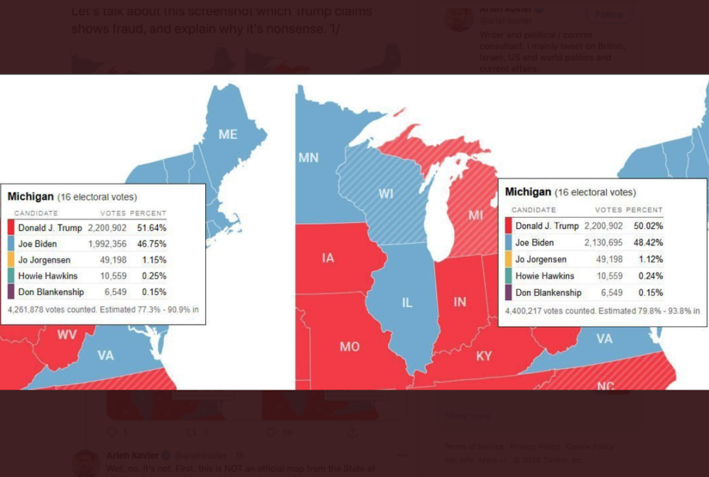
For Wisconsin overall, the turnout was above 90% of registered voters. Even in a state with same-day registration, such a number seems implausible.  After all, in Australia, a place where voting is mandatory, and failing to vote is punishable with stiff fines, the total turnout for the most recent election was still only 92%.

Even more importantly, looking within the Wisconsin vote, the decisive locale for Biden was, unsurprisingly, Milwaukee. Wisconsin’s largest city reported an 84% turnout to secure a 145,916 vote lead there for Biden.  Consider a comparison to another very similar Midwestern city, Cleveland, OH. Milwaukee has a population of 590,000, 67% of them minorities. Cleveland has 381,000 people with 60% of them minorities.

But Milwaukee’s 84% turnout dwarfs Cleveland’s more believable 51% turnout rate. Like many of the suspect statistical trends evident from last Tuesday, the abnormal factors favoring Biden seem only present in the key swing states that Biden allegedly won.

2. OUTPERFORMANCE VS. OBAMA

The breakouts higher for Biden relative to Obama’s performances in key areas simply do not seem credible.  Could a candidate as doddering and lazy as Biden really have massively outpaced the vote totals of a politician who boasted rock star appeal?

For example, consider that in key Pennsylvania counties of Chester, Cumberland, and Montgomery, Biden bested the Obama election performances by factors of 1.24-1.43 times. For Montgomery County, Obama won this swing county by 59,000 votes in his 2012 re-election. But in 2020, Biden won Montgomery County by a whopping 131,000 votes, more than twice the prior Obama margin.

Biden’s 2020 total vote in Montgomery is reported at 313,000, crushing Obama’s 233,000 take in 2012 – and population growth does not explain the gains, as the county only grew by 22,000 residents during those eight years.  Such eye-popping outperformance vs.Obama, in just the right places, naturally raises a lot of suspicion.

3. BIDEN-ONLY BALLOTS

Trump campaign legal counsel Sidney Powell reports that, nationwide, over 450,000 Biden-only ballots were cast, meaning the voter allegedly selected Biden but then neglected down-ballot candidates, including closely-contested Senate and House races.  Again, this phenomenon appears far more prominently in battleground states, raising the alarm for manipulation. Why would so many people vote Biden–only in battleground Georgia, but not in deeply-red Wyoming, for instance?

In the Peach State, President Trump’s vote total almost exactly tracked the vote totals for the Republican senate candidates, separated by merely 818 votes out of 2.43 million votes Trump earned there. But, Joe Biden saw an astounding surplus of 95,801 votes over the Democratic Senate candidates.

By comparison, in Wyoming Biden only registered a surplus “Biden-only” take of just 725 votes over the Democratic Senate candidate there, or about 1/4th his take in in Georgia, on a percentage basis. The Biden-only ballots do not conclusively prove fraud, but they sure reek of something very amiss.

4. ABSENCE OF MAIL-IN VOTE VETTING

Democratic governors clamored for massive amounts of mail-in voting, knowing full well that most states would become overwhelmed and wholly unable to establish the validity and legality of almost all the votes that poured in via mail.

In the case of Pennsylvania, Governor Wolf made such changes unilaterally, in stark violation of Pennsylvania law and in contradiction of the clear US Constitutional assignment of voting regulatory authority to state legislatures, not governors. Governor Wolf’s election boards clearly just accepted the ballots… en masse, without appropriate vetting. 

By their own admission, the scant 0.03% of rejected ballots represents a refusal rate that is just 1/30th the level of 2016 in Pennsylvania.  First-time mail-in voters typically see a rejection rate of about 3% historically, or 100 times the rejection rate of Pennsylvania in 2020.

When neighboring New York state moved to widespread mail-in voting this summer, their election officials rejected 21% of mailed ballots in June, representing a rate 700 times higher than Pennsylvania’s. This total lack of filtering or controls raises enormous suspicion regarding a seriously-tainted ballot pool in the Keystone State.

RIGGED?

The statistical case, in isolation, does not prove fraud. But the confluence of highly unlikely results does, emphatically, paint of picture of utter improbability.

Any one of these four factors alone would cast intense doubt upon election results.

Put all four together, and the result is a seemingly impossible statistical perfect storm.

To use a sports analogy, it would be a team pitching a perfect game in the World Series.

Not one game, nor two…but in all four games to “sweep” via pitching perfection.

Is it possible?  Theoretically, sure. Is it probable?

Hell no – and so, we must commence with a vigorous audit as the future of our republic hangs in the balance.

Oct. Ocean Air Temps Steady, Despite NH Storm Spike

banner-blog
With apologies to Paul Revere, this post is on the lookout for cooler weather with an eye on both the Land and the Sea.  UAH has updated their tlt (temperatures in lower troposphere) dataset for October 2020.  Previously I have done posts on their reading of ocean air temps as a prelude to updated records from HADSST3. This month also has a separate graph of land air temps because the comparisons and contrasts are interesting as we contemplate possible cooling in coming months and years.

Presently sea surface temperatures (SST) are the best available indicator of heat content gained or lost from earth’s climate system.  Enthalpy is the thermodynamic term for total heat content in a system, and humidity differences in air parcels affect enthalpy.  Measuring water temperature directly avoids distorted impressions from air measurements.  In addition, ocean covers 71% of the planet surface and thus dominates surface temperature estimates.  Eventually we will likely have reliable means of recording water temperatures at depth.

Recently, Dr. Ole Humlum reported from his research that air temperatures lag 2-3 months behind changes in SST.  He also observed that changes in CO2 atmospheric concentrations lag behind SST by 11-12 months.  This latter point is addressed in a previous post Who to Blame for Rising CO2?

HadSST3 results were delayed with February and March updates only appearing together end of April.  For comparison we can look at lower troposphere temperatures (TLT) from UAHv6 which are now posted for October. The temperature record is derived from microwave sounding units (MSU) on board satellites like the one pictured above.

The UAH dataset includes temperature results for air above the oceans, and thus should be most comparable to the SSTs. There is the additional feature that ocean air temps avoid Urban Heat Islands (UHI). In 2015 there was a change in UAH processing of satellite drift corrections, including dropping one platform which can no longer be corrected. The graphs below are taken from the latest and current dataset, Version 6.0.

The graph above shows monthly anomalies for ocean temps since January 2015. After all regions peaked with the El Nino in early 2016, the ocean air temps dropped back down with all regions showing the same low anomaly August 2018.  Then a warming phase ensued peaking with NH and Tropics spikes in February, and a lesser rise May 2020. As was the case in 2015-16, the warming was driven by the Tropics and NH, with SH lagging behind.

Since the peak in February 2020, all ocean regions have trended downward in a sawtooth pattern, returning to a flat anomaly in the three Summer months, close to the 0.4C average for the period.  A small rise occurred in September, mostly due to SH. Now in October NH spiked, coincidental with all the storm activity in north Pacific and Atlantic.  The global anomaly declined slightly due to dropping temps in SH and Tropics.

Land Air Temperatures Showing Volatility

We sometimes overlook that in climate temperature records, while the oceans are measured directly with SSTs, land temps are measured only indirectly.  The land temperature records at surface stations sample air temps at 2 meters above ground.  UAH gives tlt anomalies for air over land separately from ocean air temps.  The graph updated for October 2020 is below.


Here we see the noisy evidence of the greater volatility of the Land temperatures, along with extraordinary departures, first by NH land with SH often offsetting.   The overall pattern is similar to the ocean air temps, but obviously driven by NH with its greater amount of land surface. The Tropics synchronized with NH for the 2016 event, but otherwise follow a contrary rhythm.

SH seems to vary wildly, especially in recent months.  Note the extremely high anomaly last November, cold in March 2020, and then again a spike in April. In June 2020, all land regions converged, erasing the earlier spikes in NH and SH, and showing anomalies comparable to the 0.5C average land anomaly this period.  After a relatively quiet Summer, land air temps rose Globally in September with spikes in both NH and SH. Now in October, the SH spike has been reversed, driving down the Global anomaly.

The longer term picture from UAH is a return to the mean for the period starting with 1995.  2019 average rose and caused 2020 to start warmly, but currently lacks any El Nino or NH warm blob to sustain it.

These charts demonstrate that underneath the averages, warming and cooling is diverse and constantly changing, contrary to the notion of a global climate that can be fixed at some favorable temperature.

TLTs include mixing above the oceans and probably some influence from nearby more volatile land temps.  Clearly NH and Global land temps have been dropping in a seesaw pattern, NH in July more than 1C lower than the 2016 peak.  TLT measures started the recent cooling later than SSTs from HadSST3, but are now showing the same pattern.  It seems obvious that despite the three El Ninos, their warming has not persisted, and without them it would probably have cooled since 1995.  Of course, the future has not yet been written.

Pfizer Covid Vaccine Looking Good

Zachary Stiebera writes at Epoch Times Pfizer’s COVID-19 Vaccine Effective, Early Data Indicates.  Excerpts in italics with my bolds

COVID-19 vaccine candidate proved strongly effective in a large phase 3 study, according to results released on Nov. 9.

The results were termed as the first interim efficacy analysis and included 94 patients who had confirmed cases of COVID-19, the disease caused by the CCP (Chinese Communist Party) virus.

The results were analyzed by an independent data monitoring board. They indicate an efficacy rate above 90 percent at seven days after the second dose, New York-based Pfizer and German biotechnology company BioNTech said. That means protection is achieved 28 days after the first vaccine. The vaccination schedule is two doses.

No serious safety concerns were reported in the interim results.

Today is a great day for science and humanity. The first set of results from our Phase 3 COVID-19 vaccine trial provides the initial evidence of our vaccine’s ability to prevent COVID-19,” Dr. Albert Bourla, Pfizer chairman and CEO, said in a statement.

“The first interim analysis of our global Phase 3 study provides evidence that a vaccine may effectively prevent COVID-19. This is a victory for innovation, science and a global collaborative effort,” added professor Ugur Sahin, BioNTech co-founder and CEO.

The phase 3 trial started on July 27 and has enrolled over 43,000 patients to date.

Nearly 39,000 have received the second dose as of Nov. 8.

There are currently no approved vaccines for the CCP virus. Dozens are in development around the world.

Vice President Mike Pence called the development “HUGE News,” adding: “Thanks to the public-private partnership forged by President @realDonaldTrump, @pfizer announced its Coronavirus Vaccine trial is EFFECTIVE, preventing infection in 90% of its volunteers.”

The U.S. government reached a deal with Pfizer and BioNTech in July, agreeing to pay $1.95 billion for the first 100 million doses of BNT162, the vaccine candidate the two companies created.

Dr. Richard Hatchett, CEO of the Coalition for Epidemic Preparedness Innovations (CEPI), which has been helping fund various vaccine candidates, said the results were highly positive.

“We believe these interim results also increase the probability of success of other COVID-19 candidate vaccines which use a similar approach [pre-fusion spike as their immunogen], including all of the vaccines in the CEPI portfolio,” he said in a statement.

“If the final longer term analysis of the study data confirms this result, and if no safety issues are identified in the trial participants, this vaccine candidate will be able to seek regulatory approval.”

COVID Fearmongering With ‘Cases’ of Perfectly Healthy People

John Carpay writes at Epoch Times COVID Fearmongering With ‘Cases’ of Perfectly Healthy People. Excerpts in italics with my bolds.

Across Canada, provincial governments are imposing new lockdown restrictions that violate the Charter freedoms of Canadians to move, travel, assemble, associate and worship.

Like other provinces, Manitoba relies on COVID-19 “cases,” which include perfectly healthy people who show no symptoms of any illness, to justify the violation of Charter freedoms.

Winnipeg is merely one victim, with the government having closed movie theatres, concert halls, sports facilities, restaurant dining rooms, casinos, museums, libraries, and galleries as of Nov. 2. Citizens lack the freedom to gather in groups larger than five.

Contrary to World Health Organization recommendations, they must wear masks while exercising at gyms. Children, who face essentially no risk of harm from the virus, are to be kept in a state of fear through two-metre physical distancing at schools. Contrary to what is obviously good for public health, all group sports are prohibited, and non-emergency surgeries and diagnostic procedures have been suspended.

When it comes to shaping laws and policies, context should matter. In Manitoba over 11,000 people die each year; for the year ending June 30, 2020, it was 11,266 to be precise, according to statista.com. In the context of 11,266 deaths, 75 people have died of COVID-19, which is less than 1 percent of deaths. These 75 deaths are very sad, and so are the other 11,191 deaths from cancer, cancelled surgeries, alcoholism, drug overdoses, suicides, and other causes.

In Manitoba and elsewhere, COVID-19’s impact on life expectancy is negligible, because this virus primarily targets elderly people who are already close to death because they are sick with heart disease, emphysema, diabetes, and other serious illnesses.

How many Manitobans have died, and how many will die, because of lockdown measures?

It’s not something that Chief Provincial Public Health Officer Dr. Brent Roussin talks about. He and the politicians blithely assume, without evidence, that lockdowns do more good than harm. The number of lockdown deaths from cancelled surgeries, delayed cancer diagnosis, drug overdoses, and suicides is not yet fully known, but will likely exceed the number of COVID-19 deaths. In the United Kingdom, delays in cancer diagnosis have led to thousands of avoidable deaths and more than 59,000 years of life lost, according to a Lancet study.

The fact that death is a painful, inevitable part of life should not prevent us from taking a hard look at government policies, especially policies that might be taking more lives than the number of lives being saved.

Seven months ago, Canada’s provincial and federal governments joined other jurisdictions in accepting the predictions of Neil Ferguson of Imperial College London, who said that COVID-19 would kill millions of people. Some politicians and chief medical officers claimed that COVID-19 poses a serious threat to children, youth, and young adults, thereby ramping up the fear.

This fearmongering caused Canadians to accept significant restrictions on their Charter freedoms to move, travel, assemble, associate and worship, all for the worthy goal of “saving lives.” Lockdown harms, such as increases in drug overdoses and suicides, have been ignored or accepted, as if dying of COVID-19 is somehow worse than dying of another cause.

Media continue to hype “cases” and warn of a “second wave.” Curiously, media rarely mention the fact that COVID-19 deaths peaked in April and May, then declined drastically in June, with further declines in July and August. Government data tells us that the number of deaths in September and October is nowhere near the numbers we saw in April and May. In every province, the government’s own data shows that there is no second wave of COVID-19 deaths.

Our Charter freedoms are violated on the basis of “cases” of COVID-19. Prior to lockdowns, the word “cases” referred to people who are actually sick. But today’s “cases” include completely healthy people who simply had a positive PCR (nucleic acid-based) test, the reliability of which is in dispute, with the number of false positives as high as 90 percent.

According to a National Post article, the “reverse transcription polymerase chain reaction test, or RT-PCR — is so sensitive it can pick up debris from an old infection.” The PCR test detects genetic material as well as live virus, meaning it can be positive after the person has cleared the live organism. The article goes on to claim that “provinces are encouraging mass testing using a hyper-sensitive test that’s churning out daily case numbers, the implication being that a case always equals an active infection equals a person capable of spreading to others.” But Dr. Vanessa Allen, chief of medical microbiology at Public Health Ontario, states that “PCR picks up dead organism that is not infectious.”

As Harvard University’s Dr. Michael J. Mina explains it in the New England Journal of Medicine: “Most infected people are being identified after the infectious period has passed,” such that “thousands of people are being sent into 10-day quarantines after positive RNA tests despite having already passed the transmissible stage of infection.”

According to Dr. Jared Bullard, associate medical director of Cadham Provincial Laboratory in Winnipeg, any virus that is being picked up beyond 25 cycles is probably leftover genetic material from dead virus.

Even Dr. Anthony Fauci has confirmed that any PCR test result above a cycle threshold of 35 is too high, and only picks up dead nucleotides.

Unsurprisingly, the number of “cases” rises with the number of tests that governments conduct. For example, September saw 28,763 “cases” in Canada, as a result of testing almost two million Canadians. But what really matters is not the “cases” of perfectly healthy people, but rather the fact that 300,000 Canadians die each year, an average of 25,000 per month. In September, 171 Canadians died of COVID-19, while 24,829 Canadians died of other causes.

The 10,000 COVID-19 deaths in Canada in 2020 are not much different from the 8,500 annual flu deaths in Canada in 2018.

We need to reach immunity.  Don’t Fence Us In!

Politicians claim that the lockdowns saved many lives, but they have yet to put forward actual evidence that might support their speculation and conjecture.

With government data on COVID-19 deaths at their fingertips, why do politicians and chief medical officers impose further restrictions on our Charter freedoms? Are they listening to media fearmongering about “cases” while ignoring their own data showing that there is no “second wave” of COVID-19 deaths? Do they realize that their promotion and instigation of unfounded fear serve to generate continued acceptance of Charter violations? Or is it that they have become addicted to control?

See also Clueless Covid Policies

Election Up for Grabs

Johnathon Turley explains the election process at The Hill America should welcome review for close counts. Excerpts in italics with my bolds and images.

We are finishing only the second of four stages in an election for president. After the voting stage, states began the tabulation stage. We will soon enter the canvass stage, in which local districts confirm their counts and face challenges or recounts. Finally, there is the certification stage, in which final challenges can be raised. In other words, Trump is not deceased yet. Biden has reason to claim his lead as the odds are heavily against Trump. One or two states could flip on a “Hail Mary” challenge. But Trump needs four of those to win in a feat that would hyperventilate Aaron Rogers.

[My Comment: Most of the mass media and all of social media actively campaigned for the Biden-Harris ticket so their declarations of victory are the same as those from the candidates themselves.  With so many states heading for recounts and scrutiny of irregularities, the outcome is not yet determined.  After four years of fake news burying and hiding real news, we now have the challenge to sort between fake votes and real votes.

Nor is Trump “unclassy” for not conceding at this point. Democrats and all Americans were surprised the newspapers of record got it wrong in 1948 when Truman prevailed after all four stages of the election.  Nor did Al Gore give up in 2000.  It took 36 days and went all the way to the Supreme Court.  He lost when a crooked election supervisor in Palm Beach county of Florida was found guilty of favoring the Democrat by voiding Bush votes.  As well thousands of military ballots, which favored Bush by a roughly 2-1 margin, were arbitrarily excluded.]

I think he’s referring to “DQ”, meaning DisQualified.

Yet the public should welcome close scrutiny of these swing states. There are valid reasons to examine the figures based on the many unknowns in a new kind of election. The outcome will be determined by millions of mailed ballots in various states, some of which have never used such mailed ballots to this magnitude, and legitimate concerns were raised before the election.

States used rolls that are notoriously out of date and inaccurate. Some changed rules governing signature authentication or are accused of reducing the discrimination levels for machine authentication. In Nevada, the Trump campaign alleged that thousands of votes were cast from out of state and ballots were sent to dead voters. We cannot judge the merits of these claims until we see the evidence. It is difficult to see any problems without greater access to the ballots and the records of tabulation.

Just as some of us remain skeptical of such claims of fraud, it seems as implausible that this untested form of voting was used across the country without major glitches. Officials in cities like Detroit and Philadelphia with histories of election violations said the counts of mailed ballots were almost flawless, a claim difficult to rebut without review.

We need a review of counts in critical states to resolve a crisis of faith. A recent survey found that almost half of Americans lack confidence their ballots will be counted fairly. A Harvard study also found that only half of young black voters believe their ballots are even counted.

This lack of faith in the electoral process has been fueled by the shift to mailed ballots but builds on growing distrust of our political system.

Desire for Power Hiding Behind Health and Climate Concerns

Theodore Dalrymple writes at Epoch Times The Desire for Power Hiding Behind Health and Climate Concerns.  Excerpts in italics with my bolds.

There is a threat of creeping totalitarianism in western societies that comes from health and climate activists. Who (except unfeeling monsters) could possibly be against the saving of human life or the preservation of the planet from future catastrophe? Often the two strands of redemptive enthusiasm go together: after all, environmental degradation is hardly good for health.

Since almost all human activities have health or environmental consequences, especially bad ones, it follows that those who want to preserve either human health or the environment, or both, have an almost infinitely expansible justification for interfering in our lives, indeed they have it to the nth degree.

These days, much medical research that is published in the general medical journals such as the Lancet or the New England Journal of Medicine is epidemiological rather than experimental.

It finds associations between factor a (shall we say, the consumption of bananas) and illness x (shall we say, Alzheimer’s disease).

Once an association is found that is unlikely to have arisen by chance (unlikely, that is, but not impossible), an hypothesis is put forward as to why the eating of bananas should conduce to the development of Alzheimer’s disease. Before long, the statistical association and its alleged explanation leaks out into the press or social media, and people start to be afraid of bananas. The more enthusiastic and less sceptical of the epidemiologists begin to call for banana controls: anti-banana propaganda, extra taxes on bananas, no bananas on sale within a hundred yards of anywhere there might be a child, and so on.

And of course, a reduction in the demand for bananas will assist those tropical countries large parts of which are given over to environmentally-degrading banana monoculture. Banana republics are not called bananas republics for nothing.

Often in the medical literature, the statistical associations are weak: someone who consumes a is, say, 1.2 times more likely to develop disease x than someone who does not. This is described as being a statistically significant increase in risk, but it is not significant in any other humanly important way, especially where the initial risk of contracting the disease is very low in any case. These caveats are often, even usually, missing from not only the scientific literature itself, but from the reports of it that filter into the general public’s awareness.

Not infrequently, sweeping policy changes are proposed on the basis of weak evidence which not only is likely to be superseded in time by new research (though dietary recommendations for the most part they are not very different from those recommended by physicians such as Dr. George Cheyne in the first half of the eighteenth century), but which fail to take into account that health, while an important consideration, is not an all-important consideration, and sometimes must be balanced against others.

For example, it would be easy to reduce the fatal road accident rate to zero by forbidding everyone to leave his house, but this might not be a wise prohibition. Sport is one of the most frequent causes of injury in the western world, yet sport is encouraged because of its other (alleged) benefits.

Good Intentions a Smokescreen

Supposed good intentions are often a smokescreen for an almost sadistic desire to exercise power, or at least influence. A writer of editorials for the influential British newspaper, the Observer, Sonia Sodha, has suggested, for example, that meat should be rationed. She suggests such a measure not because there is a shortage of meat, but because the environmental cost of producing it is too great.

She opposes a tax on it to lower consumption because raising the price would affect the poor more than the rich. The only other solution is to ration it, so that everyone has access to an equal, but small, quantity.

The author is honest enough to admit that she is a hypocrite in the sense that, while she strongly believes meat consumption should decrease in order to save the planet, she will continue to eat it in her accustomed quantities so long as it is available to her. She needs a dictator to get her to do the right thing.

The really striking thing in her article is that she does not consider the kind of apparatus that would be necessary to ration a commodity such as meat. Someone would have to set the ration and many people would have to enforce it.

Evidently, she has never heard of or experienced black markets; nor does she seem to be aware that, where a bureaucracy allocates or distributes goods and services, especially when they are in short supply, privilege flourishes rather than withers.

Nor does she acknowledge that meat is far from the only commodity with a high environmental cost, and that the argument for the rationing of meat could be used for the rationing of many, if not most or even all, commodities.

What the author is proposing, then, implicitly or explicitly, is a kind of communism, in which an administrative class under the direction of an even smaller class of enlightened and informed individuals doles out to the populace what it thinks it ought to have—for its own ultimate good, of course.

The author is certainly intelligent enough to realize that this is the implication or corollary of what she writes (and, to do her justice, she writes very clearly), so one must conclude that a society in which a great deal, if not everything, is rationed first in the name of protecting the environment and second in the name of social justice is one that would be pleasing to her—at least to contemplate in the abstract, if not actually to live in.

That this drastic and very far-reaching scheme is based upon evidence that is itself far from rock-solid or indisputable would probably not worry her very much, because the end result (the theoretical end result, that is, not the end result in practice) is one which she desires a priori: in other words, first the policy, and then the evidence to justify it.

As it happens, more and more young people in western countries are turning to vegetarianism by means of persuasion. I have no objection to this; I think on balance that it is probably a good thing. But no giant state apparatus was necessary to bring this about. It is a change that has welled up from below, not imposed from the top down, and requires no corrupting means of coercion to enforce.

Theodore Dalrymple is a retired doctor. He is contributing editor of the City Journal of New York and the author of 30 books, including “Life at the Bottom.” His latest book is “Embargo and Other Stories.”

Arctic Flash Freezing in November


After concerns over lackluster ice recovery in October, November is seeing ice roaring back.  The image above shows the last 10 days adding sea ice at an average rate of 215k km2 per day.  The Russian shelf seas on the right have filled with ice in this period.  On the CanAm side, Beaufort at the top left is iced over, Canadian Archipelago (center left) is frozen, and Baffin Bay is filling from the north down.  Hudson Bay (far left) has grown fast ice around the edges.  A background post is reprinted below, showing that in just 10 days, 2020 has added as much ice as an average 30-day November.

Some years ago reading a thread on global warming at WUWT, I was struck by one person’s comment: “I’m an actuary with limited knowledge of climate metrics, but it seems to me if you want to understand temperature changes, you should analyze the changes, not the temperatures.” That rang bells for me, and I applied that insight in a series of Temperature Trend Analysis studies of surface station temperature records. Those posts are available under this heading. Climate Compilation Part I Temperatures

This post seeks to understand Arctic Sea Ice fluctuations using a similar approach: Focusing on the rates of extent changes rather than the usual study of the ice extents themselves. Fortunately, Sea Ice Index (SII) from NOAA provides a suitable dataset for this project. As many know, SII relies on satellite passive microwave sensors to produce charts of Arctic Ice extents going back to 1979.  The current Version 3 has become more closely aligned with MASIE, the modern form of Naval ice charting in support of Arctic navigation. The SII User Guide is here.

There are statistical analyses available, and the one of interest (table below) is called Sea Ice Index Rates of Change (here). As indicated by the title, this spreadsheet consists not of monthly extents, but changes of extents from the previous month. Specifically, a monthly value is calculated by subtracting the average of the last five days of the previous month from this month’s average of final five days. So the value presents the amount of ice gained or lost during the present month.

These monthly rates of change have been compiled into a baseline for the period 1980 to 2010, which shows the fluctuations of Arctic ice extents over the course of a calendar year. Below is a graph of those averages of monthly changes during the baseline period. Those familiar with Arctic Ice studies will not be surprised at the sine wave form. December end is a relatively neutral point in the cycle, midway between the September Minimum and March Maximum.

The graph makes evident the six spring/summer months of melting and the six autumn/winter months of freezing.  Note that June-August produce the bulk of losses, while October-December show the bulk of gains. Also the peak and valley months of March and September show very little change in extent from beginning to end.

The table of monthly data reveals the variability of ice extents over the last 4 decades.

Table 1 Monthly Arctic Ice rates of Extent Changes in M km2. Months with losses in pink, months with gains in blue.

The values in January show changes from the end of the previous December, and by summing twelve consecutive months we can calculate an annual rate of change for the years 1979 to 2019.

As many know, there has been a decline of Arctic ice extent over these 40 years, averaging 40k km2 per year. But year over year, the changes shift constantly between gains and losses.

Moreover, it seems random as to which months are determinative for a given year. For example, much ado has been printed about October 2020 being slower than expected to refreeze and add ice extents. As it happens in this dataset, October has the highest rate of adding ice. The table below shows the variety of monthly rates in the record as anomalies from the 1980-2010 baseline. In this exhibit a red cell is a negative anomaly (less than baseline for that month) and blue is positive (higher than baseline).

Note that the  +/ –  rate anomalies are distributed all across the grid, sequences of different months in different years, with gains and losses offsetting one another.  Yes, October 2020 recorded a lower than average gain, but higher than 2016. The loss in July 2020 was the largest of the year, during the hot Siberian summer.  The bottom line presents the average anomalies for each month over the period 1979-2020.  Note the rates of gains and losses mostly offset, and the average of all months in the bottom right cell is virtually zero.

A final observation: The graph below shows the Yearend Arctic Ice Extents for the last 30 years.

Note: SII daily extents file does not provide complete values prior to 1988.

Year-end Arctic ice extents (last 5 days of December) show three distinct regimes: 1989-1998, 1998-2010, 2010-2019. The average year-end extent 1989-2010 is 13.4M km2. In the last decade, 2009 was 13.0M km2, and ten years later, 2019 was 12.8M km2. So for all the the fluctuations, the net loss was 200k km2, or 1.5%. Talk of an Arctic ice death spiral is fanciful.

These data show a noisy, highly variable natural phenomenon. Clearly, unpredictable factors are in play, principally water structure and circulation, atmospheric circulation regimes, and also incursions and storms. And in the longer view, today’s extents are not unusual.


Illustration by Eleanor Lutz shows Earth’s seasonal climate changes. If played in full screen, the four corners present views from top, bottom and sides. It is a visual representation of scientific datasets measuring Arctic ice extents.

SCOTUS Goes Full Nanny State

Seeking some comic relief from the US election fiasco, I turned to Babylon Bee and found this satirical piece skewering leftist fears about the US Supreme Court with ACB confirmed. (Just this week Pelosi declared that ACB is an “illegitimate” justice”.)  Give the BB writers credit for flipping leftist control-freak behavior into rulings constraining personal rights and freedoms, but in the opposite direction.

The article is Frightening: Here Are The 23 SCOTUS Decisions Handed Down Since ACB Was Sworn In.  Excerpts in italics with my bolds.

Since Amy Coney Barrett was confirmed to the Supreme Court, she and the other judges have wasted no time in remaking America in their image. This is what we were warned about. In only two days, 23 landmark cases have been decided by the new conservative Supreme Court. God help us all.

  • United States v. Trump, 6-3 ruling — Determined that Trump has already won reelection
  • Walsh v. Dweedlestein, 5-4 ruling — We are to be a theocracy under God
  • United States v. Trump, 5-4 ruling — Trump is now the Galactic Emperor Of Man
  • Acosta v. Elisha, 9-0 ruling — All journalists shall be thrown into a pit with a she-bear
  • Gorka v. Kagan, 5-4 ruling — All justices must now wear MAGA hats
  • Subway v. Hebrew National, 6-3 ruling — A hotdog is now legally classified as a sandwich
  • Amazon v. Smith, 6-3 ruling — Die Hard is now legally classified as a Christmas movie
  • Gates v. Cook, 7-2 ruling — .GIF must now be pronounced with a hard “G”
  • American Airlines v. Moore, 6-3 ruling — The person in the middle seat of an airplane gets both armrests
  • Casey v. Brown, 6-3 ruling — Washing your feet in the shower is unconstitutional
  • United States v. West, 5-4 ruling — The dress is blue and black
  • United States v. Barrett, 6-3 ruling — All women must have at least 7 children
  • Papa Johns v. Tony’s, 5-4 ruling — All pizzas must now have pineapple on top
  • United States v. Silverman, 9-0 ruling — Annoying celebrity videos telling you to vote are now illegal
  • Bartolli v. Xanderatrix, 5-4 ruling — Single women are now limited to only 3 cats
  • Taco Bell v. Chad, 9-0 ruling — All Taco Bells must put the Crunchwrap back on the dollar menu
  • United States v. Trump, 5-4 ruling — Everyone must have a Christopher Columbus Statue in their yard
  • LaPierre v. Morgan, 6-3 ruling — Gun ownership is now mandatory
  • United States v. Crystal Marina, 9-0 ruling — Grants McConnell Protected Status as an endangered turtle
  • United States v. Trump, 6-3 ruling — All faces on Mt. Rushmore must now be replaced by Trump
  • Babylon Bee v. Facebook, 9-0 ruling — Babylon Bee no longer allowed to tell jokes about AOC
  • Burger King v. Carson, 5-4 ruling — “Impossible Meat” now illegal
  • Thomas v. Breyer, 8-1 ruling — In favor of stealing Justice Breyer’s milk money and shutting him in a locker

Amazing. Let’s see what they come up with next week!

There’s more:

Experts Call For 15 Days Of Counting To Flatten The Curve Of Votes For Trump

Fox News Calls Arizona For Biden After 1 Vote Counted

Miracle: Ballot Counter Turns 5 Biden Votes Into 5,000


Stalin’s Wisdom

John Daniel Davidson writes at The Federalist Yes, Democrats Are Trying To Steal The Election In Michigan, Wisconsin, And Pennsylvania Excerpts in italics with my bolds.

In the three Midwest battleground states, vote counting irregularities persist in an election that will be decided on razor-thin margins.

As of this writing, it appears that Democratic Party machines in Michigan, Wisconsin, and Pennsylvania are trying to steal the election.

Something strange happened in the dead of the night. In both Michigan and Wisconsin, vote dumps early Wednesday morning showed 100 percent of the votes going for Biden and zero percent—that’s zero, so not even one vote—for Trump.

In Michigan, Biden somehow got 138,339 votes and Trump got none, zero, in an overnight vote-dump.

When my Federalist colleague Sean Davis noted this, Twitter was quick to censor his tweet, even though all he had done was compare two sets of vote totals on the New York Times website. And he wasn’t the only one who noticed—although on Wednesday it appeared that anyone who noted the Biden vote dump in Michigan was getting censored by Twitter.

It turns out, the vote dump was the result of an alleged typo, an extra zero that had been tacked onto Biden’s vote total in Shiawassee County, Michigan. It seems the error was discovered only because Davis and other Twitter users noted how insane and suspicious the vote totals looked, and demanded an investigation that uncovered what was either a typo or an incredibly clumsy attempt to boost Biden’s vote count.

There was also something suspicious about the vote reporting in Antrim County, Michigan, where Trump beat Hillary Clinton by 30 points in 2016. Initial vote totals there showed Biden ahead of Trump by 29 points, a result that can’t possibly be accurate, as plenty of journalists noted.

Then another mysterious all-Biden vote dump happened in Wisconsin. Biden miraculously overcame a 4.1-point Trump lead in the middle of the night thanks to vote dumps in which he got—you guessed it—100 percent of the votes and Trump got zero.

Unless election officials in Michigan and Wisconsin can explain the overnight vote-dumps and, in Michigan, the “typo” that appeared to benefit Biden, and Pennsylvania officials can explain their rationale for counting ballots with no postmark, the only possible conclusion one can come to right now is that Democrats are trying to steal the election in the Midwest.

US Conflicted over Green Energy

Joel Kotkin writes at Real Clear Energy Democrats’ Energy Dilemma.  Excerpts in italics with my bolds.

The biggest challenge facing a putative first-term Joe Biden administration and the Democratic Party may lie with energy policy, where gentry and green wishful thinking confront the daily realities of millions of middle- and working-class Americans.

Democrats could choose a climate policy that allows for gradual change – for example, transitioning from coal to natural gas – and consider the feasibility of smaller and safer nuclear plants, while keeping the productive economy afloat. But Biden, despite some wriggling about fracking on private land, just last week committed himself to the gradual eradication of the fossil fuel industry. His running mate, Senator Kamala Harris, is beloved by California’s extremist greens.

Already, in anticipation of a Democratic sweep, utilities are putting some natural gas projects on hold – threatening a powerful growth engine in places like Pennsylvania and Ohio. If Biden continues to embrace the basic thrust of the Green New Deal, if not its full-bore socialist program, the impact could be devastating for manufacturing areas that compete with China, which depend largely on natural gas, coal, and nuclear power to keep costs down. These state economies cannot fantasize, as some do in California, that the resulting social costs will be paid for by the wealthy digerati; lacking sufficient numbers of the rich and famous, these states will be hit hard, and fast.

If, as seems likely, victorious Democrats enact legislation broadly derived from the Green New Deal, major blowback – and economic disruption – seems inevitable. Biden and Harris have been almost comically inconsistent in their statements about fracking, but they’re certainly hostile to it: if they win the White House and pursue a ban, it would likely drive higher prices for energy, reduce national energy self-sufficiency, and cause massive job loss among a large number of Americans, particularly in key states like Ohio and Pennsylvania.

The critical gentry-green alliance

Energy effects so many other things – our daily bills, whether an employer locates in our town, our already-frayed economic mobility – and is thus a far broader issue, in terms of its consequences, than, say, abortion or race reparations, which often appeal to limited, albeit passionate, constituencies. Energy policy is certain to fracture the Democrats along ideological, class, and geographic lines.

In the past, Democrats tried to appeal to workers and communities connected to the oil and gas industries. Over the past decade or so, these constituencies have generally expanded; they tend to be unionized and well-paid. Yet today, organizations like the Oil, Chemical and Atomic Workers, once a militantly left union, have far less influence on Democratic politics, while the Sierra Club and its allies among the tech oligarchs and, increasingly on Wall Street, have much more.

You don’t have to be Karl Marx to see the reasons why financial and tech moguls support a restrictive energy regime despite the challenges posed by the high cost and intermittent nature of renewable energy. Being “green” is great if you make such stupendous profits that a few million more dollars in energy costs won’t make much difference to your bottom line. And besides, both Wall Street and the tech moguls have become heavy investors in “green” energy schemes that, due to subsidies and tax breaks, guarantee virtually assured profits.

The “Brahmin left” – as economist Thomas Picketty puts it – benefits politically and economically from centrally imposed scarcity, under the pretext of “human survival.” These interests – notably the tech elites – have lined up massively behind Biden’s exceedingly well-funded campaign. Long before they settled on Biden, Kamala Harris, as California attorney general, was an aggressive enforcer of California’s often-draconian climate and planning laws.

Class warfare by other means

In adopting an ultra-green perspective, Democrats have made a choice to favor their backers among the fantastically rich and on Wall Street, who can use green investments to correct their increasingly low standing among the masses. Get rich, go green – and preen. Tech elites and their Wall Street allies – as opposed to populists like Bernie Sanders and Elizabeth Warren – were clear winners of the Democratic primaries.

Whatever its derivation, the green energy agenda doesn’t harmonize easily with the notion of Democrats as the “party of the people.” It represents a direct threat to the party’s once-vital working-class base. In the past, Democratic voters came in large part from the working class. Today, Democrats do better among well-educated “knowledge workers” and the prestigious companies that employ them. This leads some progressives to believe that white working-class voters are no longer critical to the party’s chances.

This voting bloc is shrinking, true, but it still constitutes as much as 44 percent of the electorate, Democratic strategist Ruy Teixeira points out. These voters provided a critical boost to President Obama’s electoral success and later to Donald Trump’s. Teixeira argues that the Democratic focus on cultural and green issues, as opposed to more lunch-bucket concerns, has limited appeal to the working class. Certainly extreme environmental policies, as seen in California, hurt poor and minority populations – and electric-car production and solar plants pose their own, though rarely reported, environmental problems.

Middle- and working-class voters may say that they want a cleaner climate – and most do want something done about climate change – but generally, they consider environmental issues low priority, and they tend to be skeptical of the costs associated with ambitious programs like the Green New Deal. Democrats may feel that minorities will support anything the party proposes as long as racism is invoked, but “people of color” are also people with their own economic interests and families to support.

Today, barely 58% of all working-class Americans are white. According to a 2016 Economic Policy Institute study, nonwhites will become the majority of the working class by 2032. In Green New Deal states like California, policies have increased “energy poverty” and taken away good blue-collar jobs, particularly for the heavily Latino working class.

Regional challenge

Energy policy is unlikely to turn California and most coastal states red (unless you’re using the traditional political meaning of that color). The potential havoc is clearer, though, in parts of the country where low energy prices and production are primary elements of the economy. One can only imagine the damage to the Democratic Party when, despite promises to the contrary, Biden and his presumed heir Harris eventually find a way to “ban” through regulations fracking in places like Texas, North Dakota, Ohio, West Virginia, and Pennsylvania. In Texas alone, by some estimates, 1 million jobs would be lost. Overall, according to a Chamber of Commerce report, a full ban would cost 14 million jobs, far more than the 8 million lost in the Great Recession.

The effects will be particularly severe in the Rust Belt, still the fulcrum of American politics. Trump may be underperforming in high-end suburbs, but he’s still doing well in once-Democratic parts of the Midwest, such as Minnesota’s mining country. Beyond the extractive industries, far bigger sectors – logistics, agriculture, and manufacturing – would face serious problems with intermittent and expensive “green energy,” as a recent MIT report suggests. These policies have already been tied to persistent blackouts in California that forced the Golden State to depend on imported energy and delayed its planned decommissioning of gas plants.

These realities may not be enough to save Donald Trump at the polls, but over time, they could further alienate voters in a broad swath of states that generally determine the country’s political future. Ultimately, the test for Joe Biden, and his party, lies in the old union slogan: “Which side are you on?” If Democrats adhere blindly to California’s Ecotopian absolutism, glasses may clink at Davos, on Wall Street, and in San Francisco, but “the party of the people” will surrender its historic legacy – perhaps permanently.