Yes, We Will Avoid a Climate Catastrophe.

At Quora someone posed this question: Will we avoid a climate catastrophe just in time (please be positive I need some hope)?
Paul Noel ,Former Research Scientist 6 Level 2 UAH (2008–2014) wrote this response. Excerpts in italics with my bolds and added images.
I have researched this issue in depth. As a good scientist I have gone deeply and gotten the facts. I have gotten:
- the Satellite data on the global profiles,
- the weather data.
- the storm data and disaster data
- the polar ice data.
- the historical data.
I have looked in deeply on this issue. I have studied the physics too! I have studied the history too! I have studied the archeology and even the paleo geology and even the ice core data.
This isn’t easy to get because lots of people are producing lies on the topic. So I have worked very hard to get down to the facts. Then the job becomes one which is very hard. If I just tell you the answers I got , it is a case of if you believe me or not. If I tell you the science data it is likely to get way in over your understanding and that is back to if you believe me or not. This is a job of explaining to you very carefully what the data is using things you can see and understand.
So taking this from the top there are 2 ways I can go.
One way is to go into the advocates of the topic that are so scaring you deeply
and the other is to go into the science.
The explanation of the science is pretty easy and such but explaining to you the motives of people and their actions and methods is much harder. But I am going to start with the people.
Why are they scaring you about the climate?
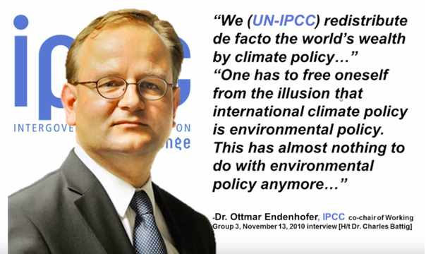
Climate policy has almost nothing to do anymore with environmental protection, says the German economist and IPCC official Ottmar Edenhofer.
This is what this is all about. There is no other motive. You may dispense with your worries here if you are worried for the world environment. But I will now switch to the facts and reality on the ground. Remember this alone should pretty much put an end to your worries. You are facing a very large deliberate well funded and most professionally constructed set of lies and propaganda designed to get you scared like you are. This is 5th generational warfare. It is not anything you are used to thinking about. That is why it is effective.
What are the climate facts on the ground?
The fact on the ground are that if the changes you are supposing to see are real they should be obvious. They should be something you can see, feel, hear and touch. That is where we are going right now!
If the world is warming up the paleo-climate data says that the polar regions warm first. That is what you are being told about arctic ice melting and sea level raise. If you go to the Denmark Polar Portal on the web you can get the data.
Greenland Ice Sheet is not Melting Away
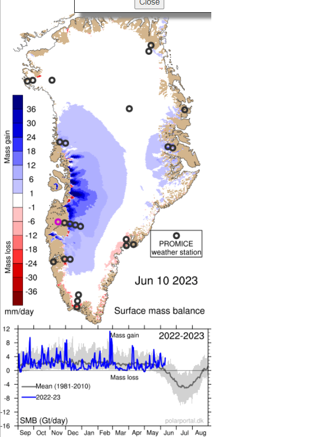
Because these people have to comply with the IPCC they put in all kinds of disclaimers trying to keep you scared of melt down etc.. The reality is we are solidly into the melt season and the ice is not melting down more than usual.
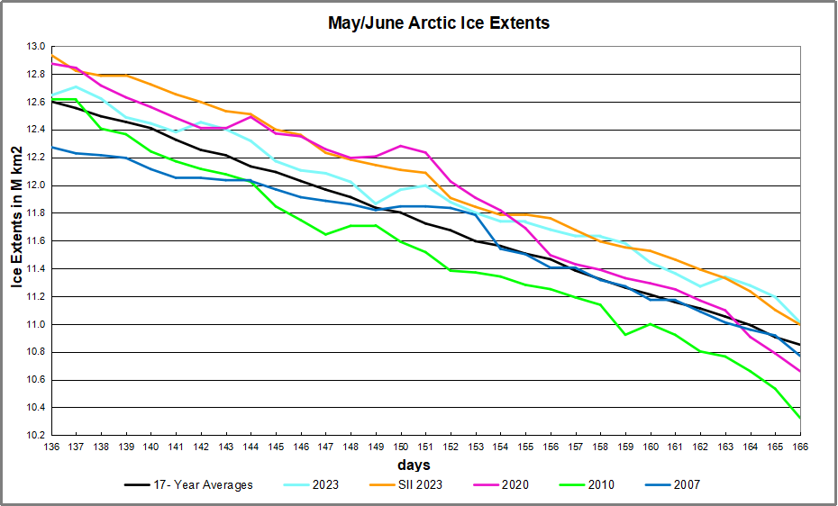
Arctic Sea Ice Is Not Going Away
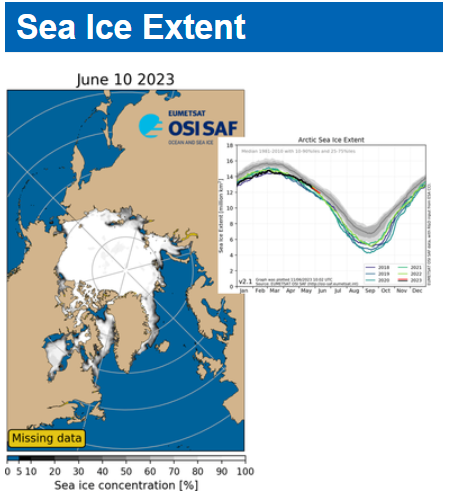
The polar ice is at normal levels. I can go on and on here but the reality is that there is no emergency.
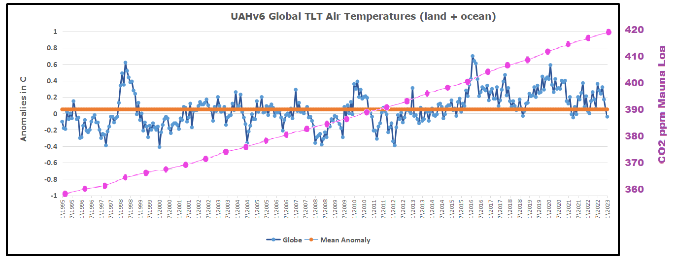
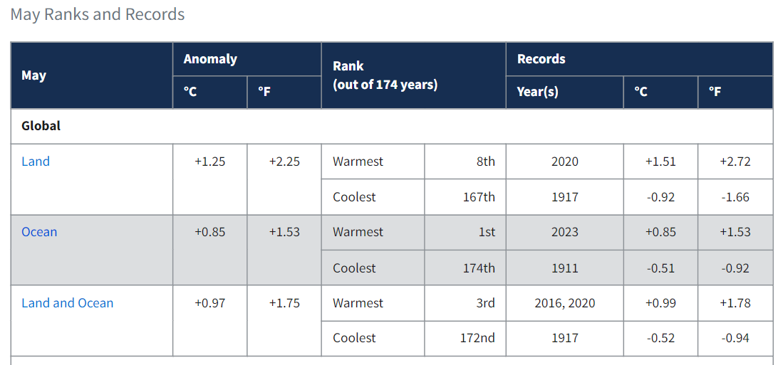
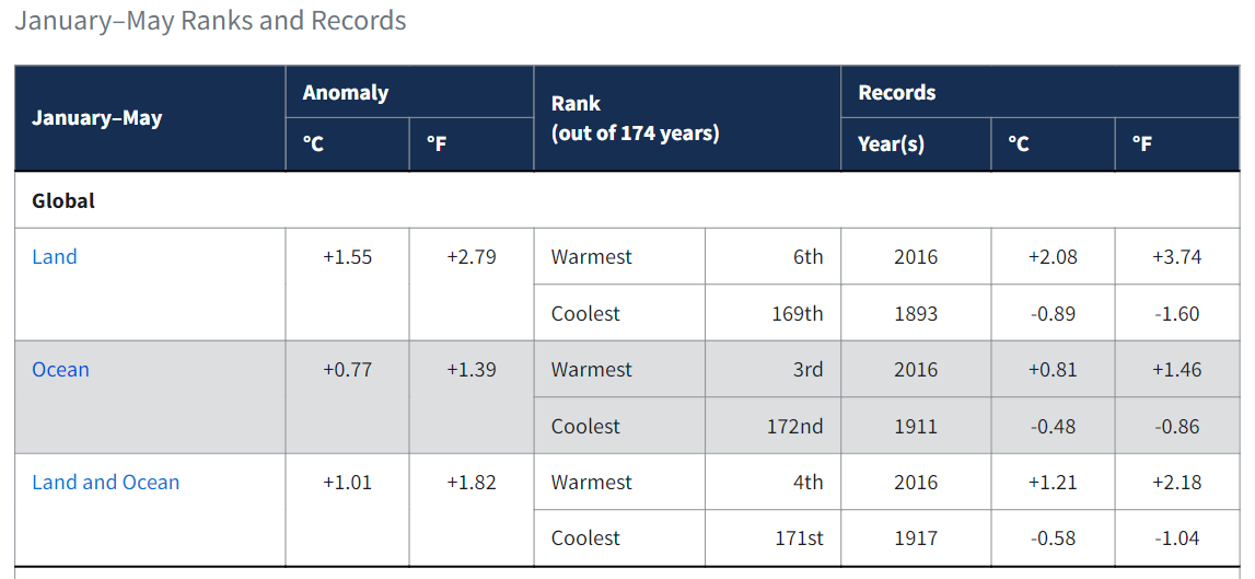
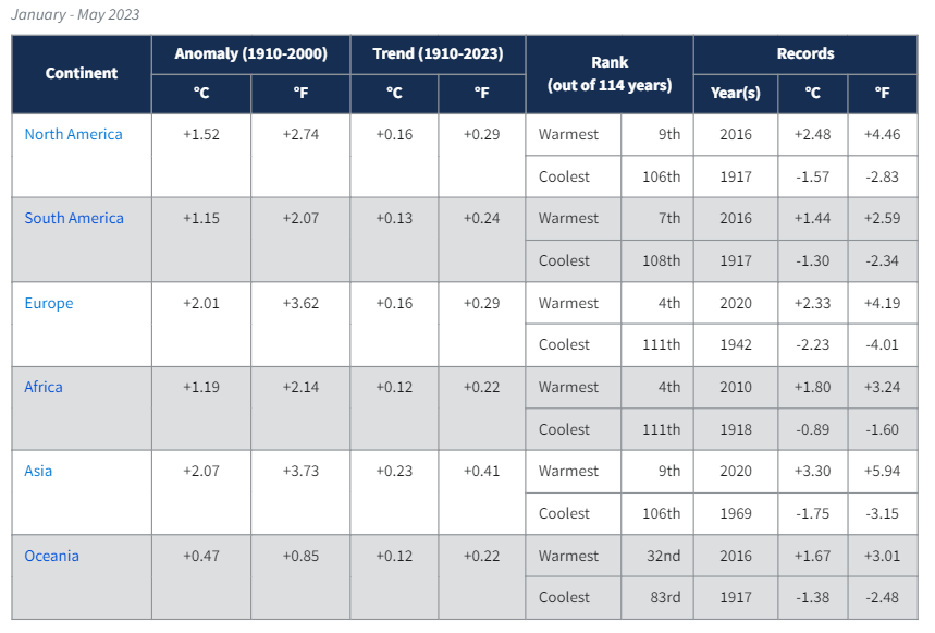
Global Warming is Not Accumulating
The data from UAH which is technical showed from January 1995 to January 2023 the global temperature did not increase at all. And from 2016 actually went down (-0.7C) . That isn’t some melting or Global Warming or some Climate Catastrophe. It just is not.
CO2 Is Rising But Far Below Its Optimum
Is CO2 rising it sure is and it isn’t even to the maximum level that occurred in the last maximum in the last interglacial period of earth. CO2 is not 1% it is 0.042%. The earth has thrived with maximum life at 1% CO2 there are no melt down periods.

Is the climate variable, You bet it is. We have seen in the last 2000 years it go up and down in temperature and we are actually near the bottom of that period. The reality is that we have been up to 10C warmer and guess what that time mankind did his very best. We don’t thrive on cold.
Warming Has Been Beneficial and More Would be a Good Thing
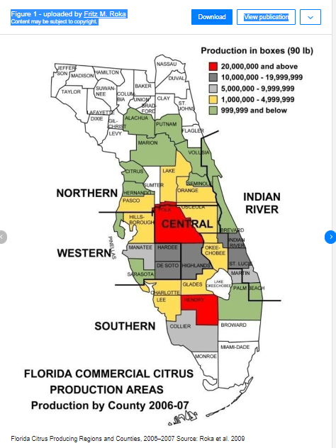
Now let’s look at the trends and in a way you never imagined. I have looked into this matter because Alabama where I live has a cute lovely vacation town called Orange Beach. I highly recommend Orange Beach for a vacation it is beautiful. Orange Beach was named in 1898 when the US Post Office (Now the USPS) opened a new post office there. The unincorporated town’s principal business was raising oranges commercially. Alabama used to raise oranges up to about Evergreen Alabama or almost to Montgomery Alabama the state capitol.

Production of Oranges Limited by Freezing Temperatures in SE US
No commercial orange production exists in Alabama at this time. The reason is simple. The growing season in Orange Beach Alabama went from 365 days a year to 268 days a year. The orange trees froze out. Now they have new varieties that can grow in the colder weather but even they are severely limited in Alabama. The orange trees have frozen out almost to Orlando Florida now.
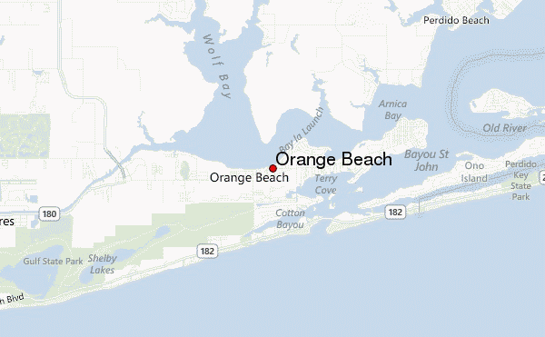
Orange beach would be right next to North Florida along the Gulf of Mexico. Literally Florida is just across the Perdido River from Orange Beach.
The Gulf Stream Makes Climate Change in the North Atlantic
The reality is the climate from 1898 to the present has gotten colder in the USA. This is significant to the whole earth for a very important reason.
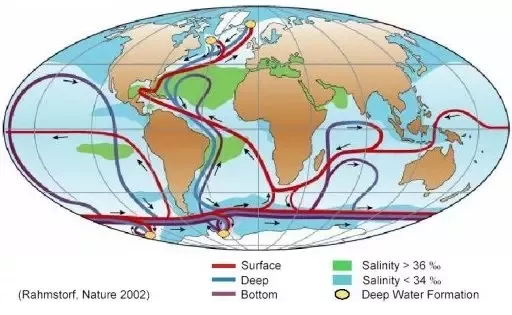
You see the heat from the whole earth gets aimed directly at Alabama! We cool down so is the rest of the world. The whole circulation for the whole earth focuses on the Gulf of Mexico and Alabama.
This by the way is why Greenland has so much ice. You see it is the warm water from the Gulf Stream that generates the steam that freezes and comes down as snow. You have to make the steam to make the ice.
Sea Level Depends on Land Buoyancy, not CO2
Now on to sea level rise. First of all if you believe that the sea level is rising and such it is only reported to be rising in the order of the thickness of 2 US 5 Cent coins per year. So if you believe it is happening it is no emergency and no real problem. It isn’t worthy of losing sleep over. The stories of melting sea ice are silly. First of all even if they melt they will have absolutely no effect on the sea level because they are floating. But there is another thing these people don’t tell you about.
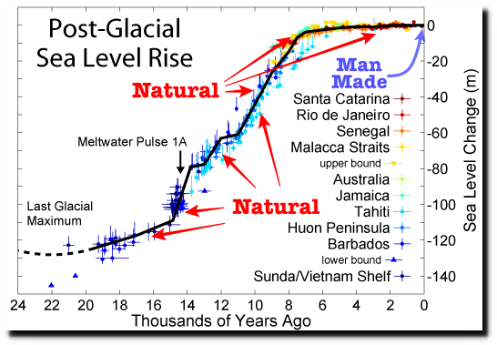
The sea level is not the product of the amount of water in the ocean. It is in fact the product of a large sum of buoyancy issues and the gravity of the earth. The continents are where they are because they have less gravity than the other areas. The seafloor is a zone of higher gravity. Because the continents are floating that means that their level above the sea is determined by the laws of buoyancy. If Greenland were to melt off, the resulting reality would cause the area to buoy up because it would weigh less. At the same time the water added to the oceans would simply sink the sea floor deeper.
Continents Can Sink to Form New Seas
But to illustrate this you must learn about the Great Rift Valley of Africa. That valley is a place where the base continental rocks have spread apart. The land is sinking there and has already sunk to form the Red Sea! A new ocean is forming in Africa. This is what has sunk the continental shelves of the continents. The edge of the continents tinned out and lost the thick granite below that floats on the magma and they sunk. So sea level is not in any way related to ice melting. Sea level is related to this continental buoyancy issue. So nothing in their story not melting ice nor rising seas is happening. But I will show you this in pictures because we have these now.
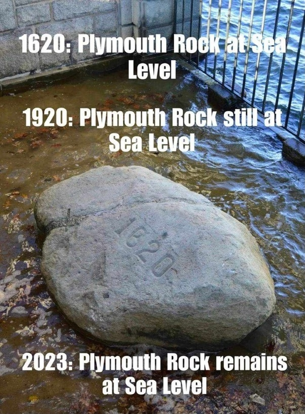
Many Coastlines Show Water Receding Rather than Rising
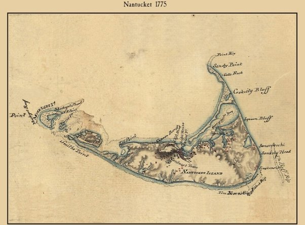
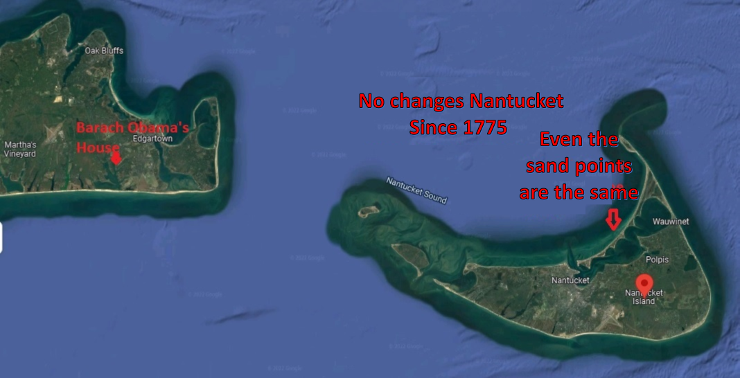
Tell me if you see any sea level rise in the past 246 years now. (None!)
[Since we are looking in New England:]
This is just about due south of London–Pevensey Castle.
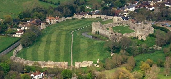 It was started construction in about 203 AD. It was built right on the sea on a coastal island. Such a fort only has value as far as an archer can shoot an arrow. It guarded the entrance to Pevensey Bay. The bay doesn’t exist it is nearly 30 meters above sea level now. Lots of people just refuse to see them. The fort itself is 110 feet above sea level and 5/8 mile from the sea.
If it isn’t clear yet that you have been hoaxed into a panic I don’t know what I can do. I have shown you that it got colder not warmer. That the ice is not melting. That the seas are not rising. Shall I go on?
CO2 Is Plant Food not a Pollutant
How about the real truth of CO2 and what it is doing on our earth. Look at these pictures carefully they tell the truth beyond any possible doubt.
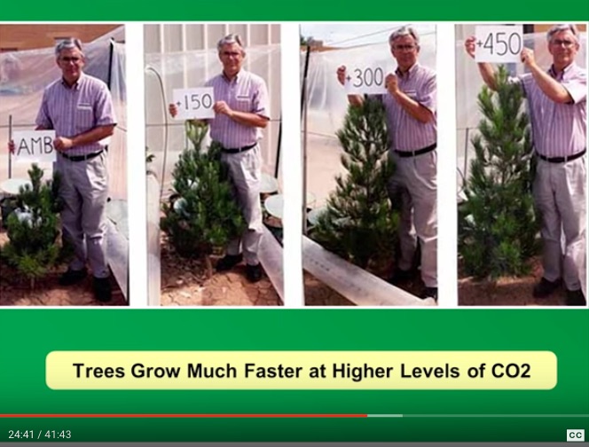
C3 photosynthesis plants are growing 800% better than they were. Our C4 plants are doing 650% better.
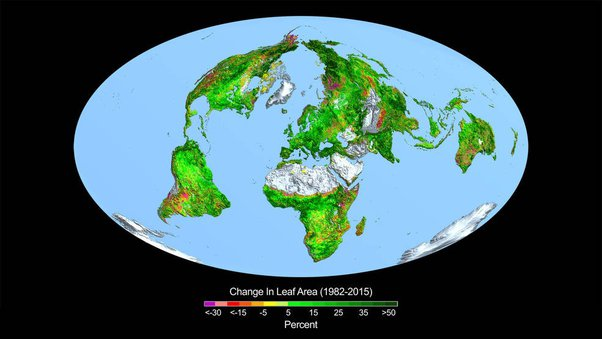
The whole earth is growing better and the forests are growing because of CO2. Sorry this isn’t a “doom and gloom” story here.
Wild fires are down too!
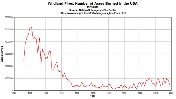
The fact is that in 1960 the world was running out of food because our plants and farms were at their limits. Today we are run over with food and 45% of our crop land has been turned back to the forests. We are not at the limits. This has led to an explosion of wildlife too!
Life is Thriving Not Facing Extinction
There literally is no mass extinction going on. We are in the largest bloom of life on earth that has been seen in the past 10,000 years.
The human race is on the edge of unlimited energy, unlimited food, unlimited technology and we are sitting here in terror of some imaginary doom and gloom hating the very system that is feeding mankind and building him up.
Everything is quite literally the opposite of what you are told!
In Sum;
The only catastrophe would be ill-advised climate policies willfully destroying
our energy platform and economic supply processes out of irrational CO2 hysteria.


 Edward Ring writes at American Greatness The Corruption of Climate Science. Excerpts in italics with my bolds.


 Stiglitz is simply doubly wrong on his only indication of how Nobel Laureate Nordhaus and I should be wrong, so for the second mistake, Stiglitz makes two false, one unsubstantiated and no correct, relevant claims.