Beware the Ice of March 2023

Previous posts showed 2023 Arctic Ice did break the 15M km2 ceiling early March peaking just two days after the 17 year average. So there is plenty of Arctic drift ice for sailers to be aware. The graph above shows that the March monthly average has varied little since 2007, typically around the SII average of 14.7 M km2.  Of course there are regional differences as described later on.

Dr. Judah Cohen at AER summarizes the situation:

If you can believe it, the major disruption of the polar vortex (PV) and is referred to as a major sudden stratospheric warming (SSW) from mid-February is still influencing the weather even into April. Relatively cold temperatures have become more widespread across Northern Europe and should continue. Northern Asia has been surprisingly quite mild but colder temperatures are predicted across Siberia for April (see Figures 6 and 9). Across North America it seems to be more what you see is what you get, no end in sight of the pattern that began in November – cold west and mild east.

The High pressure areas were forecast to warm over the Pacific Arctic basins, and extending over to the European side, while the cold Low area is presently extending down into North America, bringing some snow and freezing rain on April 1 in Montreal (no joke). There’s also ice for Montrealers to beware. The effect on Arctic Ice extents is shown in the animation below:

Over the last 31 days, there were gains and then losses, mostly in the Pacific basins.  Okhotsk upper left lost 360k km2 (now at 90% of max) while Bering lower left lost 135k m2 to be 60% of max.  Baffin Bay lower right lost 420k km2 over the same period.  Meanwhile, Greenland Sea center right gained 70k km2 to reach 105% of its max.  The effect on NH total ice extents is presented in the graph below.

The graph above shows ice extent through March comparing 2023 MASIE reports with the 17-year average, other recent years and with SII.  After surpassing average on day 64, 2023 ice extents dropped sharply and at March end matched both 2018 and 2021.  SII showed lower extents throughout, but ended with a small deficit to MASIE.

The table below shows the distribution of sea ice across the Arctic regions.

Region 2023090 Day 90 Average 2023-Ave. 2018090 2023-2018
 (0) Northern_Hemisphere 14393146 14613608  -220462  14456459 -63313 
 (1) Beaufort_Sea 1070966 1070154  812  1069836 1131 
 (2) Chukchi_Sea 966006 964029  1977  964121 1885 
 (3) East_Siberian_Sea 1087137 1086163  974  1087137
 (4) Laptev_Sea 897845 897010  835  897845
 (5) Kara_Sea 933984 919079  14905  934790 -806 
 (6) Barents_Sea 718169 651091  67078  790204 -72034 
 (7) Greenland_Sea 816301 650261  166039  533694 282607 
 (8) Baffin_Bay_Gulf_of_St._Lawrence 1202833 1402909  -200077  1380945 -178112 
 (9) Canadian_Archipelago 854843 853082  1760  853109 1734 
 (10) Hudson_Bay 1260903 1254610  6293  1259857 1047 
 (11) Central_Arctic 3248013 3233036  14977  3202650 45363 
 (12) Bering_Sea 505101 724369  -219269  277469 227632 
 (13) Baltic_Sea 60959 62776  -1818  99317 -38359 
(14) Sea_of_Okhotsk 763690 834337  -70647  1097524 -333834 

Overall NH extent March 31 was below average by 220k km2, or 1.5%.  The two major deficits are Bering Sea and Baffin Bay, partly offset by a surplus in Greenland Sea.  The onset of spring melt is as usual in most regions.


CO2 Fluxes Not What IPCC Telling You

The latest rebuttal of IPCC CO2 hysteria comes from Peter Stallinga in his 2023 publication Residence Time vs. Adjustment Time of Carbon Dioxide in the Atmosphere.  Excerpts in italics with my bolds and added comments and images.

1. Introduction

One of the major points in discussion of the anthropogenic global warming (AGW) scenario is the time the added carbon dioxide (CO2) stays in the atmosphere. In an extensive study, Solomon concluded that the residence time of carbon atoms in the atmosphere is of the order of 10 years [1], see Table 1. Such a short time would undermine the prime tenet of AGW, since a molecule of CO2  will not have time to contribute to any greenhouse effect before it disappears to sinks where it cannot do any thermal harm.

However, some claim that the residence time (the amount of time a molecule on average spends in the atmosphere before it disappears from it) is not relevant for this discussion; what matters is the adjustment time (or relaxation time or (re)-equilibration time), the time it takes for a new equilibrium to establish, the time constant seen in the observed transient, and, allegedly, these two are different. In a recent work, Cawley explains it as [3]

natural fluxes into and out of the atmosphere are closely balanced and, hence, comparatively small anthropogenic fluxes can have a substantial effect on atmospheric concentrations.

In the current work, we use these exact two concepts, with turnover time called residence time. We also focus on first-order systems mentioned here by the IPCC. We discuss the difference between residence time on the one hand, and adjustment time on the other hand, and test the hypothesis that the adjustment time can be longer than the residence time by mathematical methods. After having addressed this core point, we perform a calculation based on the available data to see how they fit.

2. Residence Time and Adjustment Time (Methods, Data, Results and Analysis)

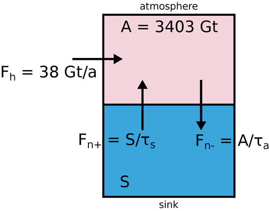
Figure 1. Two-box model of the carbon dioxide cycle. The top box represents the atmosphere, with a total carbon dioxide mass of 3403 Gt. Humans add 38 Gt per year to the system. Nature adds Fn+ and takes away Fn− to a sink represented by the bottom box. That sink has a total CO2 mass equal to S. The residence time in the atmosphere, τa is well known and estimated to be 5 years, the residence time in the sink τs is not well known.

In what follows, we will use a simple two-box first-order model, see Figure 1. The atmosphere has a mass of carbon dioxide equal to A. CO2 molecules can be captured into a sink and this occurs at a certain rate, a fraction of the molecules being trapped per time unit. Each individual molecule has a certain probability to be captured over time. In other words, a molecule has a residence time τa in the atmosphere (also sometimes called the ’turnover time’), which is the reciprocal of the rate, ka. Likewise, in the sink, there is a carbon dioxide mass equal to S, where molecules have a residence time τs; an individual molecule has a certain probability over time to be released by the sink into the atmosphere, or a rate ks.

Humans add an extra flux into the atmosphere labeled Fh. On the basis of this, we can determine the adjustment time τ of the atmosphere in terms of the residence times. This requires solving a simple mathematical differential equation; we do not have to worry at this moment about the thermodynamics and explain why the reaction constants are what they are. The questions we ask are, if we add an amount of carbon dioxide ΔA to it:

    • What are the new equilibrium values of A and S?
    • How long does it take to establish this new equilibrium?

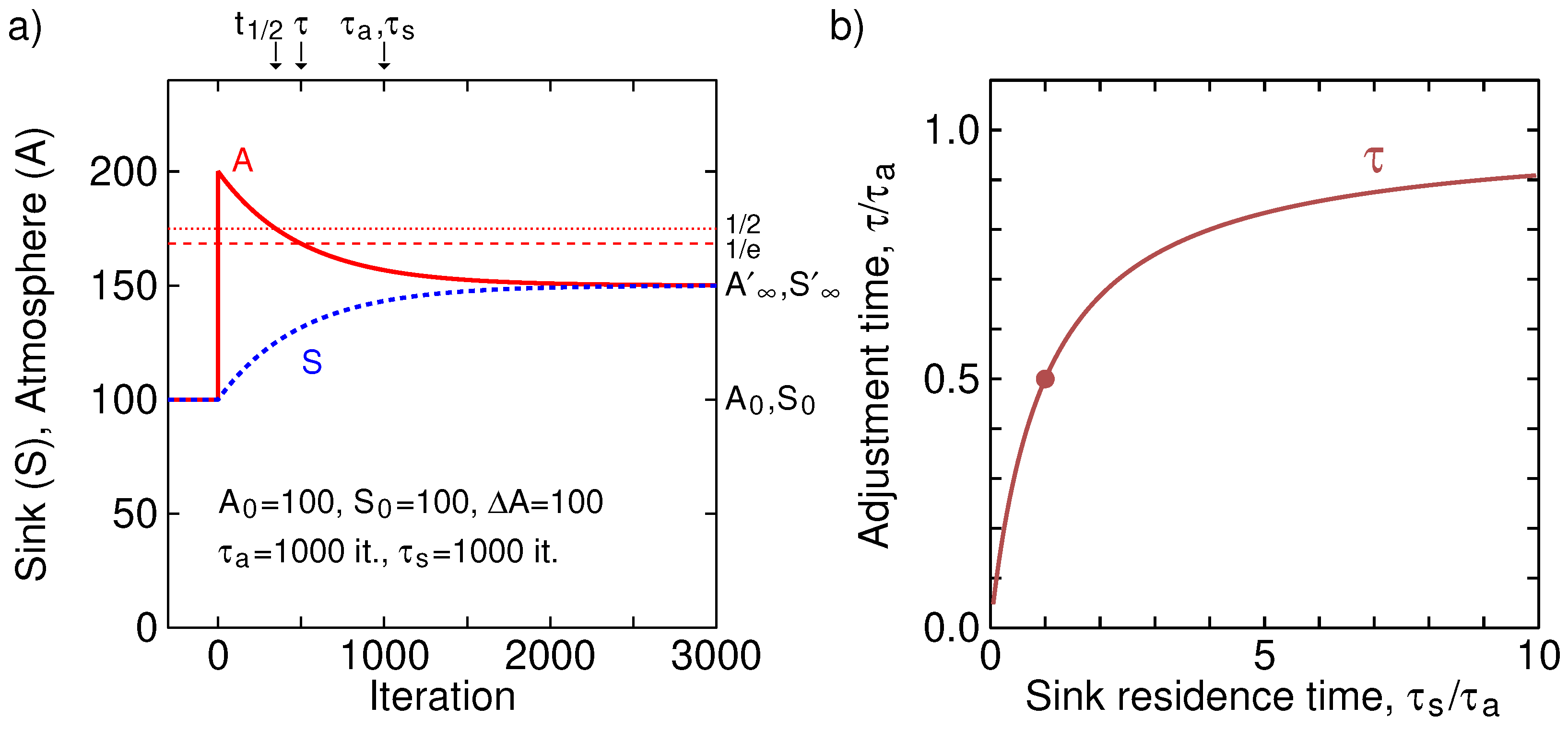
Figure 2. (a) A two-box simulation of atmosphere (A) and sink (S) of Figure 1.

Before injection of 100 into the atmosphere, the atmosphere-sink system was in equilibrium at 100 each, with the residence ‘times’ in both atmosphere and sink 1000 iterations. At each iteration A/τa is moved from atmosphere to sink and S/τs moved from sink to atmosphere. As can be seen, the observed adjustment time (relaxation time) of the system is 500 iterations, as predicted by Equation (9). After 500 iterations, the surplus quantity in the atmosphere relative to the new equilibrium has been reduced to 1/e, a level indicated by a horizontal dashed line. Further, a half-life can be defined, a time at which half of the transient amplitude has passed, t1/2=τln(2)= 347. This is indicated by a dotted line. (b) The adjustment time τ, as a function of the sink residence time τs, normalized by the atmospheric residence time τa. The dot indicates the value of the plot in (a), τs=τa, resulting in τ=τa/2 .

As can be seen, the adjustment time is shorter than the atmospheric residence time
for all values of the sink residence time, with, for large τs,
the adjustment time τ approaching the atmospheric residence time τa.

We, thus, refute the claim of the climate-skeptics-skeptics [skepticalscience.com] that:

“individual carbon dioxide molecules have a short life time of around 5 years in the atmosphere. However, when they leave the atmosphere, they are simply swapping places with carbon dioxide in the ocean. The final amount of extra CO2 that remains in the atmosphere stays there on a time scale of centuries.”

Their flawed reasoning is that the adjustment time (relaxation time) is the mass perturbation in the atmosphere divided by the flux balance, and, so goes the reasoning, while fluxes can be great (and the residence time short), the balance is close to zero and the relaxation time can then approach infinity.

3. Scenarios

We can now do a more detailed analysis based on the available data.

Table 2. Carbon dioxide facts, with the natural outflux Fn− derived from the mass in the atmosphere and the residence time. Other important parameters, influx Fn+, sink mass S, and sink residence time τs are less well known and should be considered adjustable.

The residence time in the atmosphere can be estimated quite well from the above-ground atomic bomb tests [1], which makes us happy that these at least served the purpose of advancing atmospheric science, if nothing else. The best estimate is about τa= 5 years [9]. Other references mention different times, with the IPCC mentioning the shortest (4 years) in their 5th Assessment Report (p. 1457 of Ref. [4]), showing that this value is not settled yet; we will use 5 years in this work. The equilibrium amount of carbon dioxide in the atmosphere is open for debate, but, for this purpose, we might use the consensus value of 280 ppm (A∗= 2250 Gt). To estimate the amount of CO2 in the sink is very difficult. However, there seems to be a general view that it is fifty times more than in the atmosphere, S=50A=113,400 Gt (relatively unchanged since pre-industrial times). Using the combination of these values does not allow for consistent bookkeeping, as the reader can easily verify. Something has to yield. In what follows, we will try out some scenarios based on specific assumptions.

3.1. Scenario: Pre-Industrial Atmosphere Was at Equilibrium

First we assume that the pre-industrial level of 280 ppm was indeed an equilibrium value with influx equal to outflux in the absence of human flux, as we are wont to believe, but that the mass in the sink S and the residence time τs in the sink are unknown.

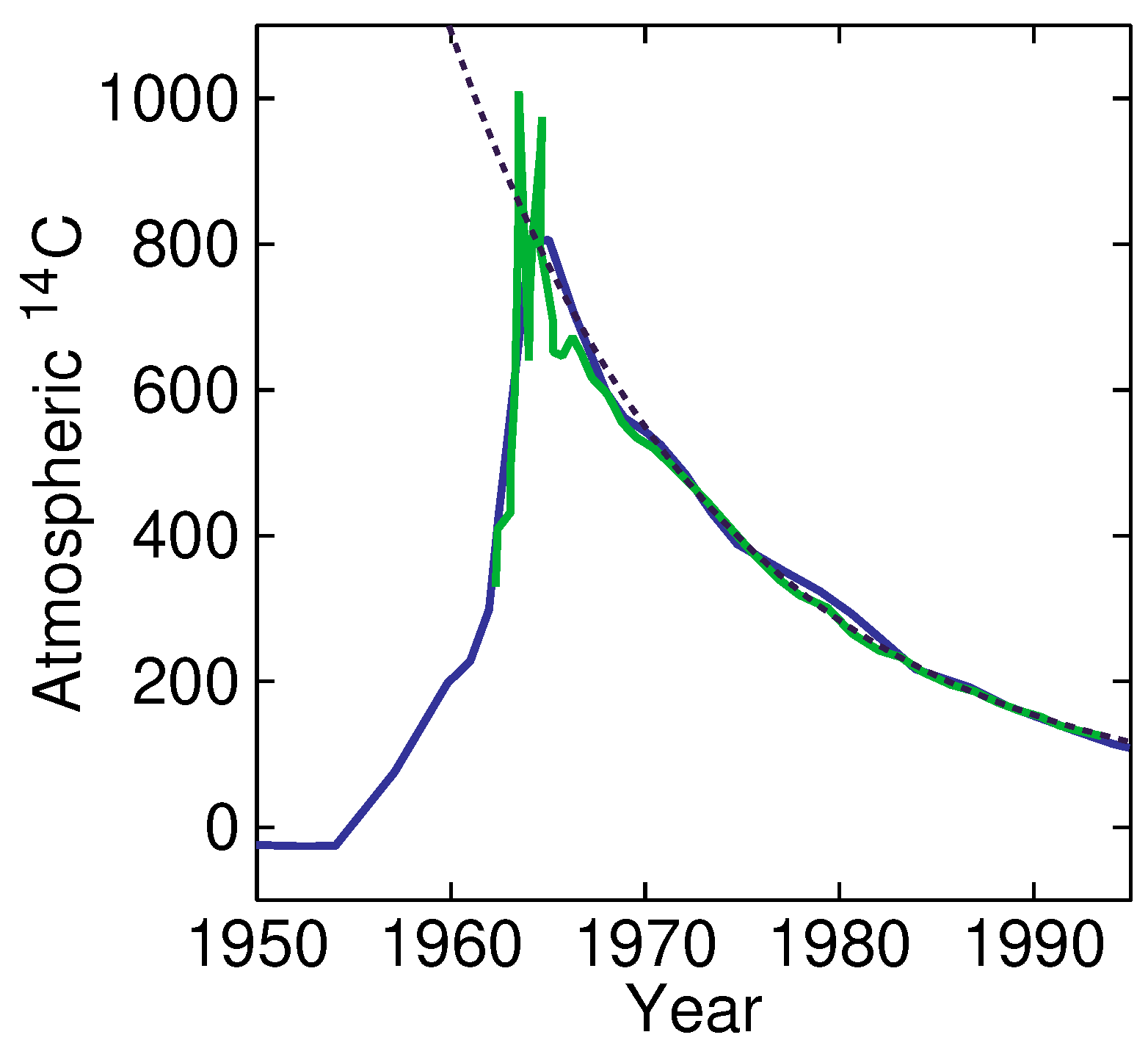
Figure 4. Above-ground atomic-bomb explosions produced a lot of 14 C that stopped in the 1960s. From a fit (dashed line) of data from 1965, we find an adjustment time of τ = 14.0 a, and an amplitude of ΔA = 740, with a final value of A′∞ = 30. This enables stating that the sink must be at least 24 times larger than the atmosphere. Data from Enting (blue) found in a work of Perruchoud [11] and Nydal et al. [10] (green), extracted with WebPlotDigitizer [12].

It seems that the idea of the pre-industrial level stable at 280 ppm (with Fn+=Fn−at 280 ppm) is untenable. It seems very likely that the sink was already off-balance and emitting amounts of carbon dioxide at the beginning of the industrial era and the increase in the atmospheric CO2 at any time in human history is not solely due to human activity. This would also explain the large pre-Mauna-Loa values found with chemical methods summarized by Beck [13] and Slocum [14]. For instance, values of 500 ppm have been observed around 1940. Ignoring these facts, on the other hand, would be equivalent to throwing entire generations of scientists under the bus.

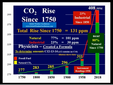
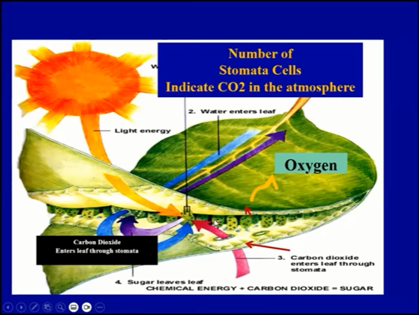
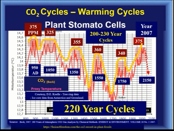
[Comment:  CO2 higher concentrations prior to 20th century are also indicated by use of plant stomata as paleo proxies for CO2 estimations.]


3.2. Scenario: The Sink Is Fifty Times Larger Than the Atmosphere

Next, we adopt the assumption that the sink at this moment really has 50 times more carbon than the atmosphere, in other words, S=50A= 170,000 Gt, and release the restriction that the atmosphere was stable at 280 ppm; in pre-industrial times there can have been a flux imbalance.

We see indeed a tremendous outgassing from the sink in pre-industrial times. The system was far from equilibrium, with an imbalance being a net influx of F∗n+−F∗n−= 207 Gt/a. Where, at the moment, there is a net natural flux of 18 Gt/a out of the atmosphere, in pre-industrial times, in this two-box first-order model with a sink 50 times larger than the atmosphere, there was a net natural influx of 207 Gt/a.

Somewhere, we must have passed the equilibrium value and,
considering the above numbers,  this value must be
rather close to today’s concentration of 420 ppm.

3.3. Scenario: Residence Time in the Sink Is Much Larger Than in the Atmosphere

If we only assume that the residence time in the sink is much larger than in the atmosphere, τs≫τa, then we can get a good idea of what has happened to our anthropogenic contribution to the carbon in the atmosphere, Fh, based on the two-box model.

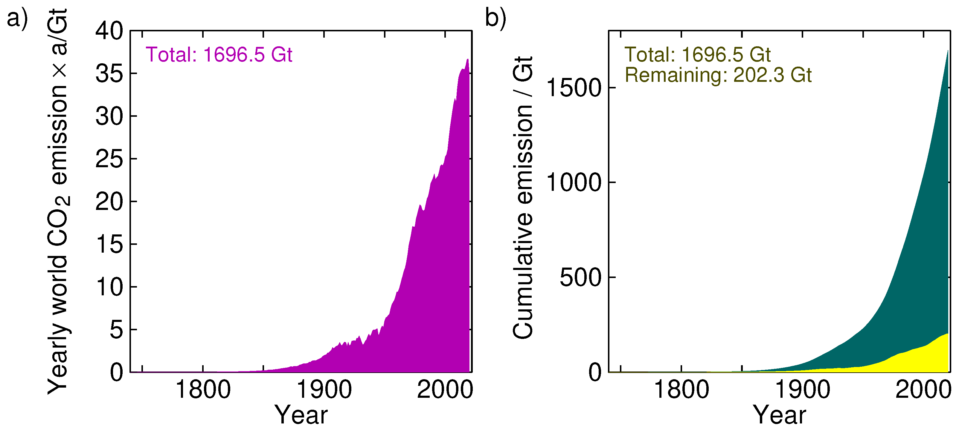
Figure 3. (a) Yearly global CO 2 emissions from fossil fuels. (b) Cumulative emissions (integral of left plot). The yellow curve is the remainder of the anthropogenic CO 2 in the atmosphere if we assume a residence time in the sink much longer than the 5-year residence time in the atmosphere; in this case τs=50τa was used. (Source of data: Our World In Data [8]).

Figure 3 shows the yearly carbon dioxide emissions into the atmosphere (left panel; data source: Our World In Data [8]). The total amount so far emitted is 1696.5 Gt. The right panel shows the cumulative emissions, ∑yeariFh(i). If at every year we apply the fluxes according to Equation (1), then we can see at each year how much of the anthropogenic CO2 is still in the atmosphere. The right panel of Figure 3 shows this for τs=50τa.

We see that only 202.3 Gt of the total injected 1696.5 Gt is still in the atmosphere.

In these years, the amount of CO2 in the atmosphere has risen from 280 ppm (2268 Gt) to 420 ppm (3403 Gt), an increment of 1135 Gt. Of these, 202.3 Gt (17.8%) would be attributable to humans and the rest, 932.7 Gt (82.2%), must be from natural sources.

In view of this, curbing carbon emissions seems rather fruitless;
even if we destroy the fossil-fuel-based economy (and human wealth with it),
we would only delay the inevitable natural scenario by a couple of years.

3.4. Scenario: Abandoning Constant Residence Times

We have seen here how the first-order-kinetics two-box model results in conclusions contrary to data. We could, of course, change our model. We could abandon the idea of first-order kinetics (where flux is proportional to mass), but that would be problematic to justify with physics.

We could also add more boxes to the system, distinguishing the sinks, or differentiating between deep ocean and shallow ocean, dissolved carbon dioxide gas, CO2 (aq), and dissolved organic carbon (sea-shells), or between CO2 disappearing in the oceans and being sequestered in biological matter on land, etc.

However, we expect the most likely improvement to the model to come from
abandoning the idea that the residence times τa and τs are constant.

They, in fact, are very much dependent on temperature. As an example, the ratio between the two that tells us the concentrations (and, thus, the masses) between carbon dioxide in the atmosphere and in the sink, if we assume this sink to be the oceans, is governed by Henry’s Law, and this concentration ratio is then dependent on temperature.

When including such effects, we might even conclude that the entire concentration of carbon dioxide in the atmosphere is fully governed by such environmental parameters and fully independent of human injections into the system. A is simply a function of many parameters, including the temperature T, but not Fh. It is as if the relaxation time is extremely short and any disturbances introduced by humans, or by other means, rapidly disappear, rapidly reaching the equilibrium determined by nature.

This fits very nicely with the recent finding that the stalling of the economy and the accompanying severe reduction in carbon emissions during the Covid pandemic had no visible impact on the dynamics of the atmosphere whatsoever [15]. The result of that research, the hypothesis that the carbon dioxide increments in the atmosphere were fully due to natural causes and not humans, fits the experimental data very well, and the hypothesis that humans are fully responsible for the increments can equally be rejected scientifically. This then also agrees with the conclusions of Segalstad that “The rising atmospheric CO2 is the outcome of rising temperature rather than vice versa” [16].

The pre-industrial atmosphere might indeed have been in equilibrium,
and we are currently also in, or close to, equilibrium.
That seems to us to be the most likely scenario.

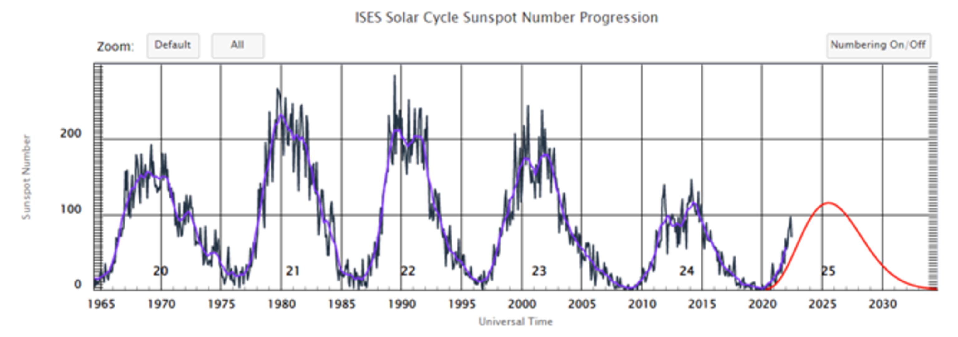
Once we admit the possibility of non-anthropogenic sources of carbon dioxide, we can start finding out what they might be. Examples such as volcanic sources, planetary and solar cycles spring to mind. It might well be that the climate puzzle is solved in such areas as the link between solar activity and seismic activity and climate [17].

This is, however, not the focus of this work. We conclude here by summarizing the major findings of this analysis using a first-order-kinetics two-box model:

(1) The adjustment time is never larger than the residence time and is less than 5 years.

(2) The idea of the atmosphere being stable at 280 ppm in pre-industrial times is untenable.

(3) Nearly 90% of all anthropogenic carbon dioxide has already been removed from the atmosphere.

Footnote:  Human CO2 Emissions Flat Last Decade

Annual total global CO2 emissions – from fossil and land-use change – between 2000 and 2021 for both the 2020 and 2021 versions of the Global Carbon Project’s Global Carbon Budget. Shaded area shows the estimated one-sigma uncertainty for the 2021 budget. Data from the Global Carbon Project; chart by Carbon Brief using Highcharts.

Previously, the GCP data showed global CO2 emissions increasing by an average of 1.4 GtCO2 per year between 2011 and 2019 – prior to Covid-related emissions declines. The new revised dataset shows that global CO2 emissions were essentially flat – increasing by only 0.1GtCO2 per year from 2011 and 2019. When 2020 and 2021 are included, the new GCP data actually shows slightly declining global emissions over the past decade, though this should be treated with caution due to the temporary nature of Covid-related declines. Source: Global CO2 emissions have been flat for a decade, new data reveals

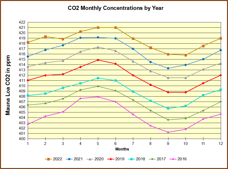
[Comment: Note the earlier chart above showing MLO atmospheric CO2 rising continuously while human emissions were flat.]

Arctic Ice Moment of Truth 2023

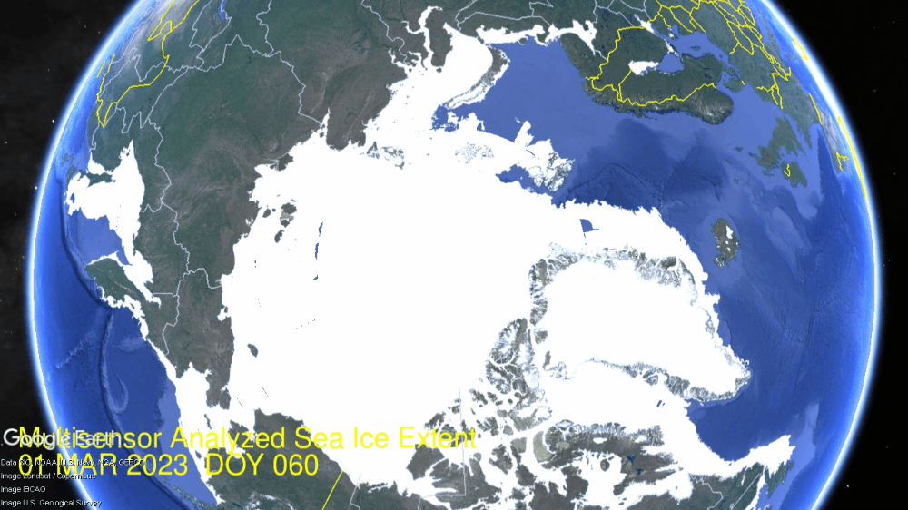
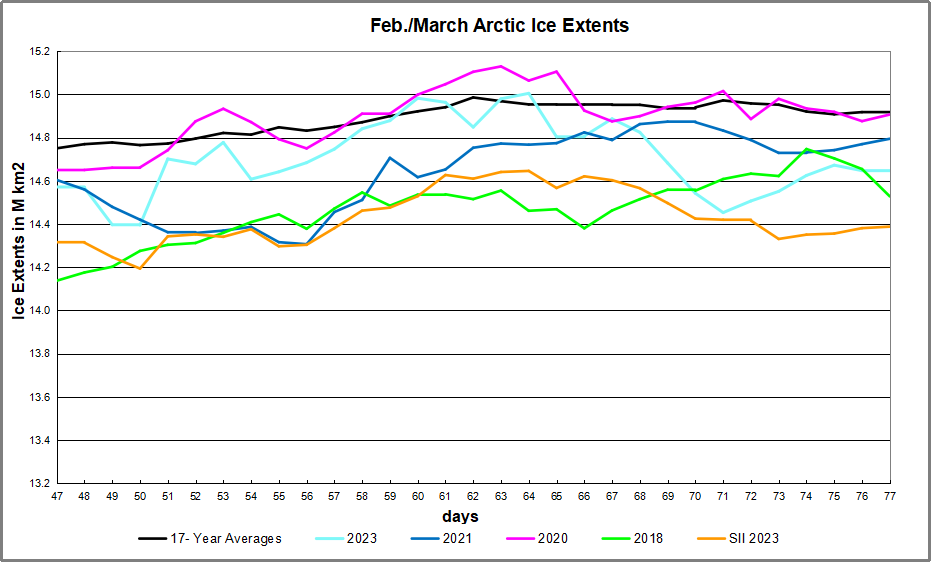
For ice extent in the Arctic, the bar is set at 15M km2. The average peak in the last 17 years occurs on day 62 at 14.986M km2 before descending, though some years the extent can be above 15M much later.  Ten of the last 17 years were higher than 15M, and recently 2020, 2022 and now 2023 ice extents cleared the bar at 15M km2. The actual day of annual peak ice extent varied between day 59 (2016) to day 82 (2012).

All of this means that 2023 peaked while passing the 15M km2 threshold two days later than average.  The graph below shows the situation evolving over the last four weeks anticipating the annual maximum.

The NH ice extent gap on day 77 is at 269k km2, or 1.8%.  After the day 62 peak, 2023 extents declined sharply until day 71 before recovering to reduce the deficit. (Note that ice extent is affected also by winds piling up drift ice, as well as melting from intrusions of warmer air or water.) SII has shown lower extents throughout this period, averaging 250k km2 less than MASIE.

March monthly average extents in recent years have been below average. While average extents will decline furher, we shall see what this year does with only two weeks left to make a difference.

Region 2023077 Day 77 Average 2023-Ave. 2018077 2023-2018
 (0) Northern_Hemisphere 14649553 14918812 -269258 14528206 121348
 (1) Beaufort_Sea 1070966 1070266 700 1070445 521
 (2) Chukchi_Sea 966006 965801 206 966006 0
 (3) East_Siberian_Sea 1087137 1087109 29 1087137 0
 (4) Laptev_Sea 897845 897837 7 897845 0
 (5) Kara_Sea 934539 922767 11771 934807 -268
 (6) Barents_Sea 605659 637818 -32159 689702 -84043
 (7) Greenland_Sea 835991 617943 218048 514678 321313
 (8) Baffin_Bay_Gulf_of_St._Lawrence 1249789 1546282 -296493 1399951 -150162
 (9) Canadian_Archipelago 854843 853118 1724 853109 1734
 (10) Hudson_Bay 1260903 1259573 1330 1257207 3696
 (11) Central_Arctic 3243341 3217827 25514 3131403 111939
 (12) Bering_Sea 739914 760728 -20814 445480 294434
 (13) Baltic_Sea 67881 80745 -12864 127449 -59568
(14) Sea_of_Okhotsk 822356 982054 -159698 1136990 -314633

The main deficit to average is in Baffin Bay and Sea of Okhotsk, partly offset by a surplus in Greenland Sea. Smaller pluses and minuses are found in other regions.

Typically, Arctic ice extent loses 67 to 70% of the March maximum by mid September, before recovering the ice in building toward the next March.

What will the ice do this year?  Where will 2023 rank in the annual Arctic maximum competition?

Drift ice in Okhotsk Sea at sunrise.

For more on the Pacific basins see post Meet Bering and Okhotsk Seas

Multiple Choice Question re Green Energy

Jack Hellner poses the issue in his American Thinker article. A single multiple choice question for the ‘green’ energy pushers.  Excerpts in italics with my bolds and added images.

Here is one burning question for scientists, entertainers, journalists, politicians,
bureaucrats, and others who claim they can control the climate:

Which of the following has caused the reservoirs to fill up rapidly in California and elsewhere in the West?

A. The Paris Climate accord.

B. The misnamed “Inflation Reduction Act” in which the Democrats claimed they can control the climate by handing out huge amounts of money to “green” pushers.

C. All the United Nations gabfests where people fly in private jets to stump about the need to cut emissions.

D. Shuttering coal and natural gas utility plants.

E. Transitioning the peasants to cricket and mealworms as “food” to control cow flatulence.

F. Making people buy inefficient, expensive, impractical electric cars powered by the dangerous, highly-flammable pollutant lithium.

G. Sequestering CO2, a clear, innocuous, non-pollutant gas that makes plants thrive and allows the world to be fed.

H. Record rain and snow that came cyclically and naturally.

(I’m sure you guessed, but the correct answer is: H.)

According to scientists, this winter’s downpour in California and other western states turned out to be a positive, as it brought relief to the drought-ridden environments:

All the moisture has helped alleviate dry conditions in many parts of the western U.S. Even major reservoirs on the Colorado River are trending in the right direction.

Of course, the scientific “experts” who somehow failed to predict this record rain and snow, warned of the “stubborn” aridity:

But climate experts caution that the favorable drought maps represent only a blip on the radar as the long-term effects of a stubborn drought persist.

Here is a hint: The Sahara Desert used to be fertile until around 9,000 years ago. A stubborn drought has persisted since then and it was not caused by oil, coal, CO2, cars, methane, or any of the other things “climate experts” blame for causing droughts, flooding, too much snow, too little snow and whatever else with which they want to scare the public.

Why should we trust scientists or anyone else whose dire predictions of doom and gloom on the climate or global warming have been 100% wrong the last hundred years?

Everyone should understand that scientists and others who push the “green” agenda make a lot of money pretending they can control the climate. They would have their spigot of money cranked off if they told the truth that the climate is and has always changed cyclically and naturally. As always, follow the money.

The same people who claim they can control the climate:
    1. Apparently lack the ability to properly regulate banks…and then blame Trump for the problem.
    2. Can’t control or tell the truth about the crisis at the borders…and then blame Trump for the problem.
    3. Can’t tell the truth or control the “spread” of COVID. Why would anyone trust the so-called “experts” at the CDC and the WHO who spread so much misinformation about COVID and destroyed so many businesses and people with their government edicts?
    4. Told so many lies about Obamacare, including the “you can keep your doctor” and “keep your plan” shticks, premiums would go down substantially fib, and that it would lower the deficit. And most of the media still says how great it is.
    5. Can’t educate children — no matter how much money they throw at it — to read or do math at grade level. 

Yet we are told that these people can control temperatures, sea levels, and storm activity forever if we just give them trillions of dollars and allow them to destroy industries that produce reasonably priced energy and thousands of other products that have greatly improved our quality and length of life.

They have trouble predicting the climate a few days out and did not predict the record amount of rain and snow in California this year but supposedly they can predict temperatures within one degree one hundred years out, with all the natural variables?

Does it sound remotely intelligent to believe these people?


How to Break the Climate Spell

Getty Images

Mark Imisides advises climate skeptics to reconsider how to dispute claims from climate believers in his Spectator Australia article Changing climate change: debunking the global colossus.  Excerpts in italics with my bolds and added images.

How is it that despite the scientific case for a climate apocalypse comprehensively collapsing some 20 years ago, we have seen a 16-year-old girl (at the time) being invited to address the United Nations, weeping children marching in our streets, and a federal election outcome in which this issue dominated the political landscape?

Where did we go wrong? And by ‘we’ I’m referring to those of us termed sceptics – people who understand the science, and the house of cards that comprises the notion of Anthropogenic Climate Change.

Put simply, we must learn the art of the polemic. The art of rhetoric. We must recognise that there’s no point in having evidence on our side if we don’t know how to use it.

We begin with this proposition. There is no case for reducing our carbon footprint unless all four of these statements are true:

  1. The world is warming.
  2. We are causing it.
  3. It’s a bad thing.
  4. We can do something about it.

No rational person can have any problem with this, and if they do, we need to find out why.

Here’s where we have to decide which of these points we want to contest. Remember, you only have to falsify one of them for the whole thing to collapse like a house of cards.

Most sceptics, in my view, pick the wrong fight. They do this by attempting to prosecute the case based on one of the first two points. This is a mistake.

Here’s why.

Arguments about whether the world is warming revolve around competing graphs: ‘My graph shows it’s warming. If your graph shows it isn’t, then it’s wrong – no it isn’t – yes it is – no it isn’t…’  This argument also looks at Urban Heat Island Effects, and examines manipulation of data by government agencies.  This is a poor approach to take because:

  • You’re never going to prove your graph is right.
  • You can be very easily and quickly discredited as a conspiracy theorist (Brian Cox did this to Malcolm Roberts on Q&A a few years ago). People just do not believe that government agencies would manipulate data.
  • We should not fear a warming world. Records began at the end of the last ice age, so it’s only natural that the world is warming. And the current temperatures are well within historical averages.

Source: Syun-Ichi Akasofu, Two Natural Components of the Recent Climate Change: (1) The Recovery from the Little Ice Age (A Possible Cause of Global Warming) and (2) The Multi-decadal Oscillation (The Recent Halting of the Warming):

As for arguments about whether we are causing the warming, this is even more problematic. The various contributions to global temperatures are extremely complex, involving a deep understanding of atmospheric physics and thermodynamics. With a PhD in Chemistry, this is much closer to my area of expertise than Joe Public, but I am very quickly out of my depth. I recognise most of the terms and concepts involved, but know just enough to know how little I know.

Sadly, many people on both sides of the debate don’t understand how little they know, nor how complex the subject of atmospheric physics is, and it is nothing short of comical seeing two people debating about a subject of which both of them are blissfully ignorant.

The bottom line is this – they simply don’t change anyone’s minds – ever.

Having seen these arguments used for years, and having used them myself, I cannot point to a single person that has said, ‘Oh yes! I see it now…’ The whole point of arguing, or debating, is to change someone’s mind (including, at times, your own). If that isn’t happening, then it’s futile to continue with the same approach.

I think the reason both these approaches fail that most people do not believe that all these experts, and the government, can be wrong. You say the world isn’t warming? Oh, I’m sure you have the wrong graph. You say that CO2 is not responsible? Oh, I’m sure the government scientists know more than you do.

This then brings us to the third point. Why is a warmer world a bad thing?

This is even more tempting than the first two points, as it’s so easy to prove that a warming world, so far from being a crisis, is actually a good thing. The reason for this is that, unlike with the first two points, they don’t have to look at a complex scientific argument. They just have to look at the weather. Are cyclones and hurricanes increasing? Are droughts increasing? Are flooding events increasing?

Regretfully, it is impossible to get people to even look at this. Even worse, they seem oblivious to the simple concept of cause and effect. We see this in that they simply can’t see that droughts and floods are opposites, and the same cause cannot produce exactly opposite effects. Astonishingly, they somehow think that charts that plot these extreme events are somehow manipulated, even when they come from a primary source such as the BOM, and that there really is a ‘climate crisis’.

Where does that leave us? Well, before we adopt Catweazle’s mantra of ‘nothing works’, there is one more point – point 4 (can we do anything about it?).

Most people will have seen the address of Konstantin Kisin at an Oxford Union debate, where he prosecuted this case to great effect. He pointed out, in simple terms, that as the UK only contributes 2 per cent to the global CO2 budget, anything they did will have negligible effect, and that global CO2 levels will be determined by people in Africa and Asia. He then pointed out that people in these countries ‘didn’t give a sh*t’ about climate change, as all they want to do is feed and clothe their children, and they don’t care how much CO2 that produces.

Finally, he pointed out that Xi Jinping knows that the way to ensure that he isn’t rolled in a revolution, as happened to so many other leaders in former communist regimes, is to ensure prosperity for the Chinese people. And indispensable to that goal is cheap, reliable, power, which is the reason that China is now building lots more coal-fired power plants – in 2021 alone they built 25 GW of capacity – equivalent to 25 x 1000MW plants.

By all accounts, his speech was well-received, with many people turning to his side. The beauty of prosecuting this case, as opposed to the other three, is that people don’t have to look at any evidence. They don’t even have to look at the weather.

The argument is at the same time simple, compelling, and irresistible. The question is this: will we see a major political party with the courage to take it on?

That part remains to be seen. But what is certain is this – the definition of insanity is doing the same thing and expecting different outcomes. If, for twenty years we’ve been telling people either that the world isn’t warming, or if it is we aren’t causing it, or if it is warmer but there’s no climate crisis, and not a single person has been persuaded by our arguments, then we have the brains of a tomato if we think anything is going to change.

Konstantin Kisin’s talk, and in particular the way it was received, fill me with hope that I haven’t had in years. It fills me with hope that if the case is prosecuted wisely, the climate change colossus can be brought to a grinding halt, politicians will unashamedly take on energy security as a political mantra, and the notion of climate change will at last be exposed as the unscientific, anti-human, regressive, apocalyptic cult that it is.


David Dilley: Signals of Global Cooling

Tom Nelson interviewed David Dilley last month and the video is above.  For those who prefer reading I provide below a transcript from the closed captions, along with the key exhibits from the presentation.

Synopsis: Between the two oceans cooling down and the natural global cooling cycle coming down we’re going to see a big dip in the temperatures worldwide during the next 10, 15 years. The cold cycle’s going to take about 20 years to bottom out. We’re going to be in an extremely cold period during that time, colder than the 1960s and 50s here in the United States. So it’s going to be very cold.

TN: I have David Dilly here, and David could you tell us a little bit about yourself?

DD: I’m a meteorologist, climatologist, for which I have about 52 years of experience, and I’m still trying to figure that out because I’m only 30 years old. But but I’ve been in the business a long time. I was a weather officer in the Air Force in the National Weather Service. Then I left to set up my own company called Global Weather Oscillations; the easiest way to remember it is global weather cycles.com.

So we’re going to take a look today at something that NOAA is really talking about: the Carbon Dioxide and Climate Cycles. They’re just talking about today’s carbon dioxide values as far as the fossil fuel is concerned. You’re not going to see this out there anywhere on the web. It’s 78% of the atmospheric gases is nitrogen of all things, 21% is oxygen, 0.9 is argon that is 99.99 percent the atmospheric gases. That doesn’t leave much that’s just about all of what we call dry air. To be non-dry air includes the greenhouse gases. The greenhouse gases now are variable regarding how much of it is water vapor how much of it is carbon dioxide. Water vapor is anywhere from one to four percent of the atmospheric gases, that’s quite a bit. It can be zero percent of the Arctic and Antarctic because that’s a desert, but it can be all the way up to four percent. So one to four percent we’ll say.

Carbon dioxide of all things it’s a trace gas it’s less than .05%, a lot less than than water vapor. less than .05 now to put it in perspective, let’s just look at the greenhouse gases here and what we see is water vapor we’re gonna do the average of it two percent that’s 20 000 parts per million. Natural carbon dioxide what I’m going to show you later on in the presentation is 380 parts per million.

Now NOAA and the IPCC say it (natural CO2) is down around 285 parts per million,
we’re going to show you that’s false.

And so the natural is point zero four percent of the atmospheric gases, while fossil fuel I’m going to show you it’s only 35 parts per million; that’s point zero zero four percent or four one thousands of a one percent. And do you think that can cause climate change?

Of course not.  We go down to Vostok in the Antarctic and there is a very deep frozen lake where they drill down fifteen thousand eight five hundred and eighty eight feet down to the bottom. That’s a long ways down over 500 000 years. So I take core samples and with the core samples they figure out how how much it is carbon dioxide what the temperatures are. These are approximate, but what they they get from a core sample is a an estimate of the temperatures and carbon dioxide during the past 500 000 years.

If we go back say 450 000 years, the red line is temperature. So what happened, we came quickly just in a few thousand years out of a deep Ice Age into a interglacial warm period. You can see the temperatures really slid up and the ice cores estimate the carbon dioxide to be right around 280 parts per million. Then we slide down out of the warm period into a deep Ice Age and you can see that the carbon dioxide is actually staying up high there. If carbon dioxide caused global warming, why did the temperatures drop; it does not make sense.

Eventually the carbon dioxide goes down because it’s being absorbed by the oceans. The oceans keep absorbing it over the course of a hundred thousand years. Then when you come up on your next interglacial warm period 338 000 years ago, the temperature goes up and the carbon dioxide is released from the oceans back into the atmosphere. And you can see the carbon dioxide lags behind the temperature rise and actually when you hit the peak of the temperature back 338 000 years ago, the carbon dioxide does not Peak out until 7000 years later. It takes quite a while but carbon dioxide peaked out at 298 parts per million. But look at that temperature then dropping quickly into an ice age while carbon dioxide is at its peak.

That’s proof right there the carbon dioxide does not cause global warming.

As we come over on the right hand side of the graphic this is about 18 000 years ago. It’s 11 000 years ago we came out of the glacial period, we warmed up quickly, we got up to about to 190 parts per million.

Then we started to take records in Hawaii in the 1950s and the instruments there said: Wow, all of a sudden now we’re up to 412 parts per million. We’ve never been that high before.  This is what we’re going to investigate: what is going on with the glacial periods and also the core samples. This is a graphic of the carbon dioxide. The peak of The inter glacial warm periods is every 120 000 years ago we’re going back 800 000 years.

Now do we have other research that will confirm what I’m saying. This is about a year ago and they’ve been adding papers to it and this corrects NOAA’s calculations of the rise in carbon dioxide since 1850. It’s in a radiation safety Journal Health physics journal and this is the name of the paper itself. The authors are professors of radiological Sciences. They’re retired and that’s a big thing because if you’re not retired, if you’re at a university, you can’t do research like this because of federal grants and everything. You have to wait until you’re retired and then you can do real science when they were working they were at the department of physics at University of Massachusetts. It’s Kenneth Skrable, George Chabot, and Clayton French and here is what they found.

This is extremely important. Since 1850 the red here is saying the increase due to fossil fuel,  and they’re showing all of that is the increase due to fossil fuel. Now how do we determine that well up on a high mountain in Hawaii we have a infrared spectrometer since 1958 it’s been been taking measurements of atmospheric carbon dioxide. However three Isotopes of Carbon are 12, 13 and 14. and the spectrometer is taking the total of all three. It’s not separating what is natural from what is fossil fuel.

Because the ice core samples say we’ve never been above 300 parts per million
NOAA is assuming that the rise above 300 parts per million is all fossil fuel.

An assumption is all it is. It’s assumed by trying to take averages of how much CO2 is taken back in by the oceans how much of it is a given not from industry. Taking those assumptions some physicists made a formula to determine how much is fossil fuel and how much is natural going back all the way back to 1750. These red lines again are what NOAA says is the increase by fossil fuel.

Well their formula separates the carbon 12, 13 and 14 to determine what is what and this is their findings as I switched everything over to green. Green is the natural increase in carbon dioxide all the way up to 1958. Now remember it’s a paper going back to 2018, but it says the increase has been from 280 parts per million up to 408 and NOAA says it is all from fossil fuel. This research paper says No, it is nearly 80% natural just like what I showed on my formulations, eighty percent natural, onlyabout 20% industrial. That’s not enough to cause climate change.

[Note: My synopsis of Skrable et al. is On CO2 Sources and Isotopes.]

Now I’m going to show you one last paper that will also verify the findings and this is using a different method fossilized plant leaflets and as you can see in this picture there’s little cells in there they call these stomata cells which are like the lungs in a human being. So they look at the fossilized plant leaflets and unlike the ice core samples where you’re taking an average over one thousand or four thousand years, the fossilized plant leaflets can give you the exact year going back the past thousand years so you can determine each year what is going on.

So the stomata cells are like the lungs in a human being or in animals but he’d found that if the leaflet has a lot of stomata cells it means a lot less carbon dioxide in the air at that time. When CO2 is plentiful, plants don’t need more oxygen lung power to get the carbon dioxide; if it has fewer cells that means there was a lot of carbon dioxide in the air.

And the beautiful thing about plant life taking in carbon dioxide is the byproduct is oxygen which we drastically need. What the plant stomata cells show during the past 1200 years: back in 800 A.D it says we were way up to 375 parts per million natural carbon dioxide and then dipped way down to 325 in one thousand A.D. Then it dipped way down to 230 and it dipped up down, up down, up down up, down. In year 2010 it was up at 375 parts per million.

Let’s look at the plant stomata that could be pretty darn real and also if you take a mean value of the plant stomata over the course of a thousand years you come out 301 parts per million. The main value of ice cores over a thousand year period 297 parts per million really darn close to being the same as now. Let’s take the plant stomata readings of the atmospheric carbon dioxide and overlay it onto our global warming and cooling Cycles during the past 1200 years. We have had six global warming Cycles during the past 1200 years as noted here in the red. This is back around 850 A.D and then you can see it cools down then we warm up again, cool down warm up cool way down and so on for six global warming cycles. People don’t talk about that but we have had six of them.

When we overlay the plant stomata atmospheric carbon dioxide, guess what: We see a perfect fit. The high values in carbon dioxide peak on global warming cycles, so that brings a lot more credibility into the plants stomata cells for recording carbon dioxide.

So putting it all together we since 1850 NOAA and the IPCC say that the rise in atmospheric carbon dioxide is 100% due to fossil fuel and human activity. The three studies I just showed you and the corrections I made on the ice core samples all show it’s 80% natural rise. Far too little fossil fuel effects to cause climate change, it is almost all natural.

Here we are today over here on the right the average is a global cooling cycle comes about every 230 years and the global cooling cycles last for a good 100, 150 years. So here we are right now, average for the return of the global cooling cycle is 230 years and the last global cooling cycle began in 1794. Add 230 to that and you calculate the year 2024.

This is 2023. so we should be sliding into a global cooling cycle, a natural global cooling cycle.

And we have signals that it is beginning. Global warming Cycles begin in the Arctic and the Antarctic when they warm up over the course of 20, 30 years or so. And as the Arctic and Antarctic warm up there’s less cold air available through the mid-latitudes. So over time the mid-latitudes warm up so that’s where global warming spreads.

In the next phase, global cooling also begins at the Arctic and the Antarctic.

What has happened just this past year, the spring and summer in the Arctic was the coldest on record. You had that during a global warming period, so that’s a signal that the Arctic is drastically cooling down. In 2021 the Antarctic had the coldest winter on record. How you have two records like that if you’re not sliding into global cooling? There’s more cold air available and it’s going to cool down the mid-latitudes and that starts our global cooling cycle. And we’re coming into that right now. Winter 2020 was a third coldest January and February on record from Alaska through Central Northern Canada into Greenland.  Antarctica as I indicated winter of 2021 coldest on record. Arctic 2022 coldest spring and summer on record since 1958, and the most Arctic Ice extent in 8 to 16 years. 

The real main point is carbon dioxide increase is mainly natural, it is not causing a global warming cycle. It’s a natural global warming cycle and we’re sliding back into a natural global cooling cycle.

TN: If you had to make a prediction what would you think of the cooling between now and 2050. Do you think it will cool between now and 2050 are you fairly confident?

DD: Actually we’re going to see a pretty good cool down here into January. The whole atmospheric circulation is beginning to change the La Nina out in the Pacific is now fading it’s going to be gone here by mid to end of January, and we can see changes in the atmospheric circulation going on now.
The cold air in Canada is going to start making its way down more into the United States during late January.

For this year we do see the drastic change and what we’re going to see really well through 2050 or so. The IPCC and NOAA say that the oceans are going to rise anywhere from eight to 26 inches during that time period. I say it may rise an inch, maybe not even that much because we’re going into a global cooling cycle now. The poles are cooling down.

Pacific Ocean has phases going back to the year 1580. For past 500 years we’ve seen these warm phase and cold phase Cycles in the Pacific Ocean which last for anywhere from about 25 to 40 years. The Pacific has been in a 40-year warm cycle which ties the record going back uh 500 years. Pacific is sliding into a cold or a cool phase ocean water cycle, and that’s going to help to cool down ,especially up around Alaska. And the Atlantic Ocean will be going into a cool phase of its own right after 2030 or so.

Between the two oceans cooling down and the natural global cooling cycle coming in
we’re going to see a big dip in the temperatures worldwide during the next 10 to 15 years.

The global warming cycle took about a 20-year period to peek out warming from about the year 2000 up to about 2021 so it took 20 years to hit the peak; the cold cycle is going to take about 20 years to bottom out also at the coldest and that’s going to be around 2040 or so. Unitil the late 2030s so we’re going to be in an extremely cold period during that time, colder than the 1960s and 50s here in the United States.

TN: Is there any sort of a simple explanation as to what causes that 230 year cycle that you mentioned?

DD: The simple explanation is our glacial periods and interglatial periods become about every 120 000 years are due to the Earth path around the Sun; where the Earth swings out further away from the Sun and also the tilt of the earth also changes.

New data out is showing that we’ve actually been cooling down during the past five to six years. So this is all looking like we are already going gradually into a global cooling Cycle. But we’re going to see a more dramatic change in the cooling cycle.

What NOAA and IPCC are doing, their science is political science while we’re looking here today at real science. There’s a huge difference. Keep your eyes open the next few years and all of a sudden in a few years people are going to be saying: Wait a minute, what are we doing here? We’re down the wrong path we need to wake up.

Comment:

The underlying issue is the assumption that the future can only be warmer than the present. Once you accept the notion that CO2 makes the earth’s surface warmer (an unproven conjecture), then temperatures can only go higher since CO2 keeps rising. The present plateau in temperatures is inconvenient, but actual cooling would directly contradict the CO2 doctrine. Some excuses can be fabricated for a time, but an extended period of cooling undermines the whole global warming mantra.

It’s not a matter of fearing a new ice age. That will come eventually, according to our planet’s history, but the warning will come from increasing ice extent in the Northern Hemisphere. Presently infrastructures in many places are not ready to meet a return of 1950s weather, let alone something unprecedented.

Public policy must include preparations for cooling since that is the greater hazard. Cold harms the biosphere: plants, animals and humans. And it is expensive and energy intensive to protect life from the ravages of cold. Society can not afford to be in denial about the prospect of the current temperature plateau ending with cooling.

Background Post: By the Numbers: CO2 Mostly Natural

See Also: What If It’s Global Cooling, Not Warming?

Save the Children and Us All from Climate Grooming

Conclusion from Ben Pile’s Climate Resistance Video above:

Experts have used the authority of institutional science and medicine to convince people that a climate crisis is happening despite there being no scientific observational evidence for it. And this misuse of institutional authority has in turn been used to close down public democratic debate about far-reaching policy and to silence critics of the Green agenda. But computer simulations and hypothetical worlds are not reality and not evidence. They are science fiction and they are used to mislead people into believing that there is a climate crisis so that they may support radical climate policies.

(Question to then IPCC chairman Rajendra Pachauri) “What do you see as the next tools you could utilize to create change?
(Pachuri Response) “Children. I think we have to sensitize the young and tell them how their future is going to be affected if we don’t take action today. I think if we can get them to understand the seriousness of the problem they would probably shame adults into taking the right steps.”

Global warming and climate change are real, but climate policy is the far more real and more dangerous threat than climate change. The world has seen unprecedented progress in recent decades and much more needs to be done to eliminate problems such as poverty and disease. But by failing to confront green scare mongering, Global agencies, world leaders, politicians, scientists and the media have allowed a dark and dangerous ideology to fester. By causing a widespread ignorance of this progress which it now threatens to reverse, green scare mongering will turn the clock back for Humanity and civilization.

Ben Pile exposes how climate radicals are using media messaging to advance the climate crisis mass delusion in his substack article Behind the ‘climate crisis’ myth: green ideology.  Excerpts in italics with my bolds and added images.

The world is healthier, wealthier, and safer than it ever has been.
And most of this progress has been achieved in the era of global warming.
The green story does not add up.

In the eighties and nineties, Adherents of the precautionary principle argued that a hypothesis of a potentially civilisation-ending catastrophe merely needs to be plausible to be sufficient to compel action, and that the world cannot afford to wait for scientific knowledge to verify the threat with any certainty. This urgency was the basis of the Montreal Protocol on limiting ozone-depleting substances, and it was the hope of many greens that the same formulation could be used again to drive global agreements on climate change.

The problem for adherents of the precautionary principle is that, as is the case with all green ideologues’ prognostications, too much time passed without the events they were sure would befall us, undermining the original hypothesis. In the 1970s, before global warming had been invented, environmentalists proclaimed that civilisation stood on the brink of collapse. Limits to Growth and The Population Bomb were global best sellers, putting green politics at the top of the global political agenda, and cementing the end of post-war optimism with a terminally negative outlook that the West has not shaken off, despite the books’ manifest failures.

The precautionary principle (and many $billions of ersatz ‘philanthropic’ generosity) saved the greens and their ideological project the humiliation they deserved by adding an unending not-if-but-when caveat to their soothsaying. . . The precautionary principle is an article of faith, and work both ways when fully considered. Progress towards a global climate lockdown agreement has been slow in significant part because many countries have been unwilling to undermine the certain benefits of economic growth on the basis of uncertain speculation. The precautionary principle, has thus been of decreasing value towards advancing the climate agenda as time has passed.

There are only so many times even the most faithful are willing to climb the mountain
to wait for salvation from doom before doubt creeps in.

The new claim, intended to overcome the global climate policy agendas’ inertia, is that certainty has been achieved by science, and that scientists have shown that the world is in the grip of the very catastrophe that environmentalists had predicted: people are starving, diseases are rampant, storms, floods, wildfires and heatwaves kill thousands by the day, forcing millions from their homes and into poverty.

The problem, of course, is that it is not true. In every region of the world, and at every level of economic development, people are living healthier, wealthier, longer, and safer lives. In the few places where this trend of continued progress does not hold, other reasons better account for the failure than slightly different weather: failed states, corruption and conflict.

The problem for the green narrative then, as now, is that deaths from these diseases of poverty were falling, and have continued to fall, radically.

Between 2000 and 2019, the number of deaths from malaria in the world fell from 900 thousand to 560 thousand – given the world’s population increase, this is equivalent to a halving of the mortality rate. Over the same time, the number of deaths caused by diarrheal diseases fell from 2.4 million to 1.5 million. And deaths from malnutrition fell from 506 thousand to 212 thousand. What this means is not merely that there is no evidence of a climate crisis, there extremely good evidence of the opposite: humanity is thriving.

Many other metrics of human welfare bear out the same picture of reality. But try to explain this indubitable progress to the protestors who, on the words of UN chiefs, nonagenarian BBC voice-over artists and degenerate green ideologues of the Guardian and green blob, block roads and demand nothing less than the cancellation of industry and the economy and the immiseration of the entire world, to make certain that all of humanity’s development is undone. The good news provokes an angry and uncomprehending rage in green activists.

To compare the story of the climate crisis with the facts is
to betray one’s own children, country and world,
and to condemn future generations to an ‘unliveable planet’.

The facts and stats of the world are in contradiction to the ideological conception of nature held by the global green Great and Good and by the street-level environmentalists, but not the broader public. So what is this ideology, and how does it overwhelm its victims’ capacity for reason and facts?

As David Attenborough explains, it,

Our economies and political systems are unconsciously predicated on the belief that nature will continue to be a benign and regular provider of the conditions we need to thrive. […] Our stable and reliable planet no longer exists. The impacts of this destabilisation will profoundly impact every country on Earth.

We can know that this is a false belief, because it is a myth that nature has ever been anything but extremely hostile, rather than a benign ‘provider’. Hence, until the end of the 1880s, a quarter of all British children died before reaching their fifth birthday. In Germany, half of children did not survive that long. Globally, infant mortality was 22.4 per cent in 1950. In 2021, it was 3.7 per cent. The ‘planet’ is manifestly far less hostile to humanity than it was just a lifetime ago. And this is thanks to industries, to expanding access to markets, and to technological and scientific development – sheer artifice – not to Natural Providence. David Attenborough is as misled and misleading as he is a ‘national treasure’.

My Mind is Made Up, Don’t Confuse Me with the Facts. H/T Bjorn Lomborg, WUWT

“There’s only one world”, a girl explains to the interviewer. “If we destroy it all, then we have no other place to live”. “Right now, we are not acting”, adds her little friend. “We should act now.”

If the words of global climate technocrats, so earnestly spoken by such innocent faces
is not an abomination, then nothing is.

Tiny children’s view of the world and their own futures have been poisoned by an ideology that has no care for facts, much less the children and their prosperity. Their heads have been deliberately filled by the false idea of a ‘climate crisis’ in order to make them instruments of a political agenda, against their own interests, far before they are equipped to understand the claims they reproduce.

Society needs to confront green ideology urgently.
It is the greatest threat to our safety and prosperity.

Please watch and share our film: Why There Is No Climate Crisis (and why people believe that there is)

Rising Sea Levels from Climate Change Hit Venice

Gondolas stranded in the canals while tourists gawk in shock!

Tyler Durden reports at zerohedge Gondola Service Halted In Venice As Famous Canals Run Dry.  Excerpts with my bolds.

Part of Venice’s vast network of canals has run dry after unusually low tides and drought conditions. The floating city is built in the middle of the Venetian Lagoon at the head of the Adriatic Sea in Northern Italy. Dried-up smaller canals mean some gondolas and water taxis are stranded.

Venice is usually prone to flooding, but a combination of factors, including lack of rain, a high-pressure system, a full moon, and water currents, have led to dried-up canals, according to Reuters.

Italian rivers and lakes are suffering from severe lack of water, the Legambiente environmental group said on Monday, with attention focused on the north of the country.

The Po, Italy’s longest river which runs from the Alps in the northwest to the Adriatic has 61% less water than normal at this time of year, it added in a statement. –Reuters

Several pictures and videos have been published on Twitter, showing dried-up canals.

Hold on!  Stop the Presses.

Revised headline:  Climate Change Sucks Water Out of Venice Canals!!!!

And Where Did the Water Go?

Why, California’s Oroville Dam, of course.


Observed vs. Imagined Sea Levels 2022 Update

3047060508_737c7687bd_o.0.0

Such beach decorations exhibit the fervent belief of activists that sea levels are rising fast and will flood the coastlines if we don’t stop burning fossil fuels.  As we will see below there is a concerted effort to promote this notion empowered with slick imaging tools to frighten the gullible.  Of course there are frequent media releases sounding the alarms.  For example:

From the Guardian Up to 410 million people at risk from sea level rises – study.  Excerpts in italics with my bolds.

The paper, published in Nature Communications, finds that currently 267 million people worldwide live on land less than 2 metres above sea level. Using a remote sensing method called Lidar, which pulsates laser light across coastal areas to measure elevation on the Earth’s surface, the researchers predicted that by 2100, with a 1 metre sea level rise and zero population growth, that number could increase to 410 million people.

The climate emergency has caused sea levels to rise and more frequent and severe storms to occur, both of which increase flood risks in coastal environments.

Last year, a survey published by Climate and Atmospheric Science, which aggregated the views of 106 specialists, suggested coastal cities should prepare for rising sea levels that could reach as high as 5 metres by 2300, which could engulf areas home to hundreds of millions of people.

The rest of this post provides a tour of seven US cities demonstrating how the sea level scare machine promotes fear among people living or invested in coastal properties.  In each case there are warnings published in legacy print and tv media, visual simulations powered by computers and desktop publishing, and a comparison of imaginary vs. observed sea level trends, updated with 2022 tidal gauge reports.

[Note: Some readers may be confused by the imagined sea level projections shown in red.  These come from models that include IPCC suppositions in estimating sea level rise in various localities.  For example, from the UCS (Union of Concerned Scientists):

Three sea level rise scenarios, developed by the National Oceanic and Atmospheric Administration (NOAA) and localized for this analysis, are included:

    • A high scenario that assumes a continued rise in global carbon emissions and an increasing loss of land ice; global average sea level is projected to rise about 2 feet by 2045 and about 6.5 feet by 2100.
    • An intermediate scenario that assumes global carbon emissions rise through the middle of the century then begin to decline, and ice sheets melt at rates in line with historical observations; global average sea level is projected to rise about 1 foot by 2035 and about 4 feet by 2100.
    • A low scenario that assumes nations successfully limit global warming to less than 2 degrees Celsius (the goal set by the Paris Climate Agreement) and ice loss is limited; global average sea level is projected to rise about 1.6 feet by 2100.

The charts below also reflect sea level forecasts by state agencies like the California Coastal Commission]

Prime US Cities on the “Endangered” List
Newport, R.I.

Examples of Media Warnings

Bangor Daily News:  In Maine’s ‘City of Ships,’ climate change’s coastal threat is already here

Bath, the 8,500-resident “City of Ships,” is among the places in Maine facing the greatest risks from increased coastal flooding because so much of it is low-lying. The rising sea level in Bath threatens businesses along Commercial and Washington streets and other parts of the downtown, according to an analysis by Climate Central, a nonprofit science and journalism organization.

Water levels reached their highest in the city during a record-breaking storm in 1978 at a little more than 4 feet over pre-2000 average high tides, and Climate Central’s sea level team found there’s a 1-in-4 chance of a 5-foot flood within 30 years. That level could submerge homes and three miles of road, cutting off communities that live on peninsulas, and inundate sites that manage wastewater and hazardous waste along with several museums.

UConn Today:  Should We Stay or Should We Go? Shoreline Homes and Rising Sea Levels in Connecticut

As global temperatures rise, so does the sea level. Experts predict it could rise as much as 20 inches by 2050, putting coastal communities, including those in Connecticut, in jeopardy.

One possible solution is a retreat from the shoreline, in which coastal homes are removed to take them out of imminent danger. This solution comes with many complications, including reductions in tax revenue for towns and potentially diminished real estate values for surrounding properties. Additionally, it can be difficult to get people to volunteer to relocate their homes.

Computer Simulations of the Future

Newport Obs Imaged

Imaginary vs. Observed Sea Level Trends (2022 Update)

Boston, Mass.

Example of Media Warnings

From WBUR Radio Boston:  Rising Sea Levels Threaten MBTA’s Blue Line

Could it be the end of the Blue Line as we know it? The Blue Line, which features a mile-long tunnel that travels underwater, and connects the North Shore with Boston’s downtown, is at risk as sea levels rise along Boston’s coast. To understand the threat sea-level rise poses to the Blue Line, and what that means for the rest of the city, we’re joined by WBUR reporter Simón Ríos and Julie Wormser, Deputy Director at the Mystic River Watershed Association.

As sea levels continue to rise, the Blue Line and the whole MBTA system face an existential threat. The MBTA is also facing a serious financial crunch, still reeling from the pandemic, as we attempt to fully reopen the city and the region. Joining us to discuss is MBTA General Manager Steve Poftak.

Computer Simulations of the Future

Boston Obs Imaged2

Imaginary vs. Observed Sea Level Trends (2022 Update)

New York City

Example of Media Warnings

From Quartz: Sea level rise will flood the neighborhood around the UN building with two degrees warming

Right now, of every US city, New York City has the highest population living inside a floodplain. By 2100, seas could rise around around the city by as much as six feet. Extreme rainfall is also predicted to rise, with roughly 1½ times more major precipitation events per year by the 2080s, according to a 2015 report by a group of scientists known as the New York City Panel on Climate Change.

But a two-degree warming scenario, which the world is on track to hit, could lock in dramatic sea level rise—possibly as much as 15 feet.

Computer Simulations of the Future

NYC Obs Imaged

Imaginary vs. Observed Sea Level Trends (2022 Update)

Philadelphia, PA.

Example of Media Warnings

From NBC Philadelphia:  Climate Change Studies Show Philly Underwater

NBC10 is looking at data and reading studies on climate change to showcase the impact. There are studies that show if the sea levels continue to rise at this rate, parts of Amtrak and Philadelphia International Airport could be underwater in 100 years.

Computer Simulations of the Future

Philly Obs Imaged

Imaginary vs. Observed Sea Level Trends (2022 Update)

Miami, Florida

Examples of Media Warnings

From WLRN Miami: Miles Of Florida Roads Face ‘Major Problem’ From Sea Rise. Is State Moving Fast Enough?

One 2018 Department of Transportation study has already found that a two-foot rise, expected by mid-century, would imperil a little more than five percent — 250-plus miles — of the state’s most high-traffic highways. That may not sound like a lot, but protecting those highways alone could easily cost several billion dollars. A Cat 5 hurricane could be far worse, with a fifth of the system vulnerable to flooding. The impact to seaports, airports and railroads — likely to also be significant and expensive — is only now under analysis.

From Washington Post:  Before condo collapse, rising seas long pressured Miami coastal properties

Investigators are just beginning to try to unravel what caused the Champlain Towers South to collapse into a heap of rubble, leaving at least 159 people missing as of Friday. Experts on sea-level rise and climate change caution that it is too soon to speculate whether rising seas helped destabilize the oceanfront structure. The 40-year-old building was relatively new compared with others on its stretch of beach in the town of Surfside.

But it is already clear that South Florida has been on the front lines of sea-level rise and that the effects of climate change on the infrastructure of the region — from septic systems to aquifers to shoreline erosion — will be a management problem for years.

Computer Simulations of the Future

Florida Obs Imaged

Imaginary vs. Observed Sea Level Trends (2022 Update)

Houston, Texas

Example of Media Warnings

From Undark:  A $26-Billion Plan to Save the Houston Area From Rising Seas

As the sea rises, the land is also sinking: In the last century, the Texas coast sank about 2 feet into the sea, partly due to excessive groundwater pumping. Computer models now suggest that climate change will further lift sea levels somewhere between 1 and 6 feet over the next 50 years. Meanwhile, the Texas coastal population is projected to climb from 7 to 9 million people by 2050.

Protecting Galveston Bay is no simple task. The bay is sheltered from the open ocean by two low, sandy strips of land — Galveston Island and Bolivar Peninsula — separated by the narrow passage of Bolivar Roads. When a sufficiently big storm approaches, water begins to rush through that gap and over the island and peninsula, surging into the bay.

Computer Simulations of the Future

Galv Obs Imaged

Imaginary vs. Observed Sea Level Trends (2022 Update)

San Francisco, Cal.

Example of Media Warnings

From San Francisco Chronicle:  Special Report: SF Bay Sea Level Rise–Hayward

Sea level rise is fueled by higher global temperatures that trigger two forces: Warmer water expands oceans while the increased temperatures hasten the melting of glaciers on Antarctica and Greenland and add yet more water to the oceans.

The California Ocean Protection Council, a branch of state government, forecasts a 1-in-7 chance that the average daily tides in the bay will rise 2 or more feet by 2070. This would cause portions of the marshes and bay trail in Hayward to be underwater during high tides. Add another 2 feet, on the higher end of the council’s projections for 2100 and they’d be permanently submerged. Highway 92 would flood during major storms. So would the streets leading into the power plant.

From San Francisco Chronicle Special Report: SF Bay Sea Level Rise–Mission Creek

Along San Francisco’s Mission Creek, sea level rise unsettles the waters.  Each section of this narrow channel must be tailored differently to meet an uncertain future. Do nothing, and the combination of heavy storms with less than a foot of sea level rise could send Mission Creek spilling over its banks in a half-dozen places, putting nearby housing in peril and closing the two bridges that cross the channel.

Whatever the response, we won’t know for decades if the city’s efforts can keep pace with the impact of global climatic forces that no local government can control.

Though Mission Creek is unique, the larger dilemma is one that affects all nine Bay Area counties.

Computer Simulations of the Future

SF Obs Imaged

Imaginary vs. Observed Sea Level Trends (2022 Update)

Summary: This is a relentless, high-tech communications machine to raise all kinds of scary future possibilities, based upon climate model projections, and the unfounded theory of CO2-driven global warming/climate change.  The graphs above are centered on the year 2000, so that the 21st century added sea level rise is projected from that year forward.  In addition, we now have observations at tidal gauges for the first 22 years, 1/5 of the total expected.  The gauges in each city are the ones with the longest continuous service record, and wherever possible the locations shown in the simulations are not far from the tidal gauge.  For example, NYC best gauge is at the Battery, and Fulton St. is also near the Manhattan southern tip.

Already the imaginary rises are diverging greatly from observations, yet the chorus of alarm goes on.  In fact, the added rise to 2100 from tidal gauges ranges from 6 to 9.5 inches, except for Galveston projecting 20.6 inches. Meanwhile models imagined rises from 69 to 108 inches. Clearly coastal settlements must adapt to evolving conditions, but also need reasonable rather than fearful forecasts for planning purposes.

Footnote:  The problem of urban flooding is discussed in some depth at a previous post Urban Flooding: The Philadelphia Story

Background on the current sea level campaign is at USCS Warnings of Coastal Floodings

And as always, an historical perspective is important:

post-glacial_sea_level


Ian Plimer Asks, “What Climate Crisis?”

The supercontinent Gondwana hundreds of million years ago at its primary stages, and the directions pieces drifted away

That question is the title of Ian Plimer’s Spectator Australia article What Climate Crisis? Excerpts in italics with my bolds and added images.

For more than 80 per cent of time, Earth has been a warm wet greenhouse planet with no ice. We live in unusual times, when ice occurs on continents. This did not happen overnight. The great southern continent, Gondwanaland, formed about 550 million years ago. It occupied 20 per cent of the area of our planet and included Antarctica, South America, Australia, South Africa and the Indian subcontinent.

Gondwanaland was covered by ice when it drifted across the South Pole 360-255 million years ago. Evidence for this ice age is in the black coal districts of Australia, South Africa and India.

If Antarctica is to lose its ice sheets to end the current ice age, plate tectonics must move the continent northwards or fragment Antarctica into smaller land masses. Parts of Antarctica are currently being fragmented which is why there are more than 150 hot spots and volcanoes in rift valleys beneath Antarctic ice. Plate tectonics must also widen the Bering Strait to allow more warm Pacific Ocean water to enter and warm the Arctic.

Arctic ice formed 2.5 million years ago when plate tectonic-driven volcanoes in central America joined North America to South America and stopped Pacific and Atlantic Ocean waters from mixing. This was exacerbated by a supernova explosion that bombarded Earth with cosmic particles to produce cloudiness and cooling.

Figure 16. The geological history of CO2 level and temperature proxy for the past 400 million years. CO2 levels now are ~ 400ppm. Source: Davis, W. J. (2017).

The Earth has been slowly cooling for the last 50 million years from times when life thrived and rapidly diversified. In these warmer times, there were no mass extinctions due to natural warming and, if the planet is warming today, the past shows us that life will thrive and diversify even more.

Source: Phanerozoic_Biodiversity.png Author: SVG version by Albert Mestre

Once the Antarctic ice formed, ice sheets waxed and waned depending on whether Earth was closer or more distant from the Sun. Within these cycles there were smaller cycles driven by variations in energy emitted from the Sun producing many short warm spikes during long glaciations and very short cold spikes during short interglacials with average temperature rises and falls of more than 10°C a decade.

    • On a scale of tens of millions of years or more, the Earth’s climate is driven by plate tectonics.
    • On a scale of hundreds of thousands of years, the Earth’s climate is driven by orbital cycles which bring Earth closer to or more distant from the Sun.
    • On a scale of thousands of years to decades, the Earth’s climate is driven by variations in energy emitted from the Sun.

If governments, the UN or climate activists want to stop the normal planetary process
of climate change, then they need to stop plate tectonics,
stop variations in the Earth’s orbit and stop variations in solar output.

Even the omnipotent, omnipresent Kevin Rudd couldn’t manage this!

No past warming events have been driven by an increase in carbon dioxide in the atmosphere. No past cooling events were driven by a decrease in atmospheric carbon dioxide.

Six of the six most recent ice ages were initiated when the Earth’s atmospheric carbon dioxide was far higher than at present. Atmospheric temperature rise occurs before the carbon dioxide content of the atmosphere rises. It has never been proven that human emissions of carbon dioxide drive global warming despite numerous requests to climate activist scientists for the published evidence. Trillion-dollar bankrupting decisions on energy policy are being made using invalid science.

The peak of the last orbitally-driven interglacial was 7,000 to 4,000 years ago and for the last 4,000 years the Earth has been cooling as the climate changes from an interglacial into glaciation. There were solar-driven warm spikes such as the Minoan Warming, Roman Warming, Medieval Warming and the Modern Warming and cold spikes (e.g. Dark Ages, Little Ice Age) during this 4,000-year cooling trend.

Solar cycle 25 prediction, NOAA, July 2022

In 2020, we entered the Grand Solar Minimum which is calculated to end in 2053. Whether there will be a solar-driven cooling, similar to the Little Ice Age (1300-1850 AD), or a full-blown orbitally-driven glaciation, such as the last glaciation from 116,000-14,400 years ago, is unknown. The former cooling could last for hundreds of years whereas the latter would last for at least 90,000 years. If there was another period of sustained subaerial volcanism, cooling would be accelerated.

During the last glaciation, Europe was covered with ice north of the Alps, as was Russia; Canada and northern and alpine USA were covered by ice; southern South America and the Andes were covered by ice; Himalayan ice expanded to lower altitudes; and alpine Australia, Tasmania and the South Island of NZ were covered by ice as were the southern and elevated portions of Africa.

In the last glaciation, vegetation contracted and tropical areas such as the Amazon Basin only had copses of trees occupying some ten per cent of the area of the current Amazonian rainforests; large areas of inland Australia, China, India, USA and Africa were covered by sand deposited from cold dry cyclonic winds; inland lakes evaporated; sea level was 130 metres lower than at present; there was no Great Barrier Reef; sea ice isolated Greenland, Iceland, northern Russia and northern Canada; Antarctic sea ice extended hundreds of kilometres north and there was a reduction in rainfall and plant and animal species. Areas that now support pastoral and grain-growing activities were sandy wastelands during the last glaciation.

Humans struggled as hunter-gatherers around the edge of ice sheets and at lower latitudes.

We are putting all our efforts and wasting trillions of taxpayers’ dollars into trying to prevent mythical human-induced global warming, yet we still don’t prepare for the inevitable annual floods, droughts and bushfires, let alone longer-term solar – and orbitally – driven global cooling.

We have a crisis of single-minded stupidity exacerbated by a dumbed-down education system supported by incessant propaganda, driven by financial interests and political activist authoritarianism.