Michael Foley writes at Quora(Excerpts in italics with my bolds and added images.)
Q: Why do most scientists believe that the climate is changing?
A: Because it is. But most scientists do not believe
human activity is the cause of the change.
The 97% of scientists belief fraud, which has been proven to be a fraud over and over again, was based on a review of the scientific literature on climate. Over 10,000 papers were reviewed and of those only about 2,000 mentioned climate change of those 1,900 were eliminated for various reasons (some of those reasons were bias based) resulting in 100 papers. Of those 100 papers 97 concluded that man’s activity may have a roll in climate change. They ranged from very likely to maybe, which is what came to be reported as the 97% figure.
There is no argument that the climate is changing,
it always has and will always continue to change.
From ice cores and ocean sediment cores it has been established that the earth has regular and generally predictable 2 major climate cycles. They are classified as a Greenhouse cycle (defined as a period where there are NO PERMANENT ice sheet anywhere on earth) and Ice Ages ( defined as periods where there are permanent ice sheets in at least 1 Hemisphere).
Each of these major cycles has several sub cycles. Ice ages have 2 major sub cycles called Interglacial and Glaciation. 73% of earth’s existence has been during a a Greenhouse period. The remaining 27% has been in at least 5 ice ages. We are currently in an Ice age. To be more exact we are living in an Interglacial phase of the current Ice age which has been going on for around 11,500 years. The 2 subcycles also have additional subcycles which last on average of 500 years. The two last such mini cycles are known by the names the Little Ice Age and the Medieval Warm Period.
The little ice age ended in the late 1800’s with 1880 being the generally used end date. Interesting enough climate alarmists almost exclusively use this date as the start date for any chart or graph they use in support of their theory. It is also important to realize that man made global warming (by burning fossil fuels and thereby contributing to atmospheric CO2) is a theory and has such remains an unproven theory.
Despite the claim of some who say the science is settled and that there is a scientific consensus.
Both of these claims should raise red flags for anyone who has even an elementary school level of science education. For starters, science is NEVER settled, our scientific understanding and knowledge is constantly changing and theories that have been accepted for decades, centuries and millennia are proven false or modified almost daily. For example, the Big Bang theory is no longer a credible theory of how the universe started. But is still generally accepted in the general public. Secondly, science is not about a consensus period. Science is a search for the true. Either a theory is true or it is false. In order for a theory to reach a level of scientific acceptance requires the use of the scientific method, which involves testing the theory and retesting, them releasing all the information and data gathered in the testing to allow it to be reviewed by others and allowing others to try and duplicate the original experiment.
If just one of these efforts fails to confirm the results of the original finding theory is not validated. Therefore a consensus believing something is the case is irrelevant.
A consensus used to believe that the earth was flat, that the earth was the center of the universe, that the sun orbited around the earth and each of these beliefs were strongly defended. When you look at the efforts of the climate alarmist research and testing of their theory you find that not one of their efforts has resulted in a conclusion that the theory is correct. Not only that but those experiments that have claimed to support the theory have never released their data sets or methodologies for review.
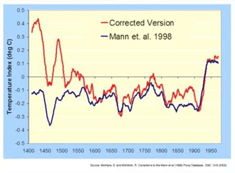
The first graph appeared in the IPCC 1990 First Assessment Report (FAR) credited to H.H.Lamb, first director of CRU-UEA. The second graph was featured in 2001 IPCC Third Assessment Report (TAR) the famous hockey stick credited to M. Mann.
The most famous of these is Michael Mann’s hockey stick graph that purported to show a relatively stable climate prior to the mid 1900’s. This graph became the poster child for the UN’s IPCC 1st climate assessment report. Man refused to release the data sets he used or let others review his methods or computer programs that came up with the hockey stick. However, Mann’s hockey stick graph eventually was proven to be a fraud. The IPCC quietly dropped it from their 3rd assessment. Each IPCC assessment has adjusted the predicted climate change downward to where the latest report has a predicted climate change resulting from human activity to be 2 to 3 degrees C over the next 100 years.
The original MBH graph compared to a corrected version produced by MacIntyre and McKitrick after undoing Mann’s errors.
However, even that amount remains nothing more than a computer model prediction which has not been proven.
Why so many people are so willing to accept a theory without any evidence and are so willing to accept the demanded changes to how we live with no evidence is a truly remarkable thing. Climate alarmist will point to every weather event as proof of man’s destruction of the planet. Even when the science has proven time and again that the supposed weather events are in fact well within the natural cycle of events. All of these claims and efforts are efforts to bring within the human experience (life time) evidence of climate change and the man made use of fossil fuels has the cause.
Even though NONE of the predictions made over the last 50 years has come to fruition. NOT ONE OF THEM. How can a group promoting and claim and being wrong every single time still be consider credible, is simply incredible. Some, maybe most are sincere in their belief but instead of using the evidence that is available they are simply Lemmings. Others, the politicians and those with an economic stake in turning the economy upside down are acting out of basic greed. Greed for power and money.
Climate changes occur on geologic timeframes,
which are measured in thousands and millions of years, not in human life times.
The climate cult never sleeps, and when they see nations in crisis they are always quick to try to exploit the situation by misrepresenting the root problem.
A heat wave is currently hitting Europe along with wild fires and the mainstream media is beating the global warming drum hard. This is nothing new; every time the weather gets hot they cry “climate change!” Every time the weather is extra cold they once again cry “climate change!” The evidence? What about the “record heat” in parts of UK, Spain and Portugal? This is surely proof that the weather is being ruined by that terrible menace known as man-made carbon?
Of course, what they don’t tell you is that the official record for weather and temperatures used by climate scientists only goes back about 140 years (it started in the 1880s). So, millions upon millions of years of Earth weather, and they only count 140 years of it to determine “record temps?” They tend to ignore ice core and tree ring data from centuries ago that indicate much hotter warming periods in our planet’s history (none of which were caused by man-made carbon emissions). In comparison, today’s temperatures are rather tame.
The Earth’s overall temperatures have only risen by 1° Celsius in the past century; this was actually the peak and currently temps have evened out to an increase of 0.8°C. This is the great climate doomsday we are all supposed to be terrified of. This is the looming threat we are supposed to sacrifice all fossil fuel based energy production for – Less than a single degree of heat.
Global warming theory claims added CO2 systematically raises surface temperatures. On the contrary all of the recent warming is episodic, associated with oceanic El Nino events.
It’s important to put the frantic climate change narrative into concrete perspective because the vast majority of climate science is paid for by governments and special interest organizations like the UN, the World Economic Forum and many other globalist groups with an agenda in mind. On average, these governments and institutions spend around $632 billion per year on climate research funding and climate policy initiatives (which they call “meager”). Their goal is to increase this cash flow to $4 trillion by the year 2030. The incentives to jump on the man-made climate change train are MASSIVE; there is almost no monetary incentive for scientists that want to study other potential causes for climate events.
The notion of the stalwart and incorruptible scientist that seeks objective truth rather than cash and notoriety is long dead. Honest scientists are few and far between these days (especially in the medical and climate science fields), and perhaps it has always been that way. The “experts” cannot be blindly trusted because they are just as susceptible to bias and corruption as anyone else.
Climate change hysteria is a nothing burger, but it is being actively promoted by the media to obscure very real threats that the public faces in the near term.
One of those threats is energy shortages, and climate regulations have put a stranglehold on many nations and their ability to adapt. The EU is now implementing carbon policies that call for a 55% reduction of emissions by 2030. Meaning, no new fossil fuel sources are supposed to be utilized. Only reductions are allowed.
Climate scientists and global elitists claim that climate change is the paramount issue of the century and must be dealt with immediately and by any means necessary. They haven’t presented a single shred of hard evidence to support this assertion, but they dictate the policies of most western governments so they don’t really need to. They just initiate restrictions without public input.
In reality, perhaps the greatest threat since WWII is about to land like a hydrogen bomb
in the laps of the European public.
Panic is beginning to take shape as Russia cuts natural gas supplies to the EU down to 20% of their original capacity and alternative sources simply do not exist on a scale that can take up the slack. A large portion of oil exports have also been shut down, and European governments are NOT informing the citizenry of the true gravity of the situation.
At current energy import rates, at least 40% of Europe
will not be able to heat their homes in the winter.
EU plans to replace Russian energy sources in the near term have also been deemed “wildly optimistic.” In other words, the EU public is screwed, and many of them still don’t realize it yet because the government won’t admit it. A disaster of epic proportions is about to strike and this isn’t even counting the enormous price hikes that are coming for the other 60% of people that will still have gas supplies available.
But the climate cult is not letting this visceral reality get in their way. To them, the crisis is an opportunity. A new narrative is rising among intergovernmental bodies, the media and among climate activists; they say this impending disaster is actually “good for Europe” in the long run, because it forces citizens to accept energy reduction policies and carbon controls which climate scientists and globalists have been demanding for years. Inflation in prices means shrinking demand and cuts in the supply chain mean resources are quashed even if demand remains high. Energy is being suffocated slowly leaving room for a “Green New Deal” of sorts.
So, it’s good for the globalists and their agenda, but not really good for anyone else that has to live through harsh winter months with no heat and limited electricity.
If the current trend continues without a dramatic change in the way Europe throttles fossil fuel energy, then there is the very real potential for mass deaths this winter. This is not hyperbole, this is a mathematical certainty. The continued push for even more climate restrictions at this time is making the situation much worse.
There is no impending threat due to climate change, but there is an impending threat due to energy shortages. Europeans need to ask themselves – Why are their governments setting them up for calamity over a non-existent climate bogeyman? Without increased fossil fuel energy from numerous sources including coal and oil the EU is on the path to a historic tragedy this winter.
Environmentalism: A new (2018) Census report shows that this year, the hottest states in the country had the biggest gains in population. Haven’t these people been listening to decades of warnings from climate change scientists about the myriad hazards of a warmer climate?
Climate scientists have been endlessly shouting that a slightly warmer planet will unleash all sorts of terrible things — more heat-related deaths, more hurricanes and storms, more diseases, more drought and the like. Despite these admonitions, climate change never registers as a top concern among the public.
Perhaps one reason is that Americans have been steadily migrating to hotter climates for decades. And they’re doing so despite the increased risks they face.
According to Census data, the five states with the biggest gains in population this year are, in order: Texas, Florida, California, Arizona and North Carolina. What else do these states have in common? They are among the states with the highest average temperatures in the country. And the two biggest gainers — Texas and Florida — are the first and fourth hottest states, respectively, in the nation.
Meanwhile, of the nine states that lost population this year, six are in states with below-average temperatures. The biggest loser in the country is New York, which dropped by 48,000 this year. Its climate is 7 degrees colder than the national average.
This year’s census numbers aren’t an aberration, either.
From 2010 to 2017, a net of 2.2 million people moved to the five hottest states in the country.
The above chart shows that over those years, the colder Northeast and Midwest have lost massive numbers of people to the warmer South and West.
Almost a third of the people who moved out of California over the past two years went to states with even higher average temperatures, census migration data show.
There’s no question that these states are more dangerous, in terms of climate-related problems, than the ones millions are fleeing.
Last year, for example, a third of the weather-related deaths occurred in just the five hottest states in the nation, according to the National Weather Service. Its data also show that states gaining in population are more prone to heat, hurricanes and floods.
More than 2.5 million people moved into hurricane-prone states like Florida, the Carolinas, Georgia, and Texas from 2010 to 2017. Florida alone had a net in-migration of more than 1 million. (Only Louisiana lost population over those years.) That’s despite constant alarms about how climate change will make hurricanes more frequent and intense.
States gaining population also are far more likely to suffer heat-related deaths and workplace injuries. And they’re more likely to suffer things like mosquito-borne diseases.
Of course, climate isn’t the only thing motivating this mass migration. The population is also moving to states that have lower tax rates and are more business friendly. It’s these states that are creating jobs and opportunity. (Which explains why frigid North Dakota saw its population climb by 12% over those years.)
[Note: The most recent US regional migration stats from 2020 to 2021 show the same trend albeit with reduced volume of movers. Both the NE and Midwest showed net losses to the South, totaling nearly 300,000.]
So, bottom line is: Millions of Americans have made it clear that when push comes to shove, they rank opportunity far higher than any of the supposed risks posed by climate change.
Is it any wonder that Americans are so indifferent to the constant demands by environmentalists that we must all sacrifice to prevent the planet from warning by a few degrees?
The editors of IBD explain at Issues and Insights Climate Emergency? What a Crock. Excerpts in italics with my bolds and added images.
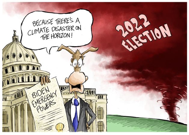
Joe Biden did not declare a climate emergency last week, as many in his party urged him to do. One Democratic senator claimed that the changing climate required “bold, intense executive action” from the president. Another said Biden needed to move because “the climate crisis is a threat to national security.” But there’s no emergency. It’s a wholly manufactured charade.
Though he put off an executive action, Biden said last Wednesday that he has “a responsibility to act with urgency and resolve when our nation faces clear and present danger. And that’s what climate change is about. It is literally, not figuratively, a clear and present danger. The health of our citizens and our communities is literally at stake.”
His non-COVID fever continued:
“Climate change is literally an existential threat to our nation and to the world. … Right now, 100 million Americans are under heat alert – 100 million Americans. Ninety communities across America set records for high temperatures just this year, including here in New England as we speak.”
On the same day Biden issued an authoritarian’s threat:
“Since Congress is not acting on the climate emergency, I will,” he tweeted. “And in the coming weeks my Administration will begin to announce executive actions to combat this emergency.”
Most Americans who aren’t named Barack Obama like to think that the U.S. is the center of our world if not the universe. But just because much of the country has been hot, it doesn’t mean the entire Earth is on fire. Yet our politicians and media focus on unusual heat despite the obvious:
If the global temperature “is just about average” – and it is –
“then clearly it must be well below average somewhere else.”
The facts, not the Democrats and activists’ political desperation, show that global temperatures have gone nowhere over the past four decades, which is the only period of time they can be accurately measured and compared. Anyone who believes that the temperature record before 1979 is reliable is fooling themselves (and also a blind ideologue).
The only data that can be trusted, that makes a genuine apples-to-apples comparison, are the measurements from satellites. All other temperature reconstructions require faith in subjective readings of often poorly placed primitive instruments, and compromised tree ring signals.
So, then what do the satellite data tell us? That we just went through “the coolest monthly anomaly in over 10 years, the coolest June in 22 years, and the ninth coolest June in the 44 year satellite record,” says University of Alabama at Huntsville climate scientist Roy Spencer. [See Tropics Lead Remarkable Cooling June 2022] Repeat the line:
Last month was “the coolest monthly anomaly in over 10 years,
the coolest June in 22 years,
and the ninth coolest June in the 44 year satellite record.”
Yeah, that’s some emergency.
But then June 2022 is just one month of many. What about the rest of the record? While global temperature based on satellite readings has trended upward, the increase has been slight. “The linear warming trend since January 1979” is a mere 0.13 of a degree Celsius per decade, says Spencer. June 2022 was also cooler than a number of months on Spencer’s chart, quite a few of them going back more than 20 years.
Other evidence than the emergency exists only in the overly political minds of Democrats, their communications department (the mainstream media), and the usual zealots include:
♦ “Despite rhetoric to the contrary, there is still plenty of sea ice over Arctic regions this summer, supplying feeding platforms for polar bears, ice-dependent seals, and walrus cows nursing their young calves.” – Watts Up With That?
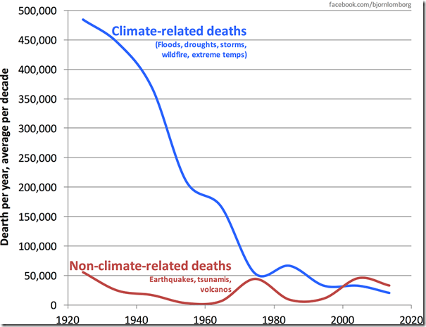
♦ “If you took a very careful look with consistent data over long periods of time, you will find that these (natural) disasters are not increasing. In fact, the health of the world is increasing tremendously. For example, deaths from weather disasters and so forth have gone down about 95% in the last hundred years. … They really aren’t increasing in frequency or intensity.” – John Christy, University of Alabama at Huntsville climatologist
♦ “The ice caps on Mars have been shrinking in sync with ice caps on earth. To me, that’s fairly good evidence that the sun is involved but NASA assures us that’s not so.” – Bookworm Room
♦ “Natural variability of the atmosphere was the proximate cause of the (recent) warmth and does not represent an existential threat to the population of Europe. Clearly, there’s no cause for alarm, no matter what the media says. But the media won’t tell you any of that, because it ruins their narrative of being able to blame the heatwave on climate change, while hoping you don’t notice their distortion of the truth about ordinary weather events we see every summer.” – Anthony Watts
It’s probably an even bet that Biden will eventually declare a climate emergency. His handlers probably think doing so would help pull his miserable ratings out of their tailspin. But we don’t think Americans want their presidents to act like dictators, especially when they are as feeble of mind as Biden is.
This post from some years ago was in response to David A. elaborating on his thinking and questions on this topic. There is much uncertain and unknown about the functioning of our climate system. I listen when a seasoned expert such as John Christy says:
“The reason there is so much contention regarding “global warming” is relatively simple to understand: In climate change science we basically cannot prove anything about how the climate will change as a result of adding extra greenhouse gases to the atmosphere. So we are left to argue about unprovable claims.”
See Christy’s Data-Based Climate Science
So everyone is theorizing and wondering if and when the best theory will win–that is, become the new conventional wisdom. According to Christy, the science is far from settled, and he has examined the datasets extensively, having built some of them himself.
I have also learned a lot from Nullius in Verba, who is one of best explaining these things to us laymen. For example, he comments:
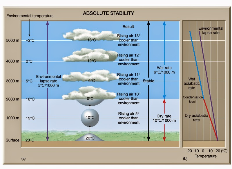
“It would be slightly more accurate to say that the lapse rate is the vertical temperature gradient at which convection switches off and therefore stops cooling the surface.
The sun warms the surface, but the heat escapes very quickly by convection so the build-up of heat near the surface is limited. In an incompressible atmosphere, it would *all* escape, and you’d get no surface warming. But because air is compressible, and because gases warm up when they’re compressed and cool down when allowed to expand, air circulating vertically by convection will warm and cool at a certain rate due to the changing atmospheric pressure. Air cools as it rises and expands, and warms as it descends and is compressed. This warming/cooling effect means that hot air no longer rises when it would cool faster from expansion than the surrounding air. Cold air can sit on top of warm air and be stable. The adiabatic lapse rate is why the tops of mountains are colder than their bottoms.
It’s a bit like the way a pot of boiling water sticks at a temperature of 100 C. If you turn the gas up, the water boils more vigorously, carrying more energy off as steam, which balances the extra energy supplied and keeps the temperature still at exactly 100 C. The rate at which heat escapes is very non-linear – extremely fast for temperatures above the threshold, extremely slow for temperatures below it. So long as the system is driven hard enough, it will get driven up against the non-linear limit and held there. The lapse rate does the same thing, except that instead of fixing the temperature, it fixes its gradient so you get a rigid slope that can freely float up and down in level.
The temperature at the average altitude of emission to space converges on the temperature that radiates the same energy the Earth absorbs. All levels above and below it are held in a fixed relationship to it by the lapse rate. The temperature at any other level is the temperature at the emission altitude plus the lapse rate times the difference in heights. Hence, the temperature at the surface differs by the lapse rate times the average height of emissions to space.”
“It’s interesting to consider what would happen if you had a strongly absorbing greenhouse material but a zero lapse rate. You’d get lots of backradiation, but no greenhouse warming. By marvelous happenstance we do have such a physical situation in the oceans. Water absorbs all thermal radiation within about 20 microns, making it something like 20,000 times more powerful a greenhouse material than the atmosphere. It’s a (relatively) easy calculation to show that if radiation was the only way heat could be transported, as the backradiation argument assumes, the temperature a metre down would be several thousand degrees! But water is almost incompressible, having a lapse rate of around 0.1 C/km, and so convection nullifies it entirely. Fortunate, eh? . . .”
“The direction of net energy flow is determined only by the difference in temperatures, not the amount of stuff. If you have a big body at a cold temperature next to a small body at a very hot temperature, the cold body might be emitting more heat overall because of its bigger surface area, but the net flow is still from the hot body to the cold. Most of the heat emitted from the big cold body doesn’t hit the small body, because it’s so small. Only the temperature matters.
The way this is arranged varies depending on the configuration, but it always happens. People have had a lot of fun over the years trying to construct exotic arrangements of mirrors and radiators and insulators and heat engines to try to break the rule, but nobody has succeeded yet. The second law of thermodynamics is one of the most thoroughly challenged and tested of all the laws of physics. I do encourage people to try though. The prize on offer is a perpetual motion machine to the lucky winner who defeats it!”
David, I am not a fan of thought experiments about hypothetical worlds with or without CO2. I have read too many threads that go around in circles until everyone turns into wheels.
I do like what E.M. Smith (Chiefio) said sometime ago:
“It is peculiar that everyone is so taken in by the whole notion of the so-called ’radiative greenhouse effect’ being such an ingrained necessity, such a self-evident, requisite part, as it were, of our atmosphere’s inner workings. The ’truth’ and the ’reality’ of the effect is completely taken for granted, a priori. And yet, the actual effect is still only a theoretical construct.
In fact, when looking at the real Earth system, it’s quite evident that this effect is not what’s setting the surface temperature of our planet.
The whole thing can be stated in a simple, yet accurate manner.
The Earth, a rocky sphere at a distance from the Sun of ~149.6 million kilometers, where the Solar irradiance comes in at 1361.7 W/m2, with a mean global albedo, mostly from clouds, of 0.3 and with an atmosphere surrounding it containing a gaseous mass held in place by the planet’s gravity, producing a surface pressure of ~1013 mb, with an ocean of H2O covering 71% of its surface and with a rotation time around its own axis of ~24h, boasts an average global surface temperature of +15°C (288K).
Why this specific temperature? Because, with an atmosphere weighing down upon us with the particular pressure that ours exerts, this is the temperature level the surface has to reach and stay at for the global convectional engine to be able to pull enough heat away fast enough from it to be able to balance the particular averaged out energy input from the Sun that we experience.
It’s that simple.”
Update 1 May 5,2015
David, an additional point of some importance: There is empirical support for the lapse rate existing independent of IR activity.
Global warmists share an assumption that CO2 raises the effective radiating altitude, thereby warming the troposphere and the surface. Now this notion can be found in textbooks and indeed operates in all the climate models. Yet there is no empirical evidence supporting it. What data there is (radiosonde balloon readings) detects no effect from IR active gases upon the temperature profile in the atmosphere.
“It can be seen from the infra-red cooling model of Figure 19 that the greenhouse effect theory predicts a strong influence from the greenhouse gases on the barometric temperature profile. Moreover, the modeled net effect of the greenhouse gases on infra-red cooling varies substantially over the entire atmospheric profile.
However, when we analysed the barometric temperature profiles of the radiosondes in this paper, we were unable to detect any influence from greenhouse gases. Instead, the profiles were very well described by the thermodynamic properties of the main atmospheric gases, i.e., N 2 and O 2 , in a gravitational field.”
While water vapour is a greenhouse gas, the effects of water vapour on the temperature profile did not appear to be related to its radiative properties, but rather its different molecular structure and the latent heat released/gained by water in its gas/liquid/solid phase changes.
For this reason, our results suggest that the magnitude of the greenhouse effect is very small, perhaps negligible. At any rate, its magnitude appears to be too small to be detected from the archived radiosonde data.” Pg. 18 of referenced research paper
In summary David, it is observed and accepted by all that there is a ~33C difference between the temperature at the surface and at the effective radiating level (the tropopause, where convection stops). Warmists attribute that increase in temperature to the IR activity of CO2.
Others, including me, contend that it is the mass of the atmosphere, mostly O2 and N2 delaying the loss of heat from the surface until IR active gases are able to cool the planet effectively without obstruction. That retention of heat in the atmosphere is measurable in the lapse rate. And 90% of the IR activity is due to H2O, especially in the lower troposphere.
Gregory R. Wrightstone writes at Real Clear Energy LinkedIn Shuts Out Truth — Again. Excerpts in italics with my bolds and some added images
Censors at LinkedIn have permanently banned me from the social media site after I presented data drawn from peer-reviewed data used by the preeminent promoter of the narrative that man-made global warming threatens the planet— the U.N. Intergovernmental Panel on Climate Change (IPCC).
How can this be? Well, first, my offending posts placed today’s level of atmospheric carbon dioxide in the context of geological time, suggesting that life would be well served if there were more CO2 — exactly the opposite of what climate alarmists say. Secondly, I’ve had the audacity to publish facts — also know as the truth, multiple times on LinkedIn— that contradict the theory that humans face an “existential threat” from a harmless gas of which each of us daily exhales two pounds.
“Your account has violated the LinkedIn User Agreement and Professional Community Policies,” read the email from the site. “Due to the number and/or the severity of these violations, this account has been permanently restricted.”
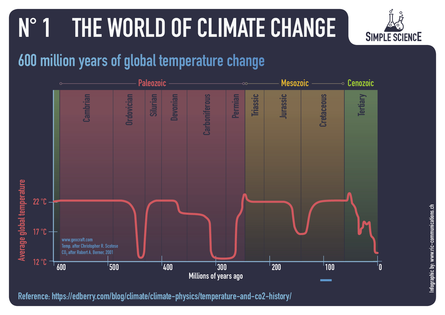
The posts were of two charts. One showed that carbon dioxide levels were nearly 6,000 parts per million (ppm) 600 million years ago when many animal life forms first appeared in the Cambrian Era. Another illustrated a 140-million-year decline of CO2 levels — from 2,500 parts per million (ppm) to the current 420 ppm.
Implied in the data is that carbon dioxide levels eventually would drop to 150 ppm, at which point plants — and ultimately all life — begin to die from CO2 starvation. The concentration got as low as 180 ppm in the last ice age about 12,000 years ago. It was at 280 ppm at the beginning of the Industrial Revolution in the 19th century.
The addition of 140 ppm since then have likely come from man’s activities, primarily the burning of fossil fuels. If so, human activity has saved the planet from the existential threat of too little CO2. In any case, more of the powerful plant food is a good thing, as evidenced by the overall greening of Earth and record crop harvests of recent decades.
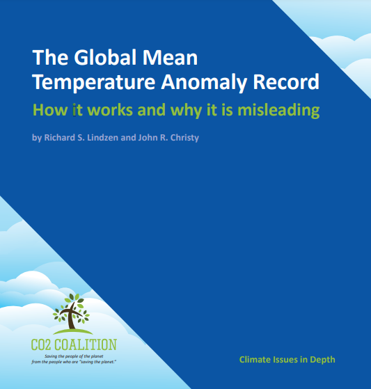
As executive director of the CO2 Coalition, I’ve had previous run-ins with LinkedIn censors. One involved a post about a CO2 Coalition paper on global temperatures. Although LinkedIn did not identify the broken rules, the only possible “violation” would have been an admonition to “not share false or misleading content.” The censored paper, The Global Mean Temperature Anomaly Record,was fully sourced and written by two of the top climate scientists in the world, Richard Lindzen and John Christy.
These are no lightweight scientists. Dr. Lindzen of the Massachusetts Institute of Technology is an award recipient of the American Meteorological Society and the American Geophysical Union. He is also a member of the National Academy of Sciences and was a lead author of the IPCC’s third assessment report’s scientific volume.
Professor Christy is the director of the Earth System Science Center at the University of Alabama, Huntsville, and has been Alabama’s State Climatologist since 2000. Along with Dr. Roy Spencer, he has maintained one of the key global temperature data sets relied on by scientists and government bodies. For this achievement, they were awarded NASA’s Medal for Exceptional Scientific Achievement.
Figure 4. As in Fig. 3 except for seasonal station and global anomalies. As noted in the text, the inhabitants of the Earth experience the anomalies as noted by the black circles, not the yellow squares.
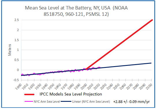
The main thrust of the paper was to put the modest one-degree rise in temperature since 1900 in its proper perspective. When compared to wide swings in temperature experienced on a daily and yearly basis, that slight rise in global temperature over the last 120 years does not appear as alarming as portrayed by the purveyors of climate doom. Like so many others who challenge the notion of catastrophic man-made warming, the authors risked being censored by the intellectual elite — or those who identify as such. And they were.
The CO2 Coalition has been attacked by other climate cultists, including Facebook and members of a political class that insists on forcing its ideology on everybody. Obviously, we care more about the truth — and our freedom — than anybody’s approval.
As noted philosopher of science Karl Popper said, “Democracy (that is, a form of government devoted to the protection of the open society) cannot flourish if science becomes the exclusive possession of a closed set of specialists.”
Gregory Wrightstone is a geologist, executive director of the CO2 Coalition, Arlington, Va., and author of “Inconvenient Facts: The science that Al Gore doesn’t want you to know.” He has been an IPCC expert reviewer.
SCOTUS ruled 6-3 that, in effect, without Congressional authorization, the EPA does not have the power to regulate carbon dioxide. Justice Elena Kagan dissented.
Kagan opened her dissent thus (whole opinion; with my paragraphification for screen readability):
Climate change’s causes and dangers are no longer subject to serious doubt. Modern science is “unequivocal that human influence”—in particular, the emission of greenhouse gases like carbon dioxide—“has warmed the atmosphere, ocean and land.” [Cites IPCC] … The rise in temperatures brings with it “increases in heat-related deaths,” “coastal inundation and erosion,” “more frequent and intense hurricanes, floods, and other extreme weather events,” “drought,” “destruction of ecosystems,” and “potentially significant disruptions of food production.” [Cites, of all things, a case in which this was quoted.]
If the current rate of emissions continues, children born this year could live to see parts of the Eastern seaboard swallowed by the ocean. See Brief for Climate Scientists as Amici Curiae 6. Rising waters, scorching heat, and other severe weather conditions could force “mass migration events[,] political crises, civil unrest,” and “even state failure.”
So Kagan has bought and believes, seemingly sincerely, the failed predictions of global warming, which she calls “climate change”. This is her adopted opinion, provided her by climate Experts, who claim there is no “serious doubt” about their theories.
We have seen many times that her (or her Experts’) quoted predictions of doom are false. There have not been an increase, but a decrease, in floods. Same for drought. There is no “destruction of ecosystems.” And just last week a paper appeared—a peer-reviewed paper in the regime-approved journal Nature, going by the name “Declining tropical cyclone frequency under global warming“—which shows the number of tropical cyclones have been decreasing, not increasing.
Here’s a picture from that paper (ignore the straight and red lines, which are models and not the data): So Kagan’s suppositions about the dooms of global warming are false, and known to be false with only a little investigation. Which she did not make. Nor did Wise Latina, and nor did the other guy who’s now retired and will be quickly forgotten. Both signed Kagan’s dissent.
Their non-curiosity and blind acceptance of the Expert Consensus is point one. And really is our only point, as we’ll see.
Under the Clean Air Act, as Kagan writes, Congress gave power to the “EPA to regulate stationary sources of any substance that ’causes, or contributes significantly to, air pollution’ and that “may reasonably be anticipated to endanger public health or welfare.’”
As we know, EPA called carbon dioxide, the basis of almost all life on earth, the very stuff of your breath, the food of plants, “pollution”. And started to regulate it. Scientifically, this is like the American Medical Association saying “not all women have cervixes”, and allowing the AMA to regulate the English language.
Do people forget, or maybe they never knew, that CO2 is plant food? And not only plant food, but the plant flood. Back in olden days, they used to teach photosynthesis. No longer? Remove CO2 and plants die. Then you die.
So what the EPA did in trying to regulate CO2 was ridiculous—unless you really do believe global warming, a.k.a. “climate change”, is an “existential crisis.” As Kagan, Wise Latina, and Gone Guy believe, or say they do. But which all observations show is not so.
Models, on the other hand, show the “existential crisis” is true. And all models only say what they are told to say. So models are told to say that “climate change” is an “existential crisis.” Experts told models to say this.
Experts, therefore, value models over observation. The Deadly Sin of Reification.
The real problem, then, is letting Experts make decisions based on models which are beautiful, to Experts, but which make lousy predictions. Experts are trusted too much.
Even if you think not, and still believe the models, nothing follows from them. That is, no policy is suggested, implied, or necessary because of the models. Not one. It is separately true that all policies, suggested from any source, have consequences, which may be known to greater or lesser extent—their uncertainty in them also are models.
It is scientism, a fallacy, to say Experts who wrote climate models also know what is best to do about the weather. Scientifically, it is like saying the CDC knows what is the best rate to pay for rent during a disease outbreak. Which they did say. And were rebuked for saying. A rebuke which they ignored. Which may happen here with the EPA, too.
Therefore, even if you believe the models, which stink, a fact that requires only minor effort to check, it does not follow the Experts who created those models, including agents in the EPA, know what is best to do about model predictions.
That power should fall to Congress, and to state and local governments, who have that mandate.
In other words, the Expertocracy, which was in part struck down and which Kagan dissented against, is based on two false assumptions. The first is that Expert models have skill. They do not. And the second, which is independent, is scientism, which is that scientists with expertise in one are are equipped with greater senses of good and evil on all subjects, which is absurd.
Kagan, though, embraces the Expertocracy. She said (her emphasis):
Members of Congress often don’t know enough—and know they don’t know enough—to regulate sensibly on an issue. Of course, Members can and do provide overall direction. But then they rely, as all of us rely in our daily lives, on people with greater expertise and experience. Those people are found in agencies. Congress looks to them to make specific judgments about how to achieve its more general objectives. And it does so especially, though by no means exclusively, when an issue has a scientific or technical dimension. Why wouldn’t Congress instruct EPA to select “the best system of emission reduction,” rather than try to choose that system itself?
Second and relatedly, Members of Congress often can’t know enough—and again, know they can’t—to keep regulatory schemes working across time. Congress usually can’t predict the future—can’t anticipate changing circumstances and the way they will affect varied regulatory techniques. Nor can Congress (realistically) keep track of and respond to fast-flowing developments as they occur.
Kagan is quite wrong. For all the reasons we discussed. Congress (as sick as that institution is) does know enough, and it knows vastly more than weather Experts about law. Because it knows, or is supposed to, what laws are, and what laws should do, and what the consequence of laws are. Climate or weather Experts do not. Congress can consult with Experts: “If we pass this law, what are the bounds of uncertainty on this particular weather-effected thing?” That is sensible. But it is rank foolishness to trust weather Experts to decide what laws are best, even if you by subterfuge call those laws “regulations”. And it even more dangerous to trust people who have something to gain, as Experts do, to decide what is “best” to do.
The impetus for the Expertocracy, and the faith in it, is there in Kagan’s words. She reasons, in effect, that Experts know more than anybody else on their subjects of expertise, therefore we have no right to interfere with their decisions on any subject.
It is a bad argument because Experts don’t always know best about their own subjects, as we see now everywhere. And even if Experts do know best about their subjects, they don’t know what is best to do about them.
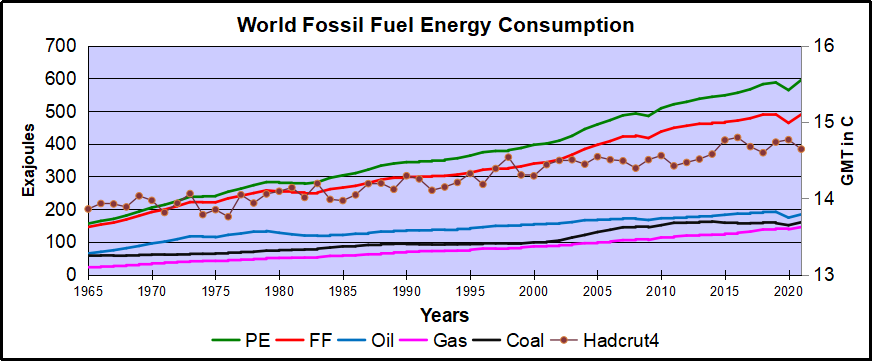
Previous posts addressed the claim that fossil fuels are driving global warming. This post updates that analysis with the latest (2021) numbers from BP Statistics and compares World Fossil Fuel Consumption (WFFC) with three estimates of Global Mean Temperature (GMT). More on both these variables below.
The reporting categories are:
Oil
Natural Gas
Coal
Nuclear
Hydro
Renewables (other than hydro)
Note: British Petroleum (BP) now uses Exajoules to replace MToe (Million Tonnes of oil equivalents.) It is logical to use an energy metric which is independent of the fuel source. OTOH renewable advocates have no doubt pressured BP to stop using oil as the baseline since their dream is a world without fossil fuel energy.
From BP conversion table 1 exajoule (EJ) = 1 quintillion joules (1 x 10^18). Oil products vary from 41.6 to 49.4 tonnes per gigajoule (10^9 joules). Comparing this annual report with previous years shows that global Primary Energy (PE) in MToe is roughly 24 times the same amount in Exajoules. The conversion factor at the macro level varies from year to year depending on the fuel mix. The graphs below use the new metric.
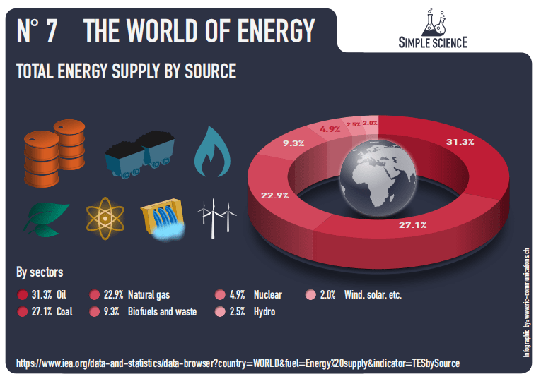
This analysis combines the first three, Oil, Gas, and Coal for total fossil fuel consumption world wide (WFFC). The chart below shows the patterns for WFFC compared to world consumption of Primary Energy from 1965 through 2021.
The graph shows that global Primary Energy (PE) consumption from all sources has grown continuously over 5 decades. Since 1965 oil, gas and coal (FF, sometimes termed “Thermal”) averaged 88% of PE consumed, ranging from 93% in 1965 to 82% in 2021. Note that in 2020, PE dropped 23 EJ (4%) below 2019 consumption, then increased 31 EJ in 2021. WFFC for 2020 dropped 26 EJ (5%), then in 2021 gained back 26% to match 2019 WFFC consumption. For the 56 year period, the net changes were:
Oil
184%
Gas
540%
Coal
176%
WFFC
236%
PE
282%
Global Mean Temperatures
Everyone acknowledges that GMT is a fiction since temperature is an intrinsic property of objects, and varies dramatically over time and over the surface of the earth. No place on earth determines “average” temperature for the globe. Yet for the purpose of detecting change in temperature, major climate data sets estimate GMT and report anomalies from it.
UAH record consists of satellite era global temperature estimates for the lower troposphere, a layer of air from 0 to 4km above the surface. HadSST estimates sea surface temperatures from oceans covering 71% of the planet. HADCRUT combines HadSST estimates with records from land stations whose elevations range up to 6km above sea level.
Both GISS LOTI (land and ocean) and HADCRUT4 (land and ocean) use 14.0 Celsius as the climate normal, so I will add that number back into the anomalies. This is done not claiming any validity other than to achieve a reasonable measure of magnitude regarding the observed fluctuations.
No doubt global sea surface temperatures are typically higher than 14C, more like 17 or 18C, and of course warmer in the tropics and colder at higher latitudes. Likewise, the lapse rate in the atmosphere means that air temperatures both from satellites and elevated land stations will range colder than 14C. Still, that climate normal is a generally accepted indicator of GMT.
Correlations of GMT and WFFC
The next graph compares WFFC to GMT estimates over the five decades from 1965 to 2021 from HADCRUT4, which includes HadSST4.
Since 1965 the increase in fossil fuel consumption is dramatic and monotonic, steadily increasing by 236% from 146 to 490 exajoules. Meanwhile the GMT record from Hadcrut shows multiple ups and downs with an accumulated rise of 0.8C over 56 years, 6% of the starting value.
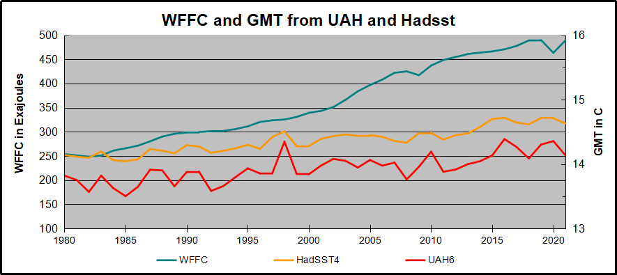
The graph below compares WFFC to GMT estimates from UAH6, and HadSST4 for the satellite era from 1980 to 2021, a period of 41 years.
In the satellite era WFFC has increased at a compounded rate of nearly 2% per year, for a total increase of 90% since 1979. At the same time, SST warming amounted to 0.49C, or 3.4% of the starting value. UAH warming was 0.48C, or 3.5% up from 1979. The temperature compounded rate of change is 0.1% per year, an order of magnitude less than WFFC. Even more obvious is the 1998 El Nino peak and flat GMT since.
Summary
The climate alarmist/activist claim is straight forward: Burning fossil fuels makes measured temperatures warmer. The Paris Accord further asserts that by reducing human use of fossil fuels, further warming can be prevented. Those claims do not bear up under scrutiny.
It is enough for simple minds to see that two time series are both rising and to think that one must be causing the other. But both scientific and legal methods assert causation only when the two variables are both strongly and consistently aligned. The above shows a weak and inconsistent linkage between WFFC and GMT.
Going further back in history shows even weaker correlation between fossil fuels consumption and global temperature estimates:
Figure 5.1. Comparative dynamics of the World Fuel Consumption (WFC) and Global Surface Air Temperature Anomaly (ΔT), 1861-2000. The thin dashed line represents annual ΔT, the bold line—its 13-year smoothing, and the line constructed from rectangles—WFC (in millions of tons of nominal fuel) (Klyashtorin and Lyubushin, 2003). Source: Frolov et al. 2009
In legal terms, as long as there is another equally or more likely explanation for the set of facts, the claimed causation is unproven. The more likely explanation is that global temperatures vary due to oceanic and solar cycles. The proof is clearly and thoroughly set forward in the post Quantifying Natural Climate Change.
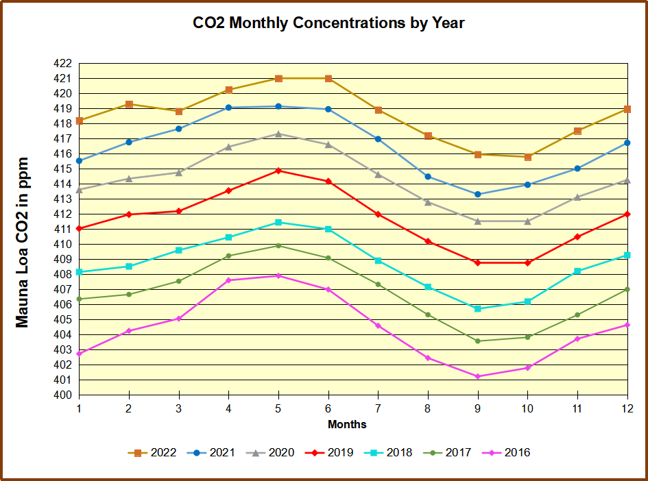
Footnote: CO2 Concentrations Compared to WFFC
Contrary to claims that rising atmospheric CO2 consists of fossil fuel emissions, consider the Mauna Loa CO2 observations in recent years.
Despite the drop in 2020 WFFC, atmospheric CO2 continued to rise steadily, demonstrating that natural sources and sinks drive the amount of CO2 in the air.
Those committed to blaming humans for rising atmospheric CO2 sometimes admit that emitted CO2 (from any source) only stays in the air about 5 years (20% removed each year) being absorbed into natural sinks. But they then save their belief by theorizing that human emissions are “pulses” of additional CO2 which persist even when particular molecules are removed, resulting in higher CO2 concentrations. The analogy would be a traffic jam on the freeway which persists long after the blockage in removed.
A recent study by Bud Bromley puts the fork in this theory. His paper is A conservative calculation of specific impulse for CO2. The title links to his text which goes through the math in detail. Excerpts are in italics here with my bolds.
In the 2 years following the June 15, 1991 eruption of the Pinatubo volcano, the natural environment removed more CO2 than the entire increase in CO2 concentration due to all sources, human and natural, during the entire measured daily record of the Global Monitoring Laboratory of NOAA/Scripps Oceanographic Institute (MLO) May 17, 1974 to June 15, 1991.
Then, in the 2 years after that, that CO2 was replaced plus an additional increment of CO2.
The Pinatubo Phase I Study (Bromley & Tamarkin, 2022) calculated the mass of net CO2 removed from the atmosphere based on measurements taken by MLO and from those measurements then calculated the first and second time derivatives (i.e., slope and acceleration) of CO2 concentration. We then demonstrated a novel use of the Specific Impulse calculation, a standard physical calculation used daily in life and death decisions. There are no theories, estimates or computer models involved in these calculations.
The following calculation is a more conservative demonstration which makes it obvious that human CO2 is not increasing global CO2 concentration.
The average slope of the CO2 concentration in the pre-Pinatubo period in MLO data was 1.463ppm/year based on the method described in Bromley and Tamarkin (2022). Slope is the rate of change of the CO2 concentration. The rate of change and slope of a CO2 concentration with respect to time elapsed are identical to the commonly known terms velocity and speed.
June 15, 1991 was the start of the major Pinatubo volcanic eruption and April 22, 1993 was the date of maximum deceleration in net global average atmospheric CO2 concentration after Pinatubo in the daily measurement record of MLO.
The impulse calculation tells uswhether a car has enough braking force to stop before hitting the wall, or enough force to take the rocket into orbit before it runs out of fuel, or, as in the analogy in the Phase Pinatubo report (Bromley & Tamarkin, 2022), enough force to accelerate the loaded 747 to liftoff velocity before reaching the end of the runway, or enough force to overcome addition of human CO2 to air.
MLO began reporting daily CO2 data on May 17, 1974. On that day, MLO reported 333.38 ppm. On June 15, 1991, MLO reported 358 ppm. 358 minus 333 = 25 ppm increase in CO2. This increase includes all CO2 in the atmosphere from all sources, human and natural. There is no residual human fraction.
25 ppm * 7.76 GtCO2 per ppm = 194 GtCO2 increase in CO2
For this comparison, attribute to humans that entire increase in MLO CO2 since the daily record began. This amount was measured by MLO and we know this amount exceeds the actual human CO2 component.
11.35 GtCO2 per year divided by 365 days per year = 0.031 Gt “human” CO2 added per day. Assume that human emissions did not slow following Pinatubo, even though total CO2 was decelerating precipitously.
Hypothetically, on April 22, 1993, 677 days later, final velocity v of “human” CO2 was the same 0.031 per day. But to be more conservative, let v = 0.041 GtCO2 per day, that is, “human” CO2 is growing faster even though total CO2 is declining sharply.
Jh = 2.17 Newton seconds is the specific impulse for our hypothetical “human” CO2 emissions.
Comparison:
♦ 2.17 Newton seconds for hypothetical “human” CO2 emissions ♦ -55.5 Newton seconds for natural CO2 removal from atmosphere
In this conservative calculation, based entirely on measurements (not theory, not models, and not estimates), Earth’s environment demonstrated the capacity to absorb more than 25 times the not-to-exceed amount of human CO2 emissions at that time.
The data and graphs produced by MLO also show a reduction in slope of CO2 concentration following the June 1991 eruption of Pinatubo, and also shows the more rapid recovery of total CO2 concentration that began about 2 years after the 1991 eruption. This graph is the annual rate of change of total atmosphere CO2 concentration. This graph is not human CO2.
During the global cooling event in the 2 years following the Pinatubo eruption, CO2 concentration decelerated rapidly. Following that 2 year period, in the next 2 years CO2 accelerated more rapidly than it had declined, reaching an average CO2 slope which exceeded MLO-measured slope for the period prior to the June 1991 Pinatubo eruption. The maximum force of the environment to both absorb and emit CO2 could be much larger than the 25 times human emission and could occur much faster.
We do not know the maximum force or specific impulse. But it is very safe to infer from this result that human CO2 emissions are not an environmental crisis.
Theoretical discussion and conclusion
These are the experiment results. Theory must explain these results, not the other way around.
Bromley and Tamarkin (2022) suggested a theory how this very large amount of CO2 could be absorbed so rapidly into the environment, mostly ocean surface. This experimental result is consistent with Henry’s Law, the Law of Mass Action and Le Chatelier’s principle. In a forthcoming addendum to Bromley and Tamarkin (2022), two additional laws, Fick’s Law and Graham’s Law are suggested additions to our theory explaining this experimental result.
There are several inorganic chemical sources in the sea surface thin layer which produce CO2 through a series of linked reactions. Based on theories asserted more than 60 years ago, inorganic and organic chemical sources and sinks are believed to be too small and/or too slow to explain the slope of net global average CO2 concentration. Our results strongly suggest that the net CO2 absorption and net emission events that followed the Pinatubo eruption are response and recovery to a perturbation to the natural trend. There is no suggestion in our results or in our theory that long-term warming of SST causes the slope of net global average CO2 concentration. We have not looked at temperatures or correlation statistics between temperature and CO2 concentration because they are co-dependent variables, and the simultaneity bias cannot be removed with acceptable certainty. References to 25 degrees C in Bromley and Tamarkin (2022) are only in theoretical discussion and not involved in any way in our data analysis or calculations. References to 25 degrees C are merely standard ambient temperature, part of SATP, agreed by standards organizations.
When CO2 slope and acceleration declined post-Pinatubo, why was there a recovery to previous slope, plus and additional offset? The decline and the recovery were certainly not due to humans or the biosphere. As we have shown, CO2 from humans and biosphere combined are over an order of magnitude less than the CO2 absorbed by the environment and then re-emitted. That alone should end fears of CO2-caused climate crisis. Where did the CO2 go so rapidly and where did the CO2 in the recovery come from? Our data suggests that in future research we will find a series of other events, other volcanoes, El Ninos and La Ninas, etc. that have similarly disrupted the equilibrium followed by a response and recovery from the environment.
Footnote:
Tom Segalstad produced this graph on the speed of ocean-CO2 fluxes:
Recently, Dr. John Robson of the Climate Discussion Nexus (CDN) interviewed CERES co-team leader, Dr. Ronan Connolly, on the role of the Sun in recent climate change. Excerpts from ICECAP in italics with my bolds, followed by a video and my transcript from the closed captions.
CDN have now published their 20 minute “explainer” video including extracts from this interview and discussion of some of CERES’ recent scientific research. Although the video covers quite a few technical points, they are explained in a very clear and accessible manner.
Topics covered include:
The significance of the debates between the two main rival satellite estimates of solar activity trends since 1978, i.e., PMOD and ACRIM.
How using either PMOD or ACRIM to calibrate the pre-satellite era solar data can give very different estimates of how much solar activity has changed since the 19th century and earlier.
How politics and the UN’s Intergovernmental Panel on Climate Change (IPCC) reports have downplayed the possible role of solar activity in recent climate change.
The urbanization bias problem of current thermometer-based estimates of global temperature trends since the 19th century.
They say you should not look directly at the sun but when it comes to climate a lot of people take that advice to ridiculous extremes. That bright yellow ball in the sky is basically earth’s only source of energy though a very small amount radiates from the planet’s hot core. The sun’s output has been measured to a high degree of precision by satellites in orbit since the late 1970s. and we now know that it varies over time.
Since it is our only source of energy, if it gets stronger it stands to reason that it could warm the climate.
Indeed there was a time about 20 years ago when many scientists believed that the sun had gotten a bit brighter during the 1980s and 1990s. And they even argued it was enough to explain much of the warming that had taken place.
But now agencies like the UN IPCC ( intergovernmental panel on climate change), NASA and others insist the change in solar output never happened. They say the warming can only be explained by greenhouse gases, so do not look at the sun.
People, something pretty basic doesn’t add up here.
If satellites are measuring the sun’s energy precisely, how can there be disagreement about what it’s been doing? The answer unfortunately is that there’s a gap in the satellite record, a gap that came about after the 1986 space shuttle challenger disaster. And as happens too much in this field, the gap quickly went from being a scientific problem to a political one. And the way that gap was handled is a story that deserves a little sunlight.
I’m John Robson and this is a climate discussion nexus backgrounder on the ACRIM gap controversy
The name ACRIM comes from an instrument called the Active Cavity Radiometer Irradiance Monitor that satellites use to measure solar output. And the amount of solar energy that hits the earth’s atmosphere is called the total solar irradiance or TSI measured in watts per square meter.
On average the sun provides about 1367 watts of energy per square meter continuously on the upper atmosphere. For comparison, all the carbon dioxide ever released from using fossil fuels is estimated by the IPCC to have added about 2 watts per square meter of energy to the atmosphere. And so given the overwhelming role of solar output in the total it shouldn’t take much of a change in the sun’s output to have a global influence on the climate.
We also have data on solar output from the pre-satellite era. For centuries astronomers have been keeping track of the number of dark circles or sunspots that appear on the surface of the sun. Galileo even wrote a book about them. The sunspot count rises and falls on a roughly 11-year cycle which provides clues to the changing strength of solar energy in the past. Scientists can also use evidence from chemical signatures in the earth, called cosmogenic isotopes, to reconstruct solar activity. As usual when you go backward in time on climate it’s only proxy data, and it’s considerably less precise than modern measurements.
Source IPCC Assessment Report #1
But by comparing proxies to satellite data since 1979 we get some idea of how to interpret the clues. In the IPCC’s first report in 1990 they presented a graph that summarized the prevailing view of the sun’s history over the 19th and 20th centuries. It showed the familiar sunspot cycle and also suggested average solar output grew stronger in the second half of the century but they said the changes were not large enough to cause much warming unless there are positive feedback mechanisms that amplify those changes.
But that qualification is not trivial because in fact the notion that carbon dioxide is the driver of warming itself depends on a series of positive feedback mechanisms.Because on its own the warming effect of CO2 is quite small. So there have been various proposals for amplifying mechanisms to increase its impact, which we’ll look at in more detail on another day.
When it comes to the sun basically the argument is that the sun doesn’t just affect how bright it is outside, it also influences how cloudy it is. And since some kinds of clouds have a major role in reflecting heat back into space if more solar output not only adds a bit of heat but also suppresses that kind of cloud formation, it can translate into a lot of surface warming.
So key point here: By the time of the IPCC’s third assessment report in 2001, their views about the sun’s history were getting more uncertain not less uncertain. In AR3 in 2001, instead of having just one reconstruction of solar output, the IPCC now had multiple different ones to choose from. The reconstructions all agreed that solar output followed the sunspot cycle and they all agreed that solar output had increased over the 20th century.
Fig. 6.5 Reconstructions of total solar irradiance (TSI) by Lean et al. as well as Hoyt and Schatten 1993 updated.
But they disagreed over whether the increase was a lot or little and whether it had happened all at once early in the century or more gradually over the whole span. Since these differences arose from statistical estimates using proxy records, it didn’t look as though there would be an easy way to resolve the disagreements.
So attention turned to the modern satellite record with precise measurements of TSI available since 1978. It should have been possible to compare them with surface temperatures to see if there was any relationship. Unfortunately there was the problem we referred to at the outset: A big gap in the data. The satellites that carried the ACRIM system were first launched in 1978. From time to time satellites wear out and need to be replaced. A replacement satellite is supposed to be launched early enough so its ACRIM system overlaps with the existing one allowing the instruments to be calibrated to each other giving scientists a continuous record.
But as you can see, there’s a gap in the ACRIM record from June 1989 to October 1991. and that gap was a consequence of the space shuttle challenger disaster in January of 1986 that caused NASA’s satellite launch program to be suspended for several years.
By the time a new ACRIM system could be put into orbit in 1991 the old one had already been offline for two years. And the only data available to fill the gap was from a different monitor called the earth radiation budget system or ERB which flew on the Nimbus 7 satellite launched in 1978 as part of a separate series. That satellite didn’t have an acronym and unfortunately the ERB system was not meant to monitor solar output with much precision. Its sensors were pointed toward the earth so it could monitor the climate system and it only had a view of the sun during brief intervals of its orbit.. Also it generated two data series, called ERB and ERBS in the diagram, and they disagreed with each other regarding what the sun did during the ACRIM gap.
Still it was something to work with. In 1997 the lead scientist working on the ACRIM system RIchard Willson of Columbia University used the satellite data and all available information on the behavior of the onboard sensors in the various satellites to construct a composite ACRIM record. A comparison of the minimum points in the solar cycle suggested an increase in TSI from the early 1980s through to the end of the 1990s, after which solar output flattened out.
Since this broadly matched the progress of temperatures after 1980 it opened the door to the possibility that the sun might be responsible for some or all of recent climate changes. The alarmists didn’t like that result at all. In fact they reacted like that far side cartoon with the astronauts going blast the controls are jammed we’re headed right for Mr Sun.
So a few years later a different team led by Claus Fröhlich and Judith Lean published a new reconstruction of the same data that showed: Voila, no upward step, just the standard solar cycle steady downward trend after 1980. It’s called the PMOD reconstruction after the name of Fröhlich’s institute the Physical Meteorological Observatory in Davos. It had the convenient effect of ruling out the sun as a factor in climate change.
Now when I say convenient I do mean in the political sense. The authors made no secret of their motivation. In a recent article reviewing the whole episode scientist Ronan Connolly of the center for environmental research in earth science (CERES) massachusetts found some telling quotes from the authors and others working in the field. In a 2003 interview discussing the motivation for their research author Judith Leanstated the fact that some people could use Willson’s results as an excuse to do nothing about greenhouse gas emissions. It is one reason we felt we needed to look at the data ourselves. And in a later review published in 2014 Pia Zacharis of the international space science institute in switzerland conceded that the data adjustments are still a matter of active debate and have prevented the TSI community from coming up with a conclusive TSI composite so far.
But she went on to observe a conclusive TSI time series is not only desirable from the perspective of the scientific community but also when considering the rising interest of the public in questions related to climate change issues, “thus preventing climate skeptics from taking advantage of these discrepancies within the TSI community by for example putting forth a presumed solar effect as an excuse for inaction on anthropogenic warming.”
We spoke with scientist Ronan Connolly recently to discuss the ACRIM gap and how the IPCC handled the controversy. So the PMOD rival group took the ACRIM data and they’ve applied a series of adjustments which got rid of that rise in solar activity in the 80s and 90s, replacing it with a decline. The net effect shows a declining, effectively according to the PMOD, solar activity has been generally decreasing since at least 1970s.
If the ACRIM composite is correct then that would be consistent with a solar contribution because some of the warming in the 80s and 90s could be due to the solar activity. And then the reduction in warming, the pause or even a slight decline depending on the metric, that could be due to a reduction in solar activity. But if PMOD is correct then solar activity can’t really explain any of the global temperature trends during the satellite era.
Which gives us two things to think about.One is that if the sun’s output did get stronger over the 1980s and 1990s that means it bears some of the blame or gets some of the credit for warming the planet over that interval. Which is a valid argument for not blaming everything on greenhouse gases, especially since the sun’s subsequently quieting down coincides with two long pauses in any warming detected by satellites.
Second, the other thing is that we have scientists talking as if their motivation is not just finding the truth. It’s preventing so-called inaction on climate change and feeling no need to hide such a motive. On the contrary they seem to be broadcasting it. And if you’re going to come right out and tell us that your goal is to push a policy agenda whether it’s scientifically justified or not, don’t act surprised when we ell you we’re skeptical about your results.
One group that wasn’t skeptical was the IPCC in their fourth assessment report or AR4 in 2007 they showed both the Willson series here in violet and the Piedmont series which is green. But in their next report in 2013 while they still mentioned the Willson series they dropped it from their calculations and said from now on they would only use the PMOD series that told them what they wanted to hear.
Namely that with no increase in solar output there’s no way to blame the sun for global warming so it must be all your fault
Which is one way to do science but what kind of way? My own experience is that there’s a lot of scientists that feel a lot of pressure to conform their work to the IPCC. The IPCC has become a very dominant political body within the scientific community.
How did the PMOD team come up with a different answer than Willson’s group? By arguing that one of the sensors on the ERB system was defective and experienced an increase in its sensitivity during its time in orbit, adding an artificial upward trend to its readings. The PMOD team corrected this supposed defect by pushing the later part of their data downward, thus erasing the increase and getting the result they were looking for.
But did the ERB system actually suffer this malfunction? In 2008 Richard Willson and another of his co-authors physicist Nicola Scafetta of the university of Naples tracked down Dr Douglas Hoyt, the scientist who’d been in charge of the ERB satellite mission at the time but had since retired. And they asked him and Hoyt emailed them back the following:
Dear Dr. Scafetta:
Concerning the supposed increase in Nimbus 7 sensitivity at the end of September 1989 and other matters as proposed by Fröhlich’s PMOD TSI composite:
1.there is no known physical change in the electrically calibrated nimbus 7 radiometer or its electronics that could have caused it to become more sensitive. At least neither Lee Kyle nor I could never imagine how such a thing could happen. And no one else has ever come up with a physical theory for the instrument that could cause it to become more sensitive.
2. The Nimbus-7 radiometer was calibrated electrically every 12 days. The calibrations before and after the September shutdown gave no indication of any change in the sensitivity of the radiometer. Thus, when Bob Lee of the ERBS team originally claimed there was a change in Nimbus 7 sensitivity, we examined the issue and concluded there was no internal evidence in the Nimbus 7 records to warrant the correction that he was proposing. Since the result was a null one, no publication was thought necessary.
3. Thus Fröhlich’s PMOD TSI composite is not consistent with the internal data or physics of the Nimbus 7 cavity radiometer.
4. The correction of the Nimbus 7 tsi values for 1979 through 1980 proposed by Fröhlich is also puzzling. The raw data was run through the same algorithm for these early years and the subsequent years and there is no justification for Freulich’s adjustment in my opinion.
Sincerely Douglas Hoyt
Yeah puzzling, though we can think of other words like suspicious. So let’s look again at the various reconstructions of solar output. In the 2007 IPCC report here’s the range they admitted was possible from the 1600s to the turn of the century. And typically the uncertainty increases as you go backwards, but there are ways to try to decrease it. In that review article I mentioned by Ronan Connolly and 22 co-authors, when they surveyed the various ways experts have used the satellite and proxy records, they found 16 possible reconstructions of solar activity since 1600: Eight yielding fairly low variability and eight fairly high variability.
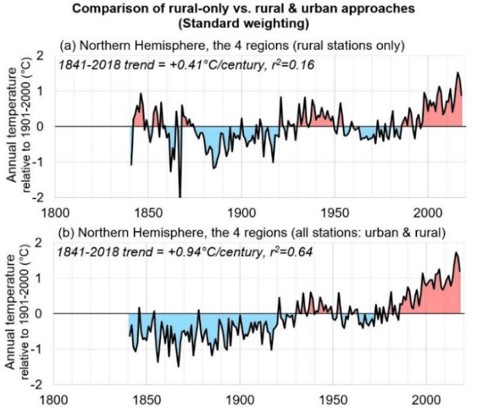
To illuminate solar influence on temperature these authors also took a close look at the other side of the equation, surface temperature data, and constructed a new climate record for the northern hemisphere using only rural weather stations and data collected over the sea surface to avoid contamination from urban heat islands. Then they coupled this with tree ring proxy data to assemble a temperature estimate covering the same interval as the solar series.
Putting the solar and temperature data together depending on which solar reconstruction you pick the sun turns out to explain either none of the observed warming or all of it or somewhere in between. So we can get a result from nothing to almost all of the temperature changes since 19th century in terms of solar activity depending on whether ACRIM is correct or PMOD is correct.
Now that result doesn’t mean we get to cherry pick the result we like and say, aha we’ve proven that the sun causes all climate change. But neither can the alarmists go, aha we’ve proven that the sun causes none of it. And the trouble is they do it when they put out reports confidently declaring that warming is all due to greenhouse gases.
They don’t tell you that their calculation is based on using one specific solar reconstruction and a lot of temperature data from cities which have grown bigger and hotter since the start of the 21st century.
I’m going to leave you here with one more quote from another scientist working in the solar measurement field. In a 2012 review paper physicist Michael Lockwood discussed all the difficulties in trying to reconstruct solar output and measure its current effects and lamented: “The academic reputation of the field of sun climate relations is poor because many studies do not address all or even some of the limitations listed above. It is also a field that in recent years has been corrupted by unwelcome political and financial influence as climate change skeptics have seized upon putative solar effects as an excuse for inaction on anthropogenic warming.”
It’s strange when scientists insist that there’s political and financial corruption in their field but it only ever goes in one direction. And it’s not the direction the funders want because, don’t forget, climate research is funded overwhelmingly by governments who believe in a man-made global warming crisis. And it’s also weird when they say that people drawing logical conclusions about the policy implications of the sun having a significant impact on climate are “just making excuses.”
I don’t expect these scientists want any advice from me but I’m going to give it to them anyway.
When you keep telling us that your motivation is to promote a costly policy agenda whether it’s scientifically justified or not;
and you keep getting caught trying to conceal the fact that you’re not nearly as certain about your conclusions as the IPCC keeps claiming;
and you keep getting caught fiddling data series;
and when challenged you substitute abuse for argument;
It makes the general public more skeptical and not less.
So please look up, because for the climate discussion nexus, I’m John Robson and I am looking at the Sun.


 hat tip to Homer Simpson


 So Kagan’s suppositions about the dooms of global warming are false, and known to be false with only a little investigation. Which she did not make. Nor did Wise Latina, and nor did the other guy who’s now retired and will be quickly forgotten. Both signed Kagan’s dissent.